
Bar Graphs PowerPoint PPT Presentations
All Time
Recommended

... that changes over time (abortion rate, population, poverty line, the ... Here are the violent crime statistics (in thousands) for the United States since ...
| PowerPoint PPT presentation | free to view

Bar Graphs are usually considered the easiest type of graph to read. They include solid lines or bars to represent different categories of data.
| PowerPoint PPT presentation | free to view
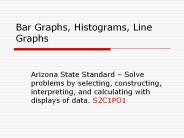
Bar Graphs, Histograms, Line Graphs Arizona State Standard Solve problems by selecting, constructing, interpreting, and calculating with displays of data.
| PowerPoint PPT presentation | free to download

A histogram is a bar graph that shows the frequency of each item. ... A line graph uses a series of line segments to show changes in data over time. ...
| PowerPoint PPT presentation | free to view

Creating bar and double-bar graphs (with Microsoft Excel) After students have learned how to construct bar graph and double-bar graphs using paper pencil ...
| PowerPoint PPT presentation | free to view

Tips for putting bar graphs into s
| PowerPoint PPT presentation | free to view

Title: PowerPoint Presentation Author: NMS Last modified by: Kathy Laudicina Created Date: 10/16/2002 3:21:37 PM Document presentation format: On-screen Show (4:3)
| PowerPoint PPT presentation | free to view

Bar Graph- a graph that displays data using bars of different heights. The following data can be displayed using a bar graph. Art Health/P.E. Social Studies Science ...
| PowerPoint PPT presentation | free to download

Bar Graphs Bar graphs are used to show amounts of data. How much? How many? Example the number of students who have a birthday in each month.
| PowerPoint PPT presentation | free to view

Bar Graphs & Histograms Glenn C. Jones Middle School Vocabulary Frequency Table: a table for organizing a set of data that shows the number of times each item or ...
| PowerPoint PPT presentation | free to view
How to Create Bar Graphs Bar Graphs Bar graphs are descriptive. They compare groups of data such as amounts and categories. They help us make generalizations and see ...
| PowerPoint PPT presentation | free to download

Use the bar graph at the top of the Guided Practice to answer each question. 1. ... Girls. Course 2. 7-3. Bar Graphs and Histograms. Lesson Quiz: Part III. 4. ...
| PowerPoint PPT presentation | free to view

For each set of data, determine what kind of graph is most appropriate. ... Shemp. 7. 8. 9. Bar Graph. 4) These numbers are 12 responses to a survey question. ...
| PowerPoint PPT presentation | free to view

State Urban Rural. Florida 65 mi/h 70 mi/h. Texas 70 mi/h 70 mi/h. Vermont 55 mi/h 65 mi/h ... Bird 2 3. Try This: Example 2. Step 2: Draw a pair of bars for ...
| PowerPoint PPT presentation | free to view

How are they similar to Pie Charts? Both pie charts & bar graphs can display the distribution of a categorical variable How are they different from Pie Charts?
| PowerPoint PPT presentation | free to view

Which student had the most smelly socks? Which student had the least ... Mr. Hoggin. 12. Mrs. Dowallaby. Favorite Teachers. Favorite Teachers. Now It's Time For ...
| PowerPoint PPT presentation | free to view

The list below shows where people like to eat: 25% McDonald's (McD) 10% KFC (KFC) ... (b) Construct pie charts from the same data. Use the same colour codes. ...
| PowerPoint PPT presentation | free to view

Linear and Nonlinear Curves. Price (in dollars) Quantity. Price (in dollars) Quantity ... Let Y=cost of an international phone call. Let X=length of call in minutes ...
| PowerPoint PPT presentation | free to view

... good at showing specific values of data, meaning that given one variable the ... The part of the graph. that explains what each. color represents is called ...
| PowerPoint PPT presentation | free to view

Math Review: line plots, bar graphs, mean, median, mode, range V. Martinez What is a line plot? A line plot displays data along a number line. Each x represents one ...
| PowerPoint PPT presentation | free to download

Doughnut? Bar? Thinking Critically about Graphing. Lynn Stallings. Marj Economopoulos ... Less Common Graphs Doughnut, Radar, Bubbles ...
| PowerPoint PPT presentation | free to view

... changes over time (abortion rate, population, poverty line, the price ... Here are the violent crime statistics (in thousands) for the United States since ...
| PowerPoint PPT presentation | free to view

On the board I have listed the 5 snack choices on page 152 in your Math Journal. Please come to the board and put a tally mark next to the snack you chose. ...
| PowerPoint PPT presentation | free to view

Communicating an important quantitative fact (e.g. an ... Most statistic packages have some graphing capabilities (boxplots, ... avoid using legends ...
| PowerPoint PPT presentation | free to view

... is up from its fourth-quarter 1992 low, manufacturing employment has continued to . ... example, not in fact shoulder-deep in horse manure, as ...
| PowerPoint PPT presentation | free to view

Hi: 85. Lo:61. Hi: 86. Lo:63. Hi: 81. Lo:62. Hi: 80. Lo:60. Hi: 75. Lo:59. Sat. Fri. Thu. Wed. Tue. Mon. Sun. Temperature Bar Graph. How do we find the Mean? ...
| PowerPoint PPT presentation | free to view

BAR Domains as Sensors of Membrane Curvature: The Amphiphysin BAR Structure Brian J. Peter,* Helen M. Kent,* Ian G. Mills, Yvonne Vallis, P. Jonathan G. Butler ...
| PowerPoint PPT presentation | free to view

... Crossing of two lines when graphing Graphs: Graphical Way of Presenting Data Bar Graphs: Compares the amount of different characteristics of data.
| PowerPoint PPT presentation | free to download

Graphs. Exploring 4 different types of graphs. And their uses. Bethany Rollet. Bar Graph - Bars can be vertical or horizontal - Helps make direct comparisons ...
| PowerPoint PPT presentation | free to view

Graphing & Scientific Method ... Graphing
| PowerPoint PPT presentation | free to view

Graphs Class A Class B Pictograph Types of Graphs Line Graphs Plots Circle Graph Histogram Single Double Stem & Leaf Line Single Double Box - and - Whisker Plot ...
| PowerPoint PPT presentation | free to download
Graphs How to set up successful graphs in Ms. Baker s class! How to set up your graph! How to set up your graph! Y Axis (This is for your dependent variable) How to ...
| PowerPoint PPT presentation | free to download

Graphs Class A Class B Pictograph Types of Graphs Line Graphs Plots Circle Graph Histogram Single Double Stem & Leaf Line Single Double Box - and - Whisker Plot ...
| PowerPoint PPT presentation | free to view

GRASPING GRAPHING * * Graphs are visual representations of data you collect in an experiment. There are many types of graphs including: bar, line, scatter plot ...
| PowerPoint PPT presentation | free to view

A bar chart is a key tool for visualizing categorical data using bars of varying lengths to represent different values. Subdivided bar graphs break each bar into segments for comparison of subcategories within a category. Distribution bar charts show how values are spread across categories, illustrating frequency distribution. Deviation bar diagrams highlight the differences between actual and expected values, making it easy to see discrepancies. Grouped bar charts arrange bars in clusters for side-by-side comparisons across multiple categories, aiding in the analysis of relationships within the data. Each type of bar chart serves a unique purpose, making them versatile tools for data analysis and presentation.
| PowerPoint PPT presentation | free to download

or more than one value.. or show data in 3 dimensions. Line Graphs. Line graphs are used to show trends or changes over time. Independent Variable ...
| PowerPoint PPT presentation | free to view

But, our birthday is constant, meaning it never changes. ... Would we use a line graph to show when our birthdays are? 9/16/09. 7. How do we make a line graph? ...
| PowerPoint PPT presentation | free to download

What s a Graph? A bunch of vertices connected by edges. ... Family relationships - Taxonomy (e.g. animal - mammal - dog) - Precedence (x must come before y ...
| PowerPoint PPT presentation | free to view
GRAPHING PRACTICE LINE GRAPHS, BAR GRAPHS AND CIRCLE GRAPHS Line Graph Suppose you are interested in graphing temperature data that you collected over the course of a ...
| PowerPoint PPT presentation | free to download

Used to demonstrate change that is not continuous. PIES CHARTS. Shows how each group of data relates to all of the data. SCATTER PLOTS ...
| PowerPoint PPT presentation | free to view

A graph that shows frequency of data along a number line. Tally Table. A table with categories for recording each piece of data with tally marks as it is collected ...
| PowerPoint PPT presentation | free to view

A graph that uses rectangles (bars) to show numbers or measurements. GLE 0406.5.1 SPI 0406.5.1 0406.5.2 Parts of a bar graph. Bar graphs are an excellent way to show ...
| PowerPoint PPT presentation | free to view

Making a graph is one way to help make data visual. Types of Graphes. Line Graph - Shows trends or how data changes over time. ...
| PowerPoint PPT presentation | free to view

Example: What is the favorite kind of movie in Mrs. Fought's class? ... Watch out for misleading graphs and charts! Missing Zero, Same Data. Missing Years, Same Data ...
| PowerPoint PPT presentation | free to view
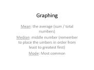
Graphing Mean: the average (sum / total numbers) Median: middle number (remember to place the umbers in order from least to greatest first) Mode: Most common Steps ...
| PowerPoint PPT presentation | free to download

Label-A label gives you information about an object. Ladybug. Grid- horizontal and vertical lines on a map or graph. y-axis. x-axis ...
| PowerPoint PPT presentation | free to view

... never be used (Excel 'line graph' always treats the x-axis categorically) ... What type of graph should you make? Pie. Bar. XY scatter (line) ...
| PowerPoint PPT presentation | free to view

Def - a chart with rectangular bars with lengths proportional to the values that ... We want to compare populations of pandas over the past seven years. ...
| PowerPoint PPT presentation | free to view

Pie charts and bar charts are important tools for visualizing data, each with its own purpose. A pie chart is a circular graphic divided into slices that show parts of a whole, making it easy to compare proportions. On the other hand, a bar chart uses rectangular bars to display the frequency or value of different categories, allowing for straightforward comparisons. To turn a pie chart into a bar graph, you can take the percentage values from the pie slices and plot them as bars. Creating a bar chart involves choosing data categories, setting a scale, and plotting values on a vertical axis while placing categories on a horizontal axis. Both pie and bar charts offer valuable insights, making them essential for effectively communicating data in various fields.
| PowerPoint PPT presentation | free to download

Graphs. Equivalent Representations. Percents. Decimals. Ratios. Fractions. 25% = 0.25 = 25/100 ... A survey was taken and the following results were obtained ...
| PowerPoint PPT presentation | free to download

I want to make a graph that shows the change in temperature throughout the day yesterday. ... Car Trip. 8/26/09. 14. What information do you need to interpret a graph? ...
| PowerPoint PPT presentation | free to view

Gradient (slope) the rise over run of the best fit line. ... Only use Excel or some other graphing program once you have the concepts under control. ...
| PowerPoint PPT presentation | free to view
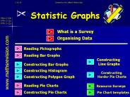
Created by Mr.Lafferty Maths Dept Statistic Graphs MNU 2-20b MTH 2-21a MTH 3-21a What is a Survey www.mathsrevision.com Organising Data Reading Pictographs
| PowerPoint PPT presentation | free to download

How many flowers does Kim have? Key = 2 flowers. How many flowers does Joseph have? Key = 5 flowers. How many flowers does Skylar have? Key = 10 flowers ...
| PowerPoint PPT presentation | free to download
2. Be able to construct a Bar Graph. ... Remember graph has to be labelled and neat ! Cat. Dog. Rabbit. Hamster. Snake. 0. 2. 4. 6 ...
| PowerPoint PPT presentation | free to download

Graphs are easy-to-read drawings or pictures that provide a ... Source: Survey of 7 Girls & 7 Boys. Title: Ways Boys and Girls Travel to School. horizontal axis ...
| PowerPoint PPT presentation | free to view