
Graphs - PowerPoint PPT Presentation
1 / 13
Title:
Graphs
Description:
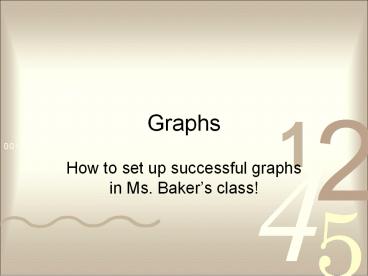
Graphs How to set up successful graphs in Ms. Baker s class! How to set up your graph! How to set up your graph! Y Axis (This is for your dependent variable) How to ... – PowerPoint PPT presentation
Number of Views:58
Avg rating:3.0/5.0
Title: Graphs
1
Graphs
- How to set up successful graphs in Ms. Bakers
class!
2
How to set up your graph!
3
How to set up your graph!
Y Axis (This is for your dependent variable)
4
How to set up your graph!
X Axis (This is for your independent variable)
5
TAILS
Teacherss Favorite Singer
T - Title
6
TAILS
Teacherss Favorite Singer
T - Title A - Axis
Y Axis Dependent Variable
X Axis Independent Variable
7
TAILS
Teacherss Favorite Singer
Decide on an appropriate scale for each
axis. Choose a scale that lets you make the graph
as large as possible for your paper and data
T - Title A Axis S Scale
8
How to determine scale
- Scale is determined by your highest lowest
number. - In this case your scale would be from 2 22.
9
How to determine Intervals
- The interval is decided by your scale.
- In this case your scale would be from 2 22 and
you want the scale to fit the graph. - The best interval would be to go by 5s.
10
TAILS
Teacherss Favorite Singer
The amount of space between one number and the
next or one type of data and the next on the
graph. The interval is just as important as the
scale Choose an interval that lets you make the
graph as large as possible for your paper and
data
T Title A Axis I Interval S Scale
11
TAILS
Teacherss Favorite Singer
T Title A Axis I Interval S Scale
25
20
15
10
5
0
12
TAILS
Teacherss Favorite Singer
T Title A Axis I Interval L Labels S
Scale
25
20
15
Number of Teachers
10
5
0
Toby Keith
Madonna
Elvis
Sting
Sinatra
Singers
Give the bars a general label. What do those
words mean?
Label your Y Axis. What do those numbers mean?
13
When to use
- Bar graphs
- Used to show data that are not continuous.
- Allows us to compare data like amounts or
frequency or categories - Allow us to make generalizations about the data
- Help us see differences in data
- Line Graphs
- - To show relationships between two
variables - For continuous data
- useful for showing trends over time
Recommended
CrystalGraphics Presentations


