Infographic Data Visualization PowerPoint PPT Presentations
All Time
Recommended
Loginworks Softwares is the leading data visualization company in India. We offer data visualization services using various data visualization tools and techniques. Loginworks data visualization consultants set a collaborative plan which ensures that they meet your business expectations, before designing a conceptual solution full with advice about the most effective technology stack. https://www.loginworks.com/data-visualization/
| PowerPoint PPT presentation | free to download
It so occurs, that public is in the want for illustrations of information that consent to the onlookers to relate and interact with the data.
| PowerPoint PPT presentation | free to download
Data visualization is far beyond an art. With ever-evolving cognitive frameworks, multidimensional imaging, and intelligence, data visualization is opening gateways to visualize huge amounts of complex data. A modern substitute for visual communication, data visualization facilitates seamless decision-making for businesses.
| PowerPoint PPT presentation | free to download
Confused by Raw Data? Let Us Transform It into Meaningful Insights! Make better business decisions with our Data Visualization Services. We create interactive dashboards, reports, and engaging visual stories from complex data. Get a free consultation today! Let’s Connect – +1 (347) 9739732, or mail us at inquiry@digiprima.com
| PowerPoint PPT presentation | free to download
Creating a combo chart in PowerPoint is easy and improves your data presentation by showing different data types in one chart. Start by inserting a chart from the "Insert" tab. You can combine chart types, like a column and line chart, by right-clicking on the data series and selecting "Change Series Chart Type." To add a combo box for drop-down selections, go to the "Developer" tab and insert a combo box control. If you need to merge two tables, copy one table, paste it into the other, and adjust the formatting for a unified appearance. PowerPoint offers various ways to combine elements, including charts and tables, to enhance the clarity and effectiveness of your presentation. This flexibility helps make your data more engaging and easier to understand for your audience.
| PowerPoint PPT presentation | free to download
Collaborating with a leading PowerPoint agency can significantly elevate the quality of your presentations. These firms possess a proven history of successful projects and excel at integrating contemporary trends, such as interactive elements and data visualization, to ensure that presentations are both captivating and aesthetically pleasing. When selecting an agency, it is crucial to assess their specialization, as many focus on corporate or sales presentations designed to meet particular goals. Engaging with a proficient agency can foster greater audience interaction and deliver a more polished presentation experience.
| PowerPoint PPT presentation | free to download
Line graphs are a popular choice for analyzing trends over time because they clearly show changes in data. They connect a series of data points with straight lines, making it easy to visualize trends. However, one drawback is that they can oversimplify complex data and may hide important fluctuations. Despite this limitation, line graphs are widely used in fields like finance and science to compare data across different time periods. A key feature of line graphs is the legend, which helps identify different lines or data series, ensuring viewers can easily understand the information presented. Overall, while line graphs are effective for trend analysis, it's important to be aware of their potential to overlook complex details in the data.
| PowerPoint PPT presentation | free to download
Data visualization is more than just charts and graphs—it's an art form that brings numbers to life. In a world overflowing with information, the ability to present data in a clear, meaningful way is essential for making smart decisions and grasping complex ideas. By turning raw data into engaging visuals, we invite viewers into a narrative where every pixel, line, and color tells a part of the story.
| PowerPoint PPT presentation | free to download
Think-cell is an innovative add-in for Microsoft Excel designed to enhance the efficiency of creating high-quality presentations and visual data representations. It streamlines the construction of intricate charts and graphs, enabling users to transform data into visually appealing formats with ease. One of its standout features is the automatic updating of charts in response to changes in the underlying data, ensuring that presentations remain precise and current. Think-cell offers a variety of templates, including Gantt charts and waterfall diagrams, to address diverse presentation requirements. Users experience considerable time savings, consistent aesthetic designs, and an intuitive interface that seamlessly integrates with Excel.
| PowerPoint PPT presentation | free to download
Explore the significance of data visualization components, their impact on analysis, and their role in conveying complex information effectively.
| PowerPoint PPT presentation | free to download
This presentation will educate you about Data visulization, Why is data visualization important?, Benefits of data visualization, Benefits of data visualization and Some other popular techniques are as follows. for more topic stay tuned with Learnbay
| PowerPoint PPT presentation | free to download
An infographic created in PowerPoint (PPT) is a visual way to present information, making complex data easy to understand and engaging for viewers. While PPT can produce infographics, it is primarily a presentation tool that can include various visuals. Infographics are different from brochures and flyers; they focus on displaying data and statistics in an attractive format, while brochures and flyers are mainly used for promotion. To effectively analyze an infographic, one should look at how clear the visuals are, check the accuracy of the data, and consider the overall message. The goal is to ensure that the infographic is not only visually appealing but also informative and relevant.
| PowerPoint PPT presentation | free to download
An infographic created in PowerPoint (PPT) is a visual way to present information, making complex data easy to understand and engaging for viewers. While PPT can produce infographics, it is primarily a presentation tool that can include various visuals. Infographics are different from brochures and flyers; they focus on displaying data and statistics in an attractive format, while brochures and flyers are mainly used for promotion. To effectively analyze an infographic, one should look at how clear the visuals are, check the accuracy of the data, and consider the overall message.
| PowerPoint PPT presentation | free to download
Elevating your consulting decks with 10 creative data visualization ideas can differentiate your work and leave a lasting impression on clients. By incorporating innovative and visually engaging charts, graphs, and infographics, you can effectively convey complex information in a clear and concise manner.
| PowerPoint PPT presentation | free to download
When choosing a chart for data visualization, it’s important to match the chart type with the data being presented. Pie charts are great for showing proportions, as they clearly illustrate how different parts contribute to a whole, making it easier to understand percentage relationships compared to bar charts. Adobe Analytics provides a powerful tool for creating visual data representations, helping users gain insights from their data. By analyzing trends and patterns, users can make better decisions. To get the most out of Adobe Analytics, users should follow specific setup steps to ensure they can effectively visualize their data for the best results.
| PowerPoint PPT presentation | free to download
Data visualization plays a crucial role in gaining valuable SEO insights. By transforming complex data into clear and visually appealing charts, graphs, and infographics, SEO professionals can identify patterns, trends, and performance metrics more efficiently. Visual representations of keyword rankings, website traffic, and user behavior aid in comprehending data at a glance, enabling better decision-making. To know more visit here https://singhimarketingsolutions.com/seo-services/
| PowerPoint PPT presentation | free to download
Data visualization is crucial in today's world for effectively communicating complex information through visuals. Interactive dashboards are a great example, allowing real-time exploration of data to identify trends and patterns easily. There are various formats for data visualization, such as bar charts, line graphs, pie charts, and scatter plots, each appropriate for different data types. To create impactful visual stories, follow five steps: understand your audience, define your goals, select the right visual format, design the visualization, and deliver the final message. The main advantage of data visualization is its ability to simplify large amounts of information, making it easier for stakeholders to understand and make decisions. To create effective visuals, start by gathering and cleaning your data, choose suitable tools and software, and iteratively design visuals that enhance your message.
| PowerPoint PPT presentation | free to download
Data visualization storytelling is the art of transforming intricate datasets into captivating narratives that resonate with the audience. This process is composed of four essential phases: identifying the audience, clarifying the core message, selecting the most suitable visualization format, and providing relevant context. Various visualization tools, such as bar charts, line graphs, and heat maps, cater to different analytical needs and insights derived from the data. A successful data storytelling approach integrates narrative elements with data analysis, facilitating better comprehension and retention of information.
| PowerPoint PPT presentation | free to download
Infographics are visually appealing tools that effectively communicate information. They are made up of visuals, data points, text, and a call-to-action. A good infographic should be engaging, easy to understand, and share valuable information. Infographics are usually designed on a single page but can span multiple pages for complex content. To create an infographic, one must choose a topic, research data, select a layout, design visuals, add text, and finalize the product. The best color for an infographic is one that is visually appealing and helps convey the intended message. Creating an infographic involves a step-by-step process to ensure a polished and informative final product.
| PowerPoint PPT presentation | free to download
Infographics are visual tools that simplify complex data for a wide audience, including students, professionals, and businesses. They enhance engagement and retention of information by presenting data in a visually appealing manner. While primarily visual, they can contain text to support the message. The best topics for infographics are those with data suitable for visual presentation, such as statistics or processes. Creating an infographic involves ten key steps, from defining the topic and researching data to designing the layout and ensuring visual coherence. Overall, infographics serve as effective communication tools for conveying information in a clear and concise way.
| PowerPoint PPT presentation | free to download
Infographics and PowerPoint presentations serve distinct purposes, yet the latter can be utilized for crafting infographics. Canva offers a plethora of templates and tools to aid in the creation of visually captivating graphics. Effective infographic design hinges on hierarchical information organization, the incorporation of eye-catching visuals, and the maintenance of a cohesive aesthetic. The conversion of a PowerPoint presentation into an infographic necessitates the simplification of content, the accentuation of key points, and the integration of visual elements.
| PowerPoint PPT presentation | free to download
Infographics are popular for their visual appeal and clear presentation of complex information. They are unique visual representations of data created with creativity and innovation. In education, infographics are used as tools to help students grasp information better. They differ from memes, which are humorous images or videos with text, as infographics focus on conveying information effectively. The theory behind infographics, known as infographic theory, includes principles and techniques for creating them, such as design elements, data visualization, and storytelling. Infographics are widely shared on social media and might include humor, but their main purpose is to convey information efficiently through visual means.
| PowerPoint PPT presentation | free to download
Data can be categorized into five primary types: nominal, ordinal, interval, ratio, and categorical, each fulfilling distinct functions in analysis and visualization. Quantitative data is optimally represented through various graphical formats, whereas categorical data is often displayed using bar charts or pie charts. High-quality data visualization should embody four critical attributes: clarity, precision, efficiency, and visual appeal. For the purpose of data classification, tools such as decision trees and scatter plots are particularly effective in distinguishing between different categories.
| PowerPoint PPT presentation | free to download
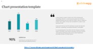
Enhance your data visualization with SlideEgg's PowerPoint Chart Templates. Our collection offers a variety of professionally designed and customizable charts, ideal for presenting data and statistics. Whether for business reports, academic presentations, or project updates, these templates ensure clarity and impact. Elevate your presentations by making complex information visually engaging. Explore SlideEgg's Chart Templates to transform your data into compelling visuals, available for download now.
| PowerPoint PPT presentation | free to download
Visual communication is perhaps the most important form of communication that takes place while users are surfing the Internet.
| PowerPoint PPT presentation | free to download
According to research, the human brain processes images within 13 milliseconds. That's how fast our brain is. Think about how easy it is for you to notice details from a graph rather than plain data?
| PowerPoint PPT presentation | free to download
Harnessing New Data Visualization Tools: Say It Visually
| PowerPoint PPT presentation | free to view
Data visualisation has become easier and more accessible for all sorts of users thanks to drag-and-drop functionality in BI solutions like Power BI and Tableau. However, it has also given rise to a slew of poor data visualisation examples. We'll look at all of these problematic visualisation approaches in this blog.You must strike the correct chord between data points and presentation to avoid data visualisation problems.
| PowerPoint PPT presentation | free to download
Before we understand the uses of infographics let’s look at the definition of infographics and advantages of using it. Infographics are just the graphical representation of data or information that are used to present a particular information quickly and clearly before readers. The main advantage of using infographics in a web content is that it presents even complicated information in a simple way that makes the readers understand it at first sight. Read more on https://bit.ly/31ObiNv
| PowerPoint PPT presentation | free to download
What is data visualisation? It is a process that involves gathering unstructured data from a variety of sources, modelling it, and displaying it in an organised and legible manner to improve decision-making.It uses visuals like interactive graphs and charts to communicate data, making it more appealing and easy to understand for all sorts of people.
| PowerPoint PPT presentation | free to download
The data visualization tool is an efficient tool that represents any specific information through visual elements like charts, graphs, and maps. It is a simple method to see and understand the trends and patterns through graphical representation. These tools play an important role in making any specific information visually appealing. This way a large number of visitors to a website can easily understand the information that is published on a web page. Read more on https://bit.ly/2v4lXaC
| PowerPoint PPT presentation | free to download
Data visualisation has had a huge impact throughout the years, not just in major companies but also in medium and small businesses. Every day, 2.5 quintillion bytes of data are generated around the world, which will be wasted if not organised properly. As a result, the future of data visualisation is both secure and vital!
| PowerPoint PPT presentation | free to download
An infographic serves as a visual aid crafted to convey intricate information in a straightforward and captivating manner. By integrating text, imagery, and graphics within a unified framework, it produces a visually stimulating and easily comprehensible depiction of data or ideas. Essential components of an infographic encompass visual hierarchy, color palette, typography, data visualization, content, and layout composition. Through the strategic use of charts, graphs, and symbols, an infographic effectively illustrates information to enhance understanding and retention. Ultimately, the primary objective of an infographic is to present information in a visually enticing and readily comprehensible format.
| PowerPoint PPT presentation | free to download
Elevating your presentations can be achieved through the strategic use of infographics, which effectively visualize complex ideas and data. By incorporating ten distinct types of infographics, such as data visualizations, timelines, and comparison charts, you can enhance audience engagement and comprehension. Each type serves a unique purpose, allowing for the clear communication of statistics, processes, and relationships.
| PowerPoint PPT presentation | free to download
Infographics are powerful tools that present information visually in an engaging and easy-to-understand way. They use vibrant colors, images, and data visualizations to capture viewers' attention and communicate messages effectively. To create a successful infographic, focus on clear and concise design that conveys the main message succinctly. The title should summarize the message, which should also be reinforced through visual elements.
| PowerPoint PPT presentation | free to download
Infographics are a powerful tool for visual communication, simplifying complex information into easily digestible visuals. To create effective infographics, one must learn their value and purpose, as well as master design software and data visualization techniques. These visual aids play a crucial role in simplifying data, enhancing storytelling, and increasing audience engagement by being visually appealing, concise, and informative. By understanding the importance of infographics and mastering the necessary skills, individuals can effectively harness the power of visual communication to convey information in a compelling and engaging manner.
| PowerPoint PPT presentation | free to download
Infographics are popular in the digital age as they are visually attractive and informative tools for communication. They help simplify complex information and are in high demand. This demand has led to opportunities for individuals to earn money as infographic designers, with organizations seeking skilled professionals for creating engaging visuals. The salary of an infographic designer can vary based on factors like experience and location. To become an infographic designer, one can pursue education or training in graphic design, data visualization, and digital marketing to develop the required skills and creativity. This field offers a promising career path for those interested in combining design and information presentation.
| PowerPoint PPT presentation | free to download
Infographic activity involves creating and interpreting visual displays of information, making complex ideas easier to understand. When analyzing an infographic, it's important to look at its visual elements, clarity of information, and overall design effectiveness in conveying its message. A SWOT analysis infographic focuses on strengths, weaknesses, opportunities, and threats related to a specific topic, providing a clear overview that supports strategic planning. Digital infographics, made with software tools, can include interactive features that engage users more effectively. While infographics can help simplify information and improve memory retention, they can also oversimplify complex data and potentially mislead if not designed properly. Therefore, careful design is crucial for effective communication in infographics.
| PowerPoint PPT presentation | free to download
Dive into the science of data storytelling, where numbers meet narrative for maximum impact. This method leverages psychology and visualization to make data insights more relatable and actionable. By mastering data storytelling, businesses can enhance communication, drive alignment, and achieve data-driven success.
| PowerPoint PPT presentation | free to download
PowerPoint has various tools to help users create engaging infographics, and it offers several pre-designed infographic templates. These templates allow users to visually present information by combining graphics, charts, and text, making complex data easier to understand. To create an infographic in PowerPoint, users can choose a template and customize it with their own data, adding visuals, icons, and concise text. PowerPoint’s features like SmartArt, shapes, and charts help illustrate ideas effectively while keeping a professional look. Overall, PowerPoint simplifies the process of making visually appealing presentations through its infographic options.
| PowerPoint PPT presentation | free to download
Data is collected from various sources like interviews, sensors, social media, server logs, website analytics and more. This process involves understanding the data sources, obtaining an informative and thorough data set, and ensuring data quality and integrity.
| PowerPoint PPT presentation | free to download
The data analysis module covers topics like exploratory data analysis, statistical inference, and predictive modeling. The data visualization module covers topics like creating charts and visualizations, using color effectively, and creating infographics. The machine learning module covers topics like supervised learning, unsupervised learning, and deep learning. After completing the four modules, you will have a solid foundation in data science that you can immediately put to use in your work or studies. So if you're thinking of pursuing a career in data science, then join our course for more details, you can check our site: https://www.talentserve.org/course-datascience
| PowerPoint PPT presentation | free to download
Infographics are visual representations of information, or “data visualization,” which implies that sets of data will be displayed in a unique way that can be seen
| PowerPoint PPT presentation | free to download
To create an engaging infographic presentation in PowerPoint, start by brainstorming ideas and selecting relevant data. Use creative elements like unique colors, custom icons, and varied fonts to enhance visual appeal. Editing in PowerPoint is easy, allowing you to adjust shapes, text, and images to fit your design. Prioritize clarity and simplicity when presenting data; using charts or graphs can help highlight key points effectively. For timeline infographics, leverage PowerPoint's SmartArt features to create attractive timelines that showcase progress or events over time. By combining these techniques, you can develop an impactful infographic presentation that captures and retains your audience's attention.
| PowerPoint PPT presentation | free to download
An infographic serves as a visually compelling tool for presenting data through the use of graphics and design elements, enhancing comprehension for viewers. A process infographic streamlines intricate procedures into easily digestible steps, while a timeline infographic arranges events in a chronological manner in an aesthetically pleasing format. Infographic files are digital assets containing graphical elements and data necessary for crafting infographics. An infographic portfolio showcases visually captivating and informative graphics that highlight an individual's or organization's expertise in designing and presenting information through infographics.
| PowerPoint PPT presentation | free to download
Creating a scatter bubble chart in PowerPoint is easy and improves data presentation. Start by gathering your data with two variables for the X and Y axes. A scatter chart visually shows the relationship between these variables, helping to identify trends and correlations. To insert a bubble chart in PowerPoint, go to the Insert tab, select Chart, and choose the "Bubble" option. Remember, a scatter diagram is a type of graph that displays data points based on their values, making it useful for data analysis and visualization.
| PowerPoint PPT presentation | free to download
Clipart consists of pre-made images that can be easily added to design projects like infographics. Using clipart can make infographics more attractive and engaging, helping to convey messages effectively. When selecting clipart, it’s important to consider the theme, audience, and intended message, choosing images that enhance your content and connect with viewers. Effective clipart includes simple icons, thematic illustrations, and colorful graphics that aid understanding without being distracting. Benefits of incorporating clipart include saving time in the design process, maintaining a consistent visual style, and simplifying complex information. Overall, using clipart can make infographics more impactful and memorable.
| PowerPoint PPT presentation | free to download
Pyramid Infographics are visual representations that use the shape of a pyramid to convey information, hierarchy, or a step-by-step process. These graphics are commonly used in presentations, reports, and educational materials to illustrate concepts where elements are arranged in a hierarchical or decreasing order, with the widest section at the top and the narrowest at the bottom. Pyramid infographics are an effective way to simplify complex ideas and make data more engaging and understandable.
| PowerPoint PPT presentation | free to download
A stacked combo chart combines different data types, usually a stacked bar and a line graph, to visually compare multiple data series. This format highlights both total values and individual contributions within categories. However, it can be challenging to interpret the values of smaller segments or when many categories are present. In a stacked chart, data is displayed in layers, with each layer representing a category. A 100% stacked chart shows each category's percentage of the total, using a common scale. To interpret a stacked line graph, viewers should focus on the overall trend of the line while considering the contributions of the stacked segments. This combination provides insights into both total performance and individual elements over time. Understanding how to read and interpret these charts is important for effective data visualization.
| PowerPoint PPT presentation | free to download
To create effective infographics, it's important to use quality clipart from libraries like Freepik, Vecteezy, and Shutterstock. Good visuals help improve information retention and comprehension by breaking up text and providing context. Choose clipart that matches the design and color scheme of your infographic to keep a consistent theme. Customizing clipart to fit your branding and message can also boost its effectiveness. However, be mindful of copyright issues; always check usage rights and consider using royalty-free resources or obtaining the necessary licenses to avoid legal problems.
| PowerPoint PPT presentation | free to download
To construct a waterfall chart in PowerPoint for effective data visualization, begin by identifying your initial value, which acts as the foundation of your analysis. Subsequently, incorporate columns to depict both increases and decreases in value, culminating in a distinctly labeled final total. You can utilize PowerPoint's integrated chart capabilities or import a chart from Excel, enabling real-time data synchronization. Furthermore, PowerPoint presents various data visualization alternatives, including funnel charts and flow diagrams, which are useful for illustrating processes and hierarchies. Leveraging these features will allow you to produce clear and insightful visual representations of your data.
| PowerPoint PPT presentation | free to download
Infographics in PDF are visual data representations that simplify complex ideas in a graphic format for better understanding and engagement. They can vary in size but are usually designed to fit a standard letter or A4 page. Infographics can be single-page or multi-page depending on the content, with digital versions tailored for online use and often featuring interactive elements. Pictures and visuals are commonly used in infographics to enhance the information presentation and make it visually appealing.
| PowerPoint PPT presentation | free to download
Infographics are a powerful tool for presenting complex information in a visually appealing way. They have a long history and are now a crucial part of modern communication. By combining text, images, and data, infographics create engaging narratives that help viewers understand and remember information easily. The main purpose of an infographic is to simplify data and convey important messages effectively. With their ability to captivate and inform, infographics are widely used across different platforms to share information efficiently.
| PowerPoint PPT presentation | free to download
To create an XY scatter chart in Excel, start by selecting your two numerical data sets and go to the "Insert" tab to choose the scatter chart option. You can enhance the chart by changing the bubble sizes in the scatter plot by selecting the data series and adjusting the size properties. Remember, scatter charts show the relationship between two variables, while line charts display trends over time. If you're using a bubble chart, you can add labels through the "Data Labels" feature in the chart tools. The main difference between bubble charts and scatter plots is that bubble charts also represent a third variable through the size of the bubbles, whereas scatter plots focus only on the correlation between the two main variables shown on the axes.
| PowerPoint PPT presentation | free to download
Creating infographics in PowerPoint involves several important steps to visually convey information. Infographics combine text, images, and graphics to present data and concepts in an easily digestible format. To start, choose a template that fits your topic. Utilize tools like shapes, icons, and charts to clearly display your data. The main difference between a traditional PowerPoint presentation and an infographic is that infographics prioritize visual storytelling and engagement, while PowerPoint s often rely more on written content. By focusing on clarity and visual appeal, you can make your infographics more effective and enhance your overall presentation. Following these steps will help you create impactful visual aids that communicate your message at a glance.
| PowerPoint PPT presentation | free to download
An infographic in PowerPoint (PPT) is a visual tool that presents information quickly and clearly, using graphics, charts, and text. While PPT is a presentation software, infographics are specifically designed to convey complex data in an engaging way, unlike traditional PPT s that focus more on verbal content. Infographics differ from brochures, which provide detailed information across multiple pages, and flyers, which are single-page announcements. To analyze an infographic, one should look at its layout, the accuracy and relevance of the data, and how well the visuals support the message. This includes examining colors, fonts, and images to see how they help convey the information clearly.
| PowerPoint PPT presentation | free to download


