Adding Data Labels to Bubble Charts - PowerPoint PPT Presentation
Title:
Adding Data Labels to Bubble Charts
Description:
To create an XY scatter chart in Excel, start by selecting your two numerical data sets and go to the "Insert" tab to choose the scatter chart option. You can enhance the chart by changing the bubble sizes in the scatter plot by selecting the data series and adjusting the size properties. Remember, scatter charts show the relationship between two variables, while line charts display trends over time. If you're using a bubble chart, you can add labels through the "Data Labels" feature in the chart tools. The main difference between bubble charts and scatter plots is that bubble charts also represent a third variable through the size of the bubbles, whereas scatter plots focus only on the correlation between the two main variables shown on the axes. – PowerPoint PPT presentation
Number of Views:2
Date added: 15 March 2025
Slides: 3
Provided by:
visualsculptors
Category:
How To, Education & Training
Tags:
Title: Adding Data Labels to Bubble Charts
1
Data Visualization Charts, Graphs and
Infographic designs Think Cell Expert QA
Insights
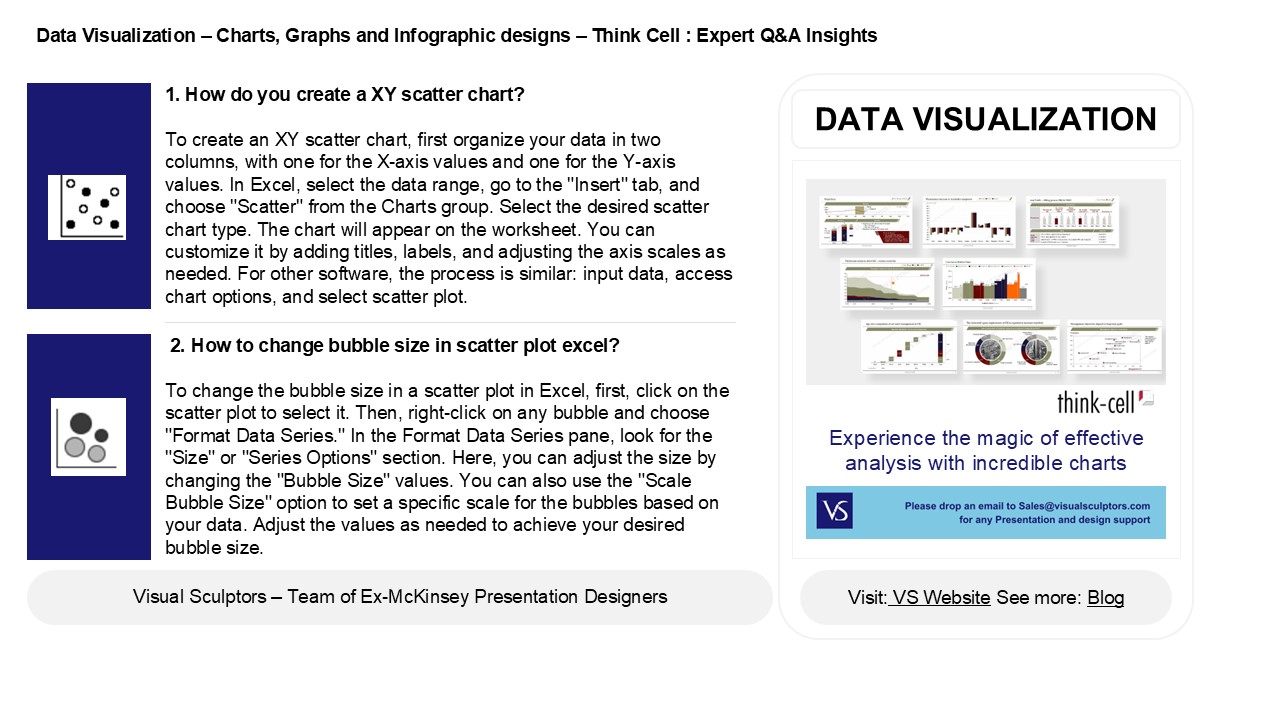
- 1. How do you create a XY scatter chart?
- To create an XY scatter chart, first organize
your data in two columns, with one for the X-axis
values and one for the Y-axis values. In Excel,
select the data range, go to the "Insert" tab,
and choose "Scatter" from the Charts group.
Select the desired scatter chart type. The chart
will appear on the worksheet. You can customize
it by adding titles, labels, and adjusting the
axis scales as needed. For other software, the
process is similar input data, access chart
options, and select scatter plot.
DATA VISUALIZATION
2. How to change bubble size in scatter plot
excel? To change the bubble size in a scatter
plot in Excel, first, click on the scatter plot
to select it. Then, right-click on any bubble and
choose "Format Data Series." In the Format Data
Series pane, look for the "Size" or "Series
Options" section. Here, you can adjust the size
by changing the "Bubble Size" values. You can
also use the "Scale Bubble Size" option to set a
specific scale for the bubbles based on your
data. Adjust the values as needed to achieve your
desired bubble size.
2
Data Visualization Charts, Graphs and
Infographic designs Think Cell Expert QA
Insights
3. Is a line chart a scatter chart? No, a line
chart is not the same as a scatter chart. A line
chart displays data points connected by lines to
show trends over time, emphasizing the
relationship between the x and y variables. In
contrast, a scatter chart displays individual
data points on a Cartesian plane, illustrating
the correlation between two variables without
connecting them. While both types of charts
visualize relationships, their formats and
purposes differ significantly.
4. How to add labels in a bubble chart? To add
labels in a bubble chart, you can follow these
steps 1. Select the Chart Click on the
bubble chart to activate it. 2. Add Data
Labels Right-click on one of the bubbles and
select "Add Data Labels" from the context
menu. 3. Format Labels Right-click on the
labels to format them, choosing options like font
size, color, or position. 4. Customize If
needed, you can manually enter specific labels by
selecting each data point and typing the desired
label. This process may vary slightly depending
on the software used, such as Excel, Google
Sheets, or other charting tools.
5. What is the difference between a bubble chart
and a scatter plot? A bubble chart and a
scatter plot both display data points on a
two-dimensional axis, but they differ in
representation. In a scatter plot, each point
represents two variables, typically using dots of
the same size. In contrast, a bubble chart adds a
third variable, represented by the size of the
bubbles. This allows for more information to be
conveyed, as the size of each bubble indicates an
additional dimension, such as volume or
frequency. Thus, the key difference lies in the
use of bubble sizes to represent an additional
variable in bubble charts.
Recommended
CrystalGraphics Presentations