Use a sans serif font for captions - PowerPoint PPT Presentation
1 / 16
Title:
Use a sans serif font for captions
Description:
Use bold sans serif for headline! Put main text in regular sans serif with no markings ... Use animations cautiously! Enter all the text at the same time! ... – PowerPoint PPT presentation
Number of Views:98
Avg rating:3.0/5.0
Title: Use a sans serif font for captions
1
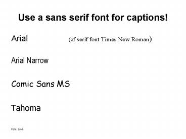
Use a sans serif font for captions!
- Arial (cf serif font Times New Roman)
- Arial Narrow
- Comic Sans MS
- Tahoma
2
Use bold sans serif for headline!
- Put main text in regular sans serif with no
markings - Avoid massive blocks of text (more than two
lines) - Left justify text
- present secondary information with indentation
and in smaller type size
3
Avoid capital letters in slides!
- CAPITAL LETTERS ARE DIFFICULT TO READ
- THIS IS ALSO TRUE FOR SANS SERIFS
- The readers eye is better served by a text which
on a book page would look like this - This is also true for text shown to a listening
audience
4
Strong contrast between text and background
improves readability
5
Strong contrast between text and background
improves readability
6
Strong contrast between text and background
improves readability
- Strong contrast between text and background
improves readability
7
Poor contrast between text and background lessens
readability
8
Poor contrast between text and background lessens
readability
9
Poor contrast between text and background lessens
readability
10
Avoid red/green as a colour combination in your
slides
- This combination will be difficult to read for
many in the audience
11
What it should not look like
12
What it should look like
- Captions
- informative headline
- key-words outlining and
- evaluating the diagram
- take-home message
13
Rhetoric is built in 5 steps
- preparation (inventio)
- structure (dispositio)
- language (elocutio)
- memory (memoria)
- delivery (actio)
14
Classical rhetoric a few brief notes
- Our initial aim is to choose relevant material.
- Structure is important for making the audience
realize the importance of the main part. Might an
introduction and a conclusion help them? - Your language should be correct and clear and
vivid and adjusted to the situation and audience. - Use visual aids to support your results!
- Delivery involves use of voice and body language
where the latter might be more significant than
we realize (up to 80 or more).
15
Use animations cautiously!
- Enter all the text at the same time!
- Let the animation point out the relevant line!
- Allow the reader to see all the information!
16
Use animations cautiously!
- Enter all text at the same time!
- Let the animation point out the relevant line!
- Allow the reader to see all the information!


