Percentiles and Percentile Rank - PowerPoint PPT Presentation
1 / 19
Title:
Percentiles and Percentile Rank
Description:
values within the two inner fences to the box. The two lines that join ... outside the two inner fences is shown by marking an asterisk and is. called an outlier. ... – PowerPoint PPT presentation
Number of Views:1501
Avg rating:3.0/5.0
Title: Percentiles and Percentile Rank
1
Percentiles and Percentile Rank
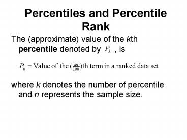
- The (approximate) value of the kth percentile
denoted by , is - where k denotes the number of percentile and n
represents the sample size.
2
Percentile Rank
3
Centre Finding the Median
The average of the minimum and maximum values is
called Midrange but its very sensitive to
outliers. The median is the middle value with
half of the data above and half below it. The
median has the same units as the data.
4
Median
- The median is the value of the middle term in a
data set that has been ranked in increasing
order. Thus, - If the number of observations in a data set is
odd, then the median is given by the value of the
middle term in the ranked data. If the number of
observations is even, then the median is given by
the average of the values of the two middle
terms.
5
Quartiles and Interquartile Range
- Quartiles are three summary measures that divide
a ranked data set into four equal parts. The
second quartiles is the same as the median of the
data set. The first quartile is the value of the
middle term among the observations that are less
than the median, and the thirds quartile is the
value of the middle term among the observations
that are greater than the median - Interquartile Range is the difference between the
third and the first quartiles, - IQRInterquartile Range
6
Each of these portions contains 25 of the
observations of a data set arranged in increasing
order. Thus, the interquartile range contains
the middle 50 of the values of the distribution.
7
Box and Whisker Plot
- A plot that shows the centre, spread and skewness
of the data set. It is constructed by drawing a
box and two whiskers that use the median, the
first quartile, the third quartile and the
smallest and the largest values in the data set
between the lower and the upper fences.
8
Step 1 First, rank the data in increasing order
and calculate the values of the Median, the
first quartile, the third quartile, and the
interquartile range.
Step 2 Find the points that are These two
points are called the lower and upper inner
fences, respectively.
Step3 Determine the smallest and the largest
values in the given data set within the two
inner fences.
9
First Quartile
Median
Third Quartile
15 25 35 45 55 65
75 85 95
Step 4 Draw a horizontal line and mark the
income levels on it such that all values in the
given data are covered. Above the horizontal
line, draw a box with its left side at the
position of the first quartile and the right hand
side at the position of the third quartile.
10
Step 5 By drawing two lines, join the point of
the smallest and the largest values within the
two inner fences to the box. The two lines that
join the box to these two values are called
whiskers. A value that falls outside the two
inner fences is shown by marking an asterisk and
is called an outlier. This completes the box and
whisker plot, as shown.
11
Largest value within the two inner fences
First Quartile
Median
Third Quartile
Smallest value within the two inner fences
An Outlier
15 25 35 45 55 65
75 85 95
12
- The following set of boxplots compares the
effectiveness of various coffee containers - What does this graphical display tell you?
13
Distribution Shape and Box-and-Whisker Plot
Right-Skewed
Left-Skewed
Symmetric
14
Shape of a Distribution
- Describes how data is distributed
- Measures of shape
- Symmetric or skewed
Right-Skewed
Left-Skewed
Symmetric
Mean lt Median lt Mode
Mean Median Mode
Mode lt Median lt Mean
15
Measure of Spread
A more powerful measure of spread than the IQR
is the standard deviation, which takes into
account how far each data value is from the
mean. A deviation is the distance that a data
value is from the mean. Since adding all
deviations together would total zero, we square
each deviation and find an average of sorts for
the deviations.
16
Variance and Standard Deviation
- The standard deviation tells how closely the
values are clustered around the mean. In general,
a lower value of the standard deviation for a
data set indicates that the values of that data
are spread over a relatively smaller range around
the mean. - The Standard Deviation is obtained by taking the
positive square root of the variance.
17
Variance
18
Coefficient of Variation
- The coefficient of variation expresses standard
deviation as a percentage of the mean and is
computed as follows - For sample data
19
Shape, Center and Spread
- When telling about a quantitative variable,
always report the shape of its distribution,
along with a center and a spread. - If the shape is skewed, report the median and
IQR. - If the shape is symmetric, report the mean and
standard deviation and possibly the median and
IQR as well.


