All control charts have three basic components: - PowerPoint PPT Presentation
1 / 30
Title:
All control charts have three basic components:
Description:
All control charts have three basic components: a centerline, usually the ... upper and lower statistical control limits that define the constraints of common ... – PowerPoint PPT presentation
Number of Views:55
Avg rating:3.0/5.0
Title: All control charts have three basic components:
1
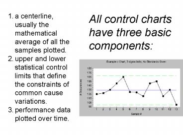
All control charts have three basic components
- a centerline, usually the mathematical average of
all the samples plotted. - upper and lower statistical control limits that
define the constraints of common cause
variations. - performance data plotted over time.
2
Common Cause
UCL
X
SCALE
LCL
3
Special Cause
UCL
X
SCALE
LCL
4
Variables Control Chart
Out ofcontrol
Abnormal variationdue to assignable sources
1020
UCL
1010
1000
Mean
Normal variationdue to chance
990
LCL
980
Abnormal variationdue to assignable sources
970
0
1
2
3
4
5
6
7
8
9
10
11
12
13
14
15
Sample number
5
If the plot looks non-random it also is not
in-control
- Any Point Above or below 3 Sigma
- 2 Out of the Last 3 Points Above or below 2 Sigma
- 4 Out of the Last 5 Points Above or below 1
Sigma - 8 Consecutive Points Above or below Control Line
- 6 in a row trending up or down
- 14 in a row alternating up and down
6
Control Charts based on Sampling Distributions
- X-bar chart - the sample means are plotted in
order to control the average value - R chart - the sample ranges are plotted in order
to control the variability
7
Importance of Subgroups and Averages
- Individual readings taken from a process may not
always be normally distributed - If data is collected from a process in subgroups
and the average of these is used instead of
individual readings, the resulting distribution
will always approach a normal distribution This
is - The Central Limit Theorem
8
(No Transcript)
9
Observations from Sample Distribution
Sample number
10
X-Bar and R Charts
The two types of charts go together when
monitoring variables, because they measure the
two critical parameters central tendency and
dispersion.
11
It is possible that an out-of-control signal will
appear on one kind of chart and not the other.
12
Mean and Range Charts
Detects shift
Does notdetect shift
R-chart
13
Mean and Range Charts
UCL
LCL
Does notdetect shift
14
X-Bar and R Control Charts
The X-Bar Chart and the R Chart are not only used
together, they are calculated from the same raw
data.
Consider that we have a precision made piece
coming off of an assembly line. We wish to see if
the process resulting in the object diameter is
in control.
15
X-Bar and R Control Charts Procedure
Take a sample of FIVE objects and measure each.
Calculate the average of the five. This is one
data point for the X-Bar Chart. Calculate the
range (largest minus smallest) of the five. This
is one data point for the R Chart.
16
X-Bar and R Control Charts Procedure
Repeat these two steps twenty (20) times. You
will have 20 "X-Bar" points and 20 "R" points.
17
X-Bar and R Control Charts Procedure
Calculate the average of the 20 X bar points-
yes, the average of the averages. This value is
X Double Bar, and is the centerline of the
X-Bar Chart.
18
X-Bar and R Control Charts Procedure
Calculate the average of the twenty R points.
This is called R Bar This is the centerline of
the R chart, and also is used in calculating the
control limits for both the X-Bar chart and the R
chart.
19
The Only Tricky Part
- Calculating the upper and lower control limits
for the X-Bar and R control charts, and the
process standard deviation. - Use the following equations for our example
- diameter of precision made piece coming off of an
assembly line - (sample size of
FIVE)
20
X-Bar Control Limits
Upper Control Limit for X-Bar chart X double
bar .577 R bar Lower Control Limit for
X-Bar chart X double bar - .577 R bar
21
R Control Limits
Upper Control Limit for R Chart 2.11
Rbar Lower Control Limit for R Chart 0
Rbar
22
X-Bar and R Control Charts Procedure
Plot the original X Bar and R points, twenty of
each, on the respective X and R control
charts. Identify points which fall outside of
the control limits. These points are due to
unanticipated or unacceptable causes.
23
X-Bar and R Control Charts Procedure
The sample size is traditionally 5, as in our
example. Control charts can and do use sample
sizes other than 5, but the control limit
factors, derived by statisticians, change (for
our example .577 for the X-Bar chart)
24
X-Bar Control Charts
Find the UCL and LCL using the following
equations UCL X double bar (A2)Rbar CL X
double bar LCL X double bar - (A2)Rbar
25
R Control Charts
Find the UCL and LCL with the following formulas
UCL (D4)Rbar CL Rbar LCL(D3)Rbar with
D3 and D4 can be found in the following table
26
Samples of 5
27
X-Bar Control Limits
28
R Control Limits
29
(No Transcript)
30
X Bar-r-chart
- The process standard deviation for each graph is
calculated by a formula based on the average of
the range values, (Rbar), and another table.


