
Effective Use of PowerPoint for Visual Data Representation - PowerPoint PPT Presentation
Title:
Effective Use of PowerPoint for Visual Data Representation
Description:
Using PowerPoint to create and edit visual data representations like pie and bar charts can greatly improve your presentations. To add text to a pie chart, click on the chart and select the “Chart Elements” button (the plus icon), then choose “Data Labels” to show values or percentages. For a bar chart, go to the “Insert” tab, select “Chart,” and pick the “Bar” option. Bar charts visually compare different categories, making complex information easier to understand. To modify an existing bar chart, click on it to access “Chart Tools” for adjusting data, styles, and layout. You can also add data bars by going to the “Insert” tab, selecting “Shapes,” and choosing rectangles to represent your data, adjusting their lengths accordingly. These tools in PowerPoint enable you to create engaging and informative presentations that effectively convey your message. – PowerPoint PPT presentation
Number of Views:2
Date added: 19 February 2025
Slides: 3
Provided by:
visualsculptors
Category:
How To, Education & Training
Tags:
Title: Effective Use of PowerPoint for Visual Data Representation
1
Data Visualization Charts, Graphs and
Infographic designs - MS Graph Key Questions
Explained
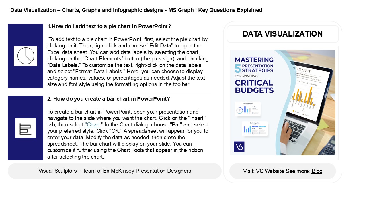
- 1.How do I add text to a pie chart in PowerPoint?
- To add text to a pie chart in PowerPoint, first,
select the pie chart by clicking on it. Then,
right-click and choose "Edit Data" to open the
Excel data sheet. You can add data labels by
selecting the chart, clicking on the Chart
Elements button (the plus sign), and checking
Data Labels. To customize the text, right-click
on the data labels and select "Format Data
Labels." Here, you can choose to display category
names, values, or percentages as needed. Adjust
the text size and font style using the formatting
options in the toolbar.
DATA VISUALIZATION
2. How do you create a bar chart in PowerPoint?
To create a bar chart in PowerPoint, open your
presentation and navigate to the slide where you
want the chart. Click on the "Insert" tab, then
select "Chart." In the Chart dialog, choose "Bar"
and select your preferred style. Click "OK." A
spreadsheet will appear for you to enter your
data. Modify the data as needed, then close the
spreadsheet. The bar chart will display on your
slide. You can customize it further using the
Chart Tools that appear in the ribbon after
selecting the chart.
2
Data Visualization Charts, Graphs and
Infographic designs - MS Graph Key Questions
Explained
3. What is bar graph ppt? A bar graph PPT
(PowerPoint presentation) is a visual tool used
to display and compare data using rectangular
bars. Each bar's length or height represents a
value, making it easy to compare different
categories. In a PPT format, these graphs can be
integrated into slideshows for presentations,
enhancing audience understanding through visuals.
Typically, bar graphs can be vertical or
horizontal and may include labels, legends, and
colors to improve clarity. They are commonly used
in business, education, and research to present
information succinctly and effectively.
4. How do I edit a bar chart in PowerPoint? To
edit a bar chart in PowerPoint, first click on
the chart to select it. Then, use the Chart
Tools that appear in the ribbon, specifically
the Design and Format tabs. Click on Edit
Data to modify the data in an Excel spreadsheet.
You can also change the chart style, colors, and
layout from the Design tab. To adjust individual
elements, right-click on the chart components,
such as bars or axes, to access formatting
options. Once finished, click outside the chart
to return to your slide.
5. How do I add data bars in PowerPoint? To add
data bars in PowerPoint, first insert a chart by
going to the "Insert" tab, selecting "Chart," and
choosing a bar chart type. Once the chart
appears, enter your data in the Excel sheet that
opens. To format the data bars, click on the
chart, then select the "Chart Design" tab, and
choose "Add Chart Element." From there, select
"Data Labels" to display values. For further
customization, right-click the chart elements,
and choose "Format Data Series" to adjust colors
and styles as needed. Finally, close the Excel
sheet to see your updated chart.
Recommended
CrystalGraphics Presentations


