
Tools and Techniques for Effective Presentation - PowerPoint PPT Presentation
Title:
Tools and Techniques for Effective Presentation
Description:
A Mekko chart, also referred to as a Marimekko chart, serves as an effective visual representation for categorical data in a two-dimensional space. This tool enables users to readily observe the size and relative proportions of various segments. Given that PowerPoint lacks built-in support for Mekko charts, individuals must rely on specialized software or plugins to generate these visualizations. Mekko charts are adept at conveying intricate data and elucidating the relationships among multiple variables, thus proving invaluable for illustrating market share distributions.In contrast to Treemaps, which employ nested rectangles to depict hierarchical structures, Mekko charts utilize variable widths and heights to facilitate more straightforward comparisons across categories. – PowerPoint PPT presentation
Number of Views:1
Date added: 15 March 2025
Slides: 3
Provided by:
visualsculptors
Category:
How To, Education & Training
Tags:
Title: Tools and Techniques for Effective Presentation
1
Data Visualization Charts, Graphs and
Infographic designs Think Cell Common Queries
Answered
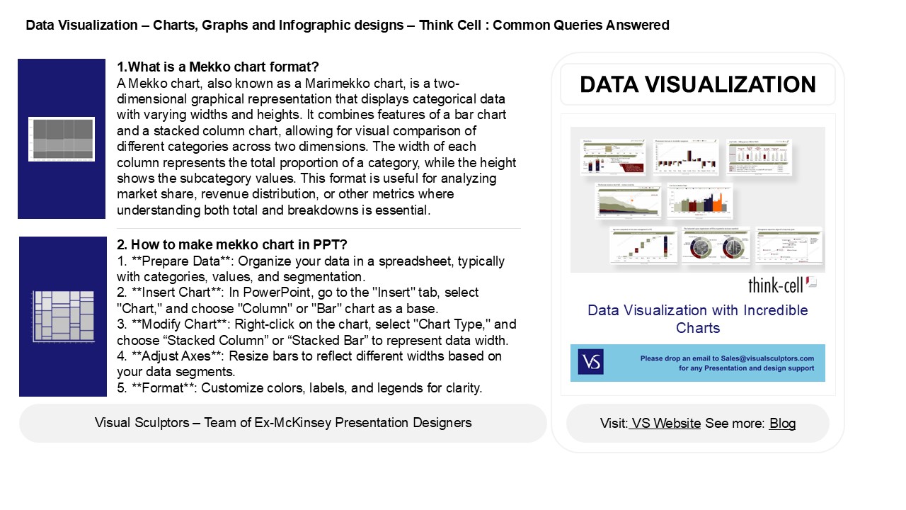
1.What is a Mekko chart format? A Mekko chart,
also known as a Marimekko chart, is a
two-dimensional graphical representation that
displays categorical data with varying widths and
heights. It combines features of a bar chart and
a stacked column chart, allowing for visual
comparison of different categories across two
dimensions. The width of each column represents
the total proportion of a category, while the
height shows the subcategory values. This format
is useful for analyzing market share, revenue
distribution, or other metrics where
understanding both total and breakdowns is
essential.
DATA VISUALIZATION
2. How to make mekko chart in PPT? 1. Prepare
Data Organize your data in a spreadsheet,
typically with categories, values, and
segmentation. 2. Insert Chart In PowerPoint,
go to the "Insert" tab, select "Chart," and
choose "Column" or "Bar" chart as a base. 3.
Modify Chart Right-click on the chart,
select "Chart Type," and choose Stacked Column
or Stacked Bar to represent data width. 4.
Adjust Axes Resize bars to reflect different
widths based on your data segments. 5.
Format Customize colors, labels, and legends
for clarity.
2
Data Visualization Charts, Graphs and
Infographic designs Think Cell Common Queries
Answered
3. What are the benefits of a Mekko chart? A
Mekko chart, or Marimekko chart, offers several
benefits, including the ability to visualize
complex data in a clear, organized manner. It
displays both categorical data and relative
sizes, allowing for easy comparison of market
segments or product performance. The chart
combines bar and area chart features,
facilitating insights into market share, revenue
distribution, and strategic decision-making. Its
unique layout helps identify opportunities and
gaps in the market, making it a valuable tool for
presentations and strategic planning. Overall,
Mekko charts enhance data comprehension and
communication effectively.
4. What is the difference between Tree map and
Mekko chart? A Tree map displays hierarchical
data as nested rectangles, with size and color
representing different metrics, effectively
visualizing proportions within categories. In
contrast, a Mekko chart (or Marimekko chart)
combines a bar chart with a stacked area, showing
both categorical data and relative size
variations across two dimensions. Mekko charts
allow for the analysis of market share or revenue
distribution, while Tree maps emphasize
hierarchical relationships and part-to-whole
comparisons. Essentially, Tree maps focus on
structure, while Mekko charts emphasize
quantitative comparisons in a two-dimensional
space.
5. How do you add a second Y axis in Mekko
Graphics? To add a second Y axis in Mekko
Graphics, first, create your chart and select the
data series you want to represent on the
secondary Y axis. Then, right-click on the
selected series and choose "Format Data Series."
In the options, find the setting for "Plot Series
on Secondary Axis" and enable it. Adjust the
secondary Y axis settings, such as scale and
labels, to suit your data. Finally, ensure the
chart is visually clear and informative by
labeling both Y axes appropriately.