
Agenda - PowerPoint PPT Presentation
1 / 32
Title:
Agenda
Description:
Add more colors to produce black. CMYK. Add more colors to produce white. RGB. RGB Color Model ... Black and white create the highest contrast possible. ... – PowerPoint PPT presentation
Number of Views:76
Avg rating:3.0/5.0
Title: Agenda
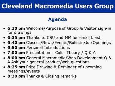
1
Agenda
- 630 pm Welcome/Purpose of Group Visitor
sign-in for drawings - 635 pm Thanks to CSU and MM for email blast
- 640 pm Classes/News/Events/Bulletin/Job Openings
- 650 pm Personal Introductions
- 700 pm Presentation Color Theory / Q A
- 800 pm General Macromedia/Web Development Q A
Ask your general product/web questions - 825 pm Prize Drawing Reminder of upcoming
meetings/events - 830 pm Thanks Closing remarks
2
Applying Color Theory to Web Design
- Created by
- Brian Meloche, Cleveland MMUG Manager
- March 23, 2005
3
Why are we doing this topic?
- This topic was inspired by a bad design by a
fellow user group manager (no, not Mick!!!). ? - I learned Color Theory in college, and because of
my understanding of color, I have never had a
problem using color in my web designs, even
though I would be considered a developer these
days. - Most developers I know are design challenged.
Although it cannot correct all design challenges,
most developers can start designing better web
pages just by a better understanding of color. - With a basic understanding of these concepts, and
a few tools, a design challenged developer can
become a better designer. - PLEASE KEEP YOUR QUESTIONS UNTIL THE END!!!
4
What IS Color Theory?
- Wikipedia.org says
- a set of basic rules for mixing color to
achieve a desired result. - Is it THAT simple? YES, understanding the rules
will help you select the right colors, but the
use of color is still subjective.
5
Color Models RGB (Additive)
- Computer/TVs Use the RGB (Red, Green and Blue)
color model, a.k.a. the Additive Color Model
RGB Uses light to display color Color results
from transmitted light
Add more colors to produce white
6
Color Models CMYK (Subtractive)
- Print uses the CMYK (Cyan, Magenta, Yellow and
Black K) color model, a.k.a. the Subtractive
Color Model
CMYK Uses ink to display color Color results
from reflected light
Add more colors to produce black
7
Color Models RGB vs. CMYK
- Because monitors use RGB and printers use CMYK,
this explains why colors that look good on the
screen dont always look the same on paper.
CMYK
RGB
Add more colors to produce black
Add more colors to produce white
8
RGB Color Model
Primary Colors
Secondary Colors
Tertiary Colors
The Color Wheel
9
Color Schemes 1 Analog
- Analog colors are those which lie on either side
of any given color. - Often, these are color schemes found in nature.
- The most widely used analogous color scheme is
the red, orange and yellow. - A site that makes use of analogous colors usually
feels harmonious. - The secondary color can often be an analogous
color.
10
Color Schemes 2 Complementary
- The complementary colors are the colors which are
directly opposite from one another on the color
wheel. - Complementary colors are contrasting and stand
out against each other. - It is a good idea to use a complementary color as
the highlight color.
11
Color Schemes 3 Split Complementary
- Split complementary is a color and the analogous
colors to its complement color. - Using split complementary colors can give you a
design with a high degree of contrast, yet still
not as extreme as a real complementary color. - It also results in greater harmony than the use
of the direct complementary.
12
Color Schemes 4 Triad
- Triad colors are three hues equidistant on the
color wheel. - When you want a design that is colorful and yet
balanced, a triad color scheme might be the way
to go.
13
Understanding Color Hue
- Hue is somewhat synonymous to what we usually
refer to as "colors". - Red, green, blue, yellow, and orange are a few
examples of different hues. - The different hues have different wavelengths in
the spectrum. - Hues are colors at full strength - 100 values
(FF in HTML)
14
Understanding Color Value
- The value is a measurement of the brightness of a
color. - The brighter a color is, the higher is its value
and the more light it emits. - For instance, a vivid yellow is brighter than
dark blue, therefore its value is higher than
that of the blue. - A good way to see the difference in the values of
colors is to look at the corresponding greyscale
version.
Higher value
Lower value
15
Understanding Color Saturation
- Saturation can also be called a color's
intensity. - It is a measurement of how different from pure
grey the color is (web colors 808080) - Saturation is not really a matter of light and
dark, but rather how pale or strong the color is. - The saturation of a color is not constant. It
varies depending on the surroundings and what
light the color is seen in.
High saturation
Medium saturation
Low saturation
16
Understanding Color Tint and Shade
- Tints and Shades describe how a color varies from
its original hue. - If white is added, the lighter version is called
a tint of the color. - If black is added, the darker version is called a
shade of the colour.
Original color High saturation
Tints Adding White
Shades Adding Black
17
Color Schemes 5 Monochrome Chromatic
- A monotone color scheme is just one single hue
and its variations in terms of tints, shades and
saturation. - Using saturation and tint/shade variations of a
color is always good. - Using a monochromatic scheme with a pure white or
black background can be efficient. - In most cases, a fully monochromatic scheme
(without a white or black) doesnt work, as there
is a risk of monotony.
18
Color Schemes 6 Monochrome Achromatic
- A monotone achromatic color scheme is a special
instance of the monotone scheme which consists of
only neutral colors ranging from black to white. - A scheme like this can be efficient, but it can
very easily look boring. Using an achromatic
scheme with just one bright color for highlight
can be very effective.
19
Contrast!!!
- Now that we know how different colors can be
combined, we just need to introduce one more
important aspect of color theory, and that is
contrast. - Simply put, contrast is the difference between
two colors. - On a web page, the amount of contrast required
varies with different parts of the page. - You usually want a high contrast between text and
its background color. - Too high contrast can give an unsettled and messy
impression. Black and white create the highest
contrast possible. - Colors can contrast in hue, value and saturation,
but there are many different types of contrasts
that have been defined by color theorists
throughout the years. - Some of them are perhaps not directly applicable
to web design, but let's look at a few of the
most important.
20
Contrast of Hue
High contrast
- Contrast of hue is what relates most directly to
the color wheel combinations described earlier. - The further away from each other two colors are,
the higher the contrast. This means that the
complementary color combination has the highest
contrast, while the analogous combination has the
lowest. - For text, a contrast of hue alone is usually not
enough to make the text as legible as wanted. In
that case, you might want to combine contrast of
hue with some other form of contrast. - A special case of contrast of hue is contrast of
warm and cold colours. The way the human eye
works, cold colors appear to be more distant,
while warmer colors appear to be closer. This
means that it is a good idea to use a warm color
for a symbol or menu, and to use the cold colors
for backgrounds.
Low contrast
Warm/cold contrast
21
Contrast of Value
- Contrast of value is very efficient in creating
large contrasts. - The biggest contrast of them all - black and
white - is a contrast of value. - In general, large differences in lightness are
considered to be pleasant for the eye, but low
contrasts of value can also be useful for more
subtle differences - e.g. a background.
High contrast
Low contrast
22
Contrast of Saturation
- Contrast of saturation is often best for design
aspects that do not require a lot of emphasis. - A set of colors with different saturations set
against a grey background can be interpreted as
transperency.
High contrast
Low contrast
23
Simultaneous Contrast
- This is a contrast effect that is created by our
eyes' tendency to require a complementary color. - You can get this effect by combining two bright
colors that are not complementary, or by using a
single bright color against a grey background. - This gives a feeling of instability and tension
and should be used with caution.
High contrast
24
Combination of Contrasts
Not good
- While the contrast techniques mentioned can be
efficiently used one at the time, it is most
common to use a combination of them, especially
for text where you need a high contrast. - The top picture to the right shows blue and its
split complementary color, orange. This is a
combination that has a high contrast of hue. This
gives a rather vibrant combination that can be
tiring to the eyes. By changing the value and
saturation as in the next picture you will get a
combination which is much more pleasing to the
eye, and more readable. - Working against the natural values of the colors
can often have bad effects. For instance, yellow
is naturally a lighter color than its complement,
blue. A combination in which yellow is darker
than blue would feel strange.
Better
Good for background
High contrast
Bad for text
Against values
With values
25
Colors and Text
- As mentioned earlier, using the right contrast is
especially important for text. - Using the wrong colors can decrease the
readability drastically, and it will quickly tire
the reader's eyes. - Black text on a white background has the highest
readability. Black and yellow is another
combination which usually has a high readability,
as do blue and white. - Green text on red and red text on green are
particularly hard for many people to read. A
combination of red and blue creates a vibrating
effect that can also make reading very difficult.
Green on red can be very hard to read
As can red on blue
Black on white is easy to read
And so is yellow on blue
26
Color Blindness
- Another thing that can be good to keep in mind
when making color selections is color blindness. - Some 8 of the population has some form of color
blindness, and by choosing the wrong colors, you
can make your page virtually unreadable for them. - There are some colors which are worse than
others-- for instance, red and green. Blues and
yellows are usually better to use for this
reason, and you should make sure that there is a
strong contrast between a text and its
background. Also, make your design so that color
is NOT the only visual cue.
27
Color Theory the Web Web-Safe Colors
- Everyone in this room has probably heard of the
web-safe colors!!! - Web-safe colors are a throwback from the early
years of the web, back when a normal screen could
only display 256 colors. Back then, there were
inconsistencies in how browsers displayed the
colors. The system used 40 colors for menus. The
remaining 216 colors could be used to display the
actual web pages. - Aside Primary colors, red, green, and blue, are
represented in a scale from 0 to 255, represented
in hexadecimal as 00 to FF. Examples Red
FF0000, Yellow FFFF00 (combination of Red and
Green) Black 000000 - Aesthetics were not considered when these colors
were decided upon. They are based solely on
mathematical formulas. To be more exact, the
web-safe colors are what you get when you use 0
(00), 20 (33), 40 (66), 60 (99), 80 (CC) and
100 (FF) of the three different primary colors,
and then mix these in every possible combination.
- Web-safe colors are still being used today, but
almost everyone has a minimum of 16-bit color
(65536 colors). All new models have 32-bit color
(millions of colors). - As a result, you can still use web-safe colors if
that is a business requirement, but all colors
are virtually fair game to use in your web
page/Flash design at this stage.
Web-Safe colors, as shown in the Dreamweaver MX
2004 properties bar
28
Applying Color Theory (and other design concepts)
to the Web
- Effective use of contrast is a key to good web
design - Not EVERYTHING should be in high contrast!
- Not everything should be in full hue!!!
- Your eyes float naturally to elements that are in
contrast, and will move to elements in lower
contrast later. A blending of low and high
contrast elements are most effective. - See the last slide on effective use of text!!!
29
Applying Color Theory (and other design concepts)
to the Web (continued)
- The natural position of elements is also a key to
good design (another topic) - CSS (colors and fonts, anyway) Use CSS!
- Stylesheets make design changes MUCH simpler, and
make it easier to swap styles. This is an
important feature if you have an application you
are selling, using an Application Service
Provider model, or just want to use an existing
site design to create a new one. - CSS (positioning, more elaborate styles)
Powerful, but there is a bit of a learning curve
when doing complex CSS. Not really color theory,
but worth mentioning - EXAMPLE
30
Wait!!! I need more help!!!
- Colormixers http//colormixers.com/mixers/cmr/
- Color Scheme Generator 2 http//wellstyled.com/to
ols/colorscheme2/index-en.html - Color Wheel Pro http//www.color-wheel-pro.com/
31
Acknowledgements
- Colours on the web Color theory and color
matching http//www.webwhirlers.com/colors/introd
uction.asp
32
Q A
Recommended
CrystalGraphics Presentations


![get⚡[PDF]❤ Pocket Planner 2024-2025: Small 2-Year Monthly Agenda for Purse | 24 Months PowerPoint PPT Presentation](https://s3.amazonaws.com/images.powershow.com/10081698.th0.jpg?_=20240719098)


![[PDF] DOWNLOAD Agenda 2021: Poker, crâne | Janvier à Décembre 2021 | A PowerPoint PPT Presentation](https://s3.amazonaws.com/images.powershow.com/10095955.th0.jpg?_=20240811046)


