Typography PowerPoint PPT Presentations
All Time
Recommended
Serif Typefaces. Have strokes at the tips of the letters. Easier to read for printed body text. Examples: Courier. Times New Roman. k. Teachers: You may want to ...
| PowerPoint PPT presentation | free to view
Title: Type Author: Kelly L. Coxe Last modified by: rlincoln1 Created Date: 1/1/2003 11:54:50 PM Document presentation format: On-screen Show (4:3) Company
| PowerPoint PPT presentation | free to view
Typography refers to the style and arrangement or appearance of text. Typefaces, Fonts, and Font Families A typeface is the basic design of a character.
| PowerPoint PPT presentation | free to download
by Patrick J. Lynch, Sarah Horton. Multimedia: Making it Work by Tay Vaughan ... Many different words express the same ideas. Aim for precise and clear usage ...
| PowerPoint PPT presentation | free to download
Typography. An introduction on how to use typefaces. adapted from the book The Non-Designer's Type Book ... Example: Sephora. Script. Characteristics of Script ...
| PowerPoint PPT presentation | free to view
Graphic designers have plumbed the heritage of typographic history, using ... American Typewriter. Geneva. Courier. Chicago. Times. Children's Books. Graffiti ...
| PowerPoint PPT presentation | free to view
Typography Tips. Override default font settings ... Typography Tips. Antialiasing Type. Technique used to smooth ... Graphics Tips and Techniques. Thumbnails ...
| PowerPoint PPT presentation | free to view
Typographic arrangement should achieve for the reader what ... 12 points = 1 pica 6 picas = 1 inch. 1 point = 0.35 mm 1 mm = 2.83 points. Type Characteristics ...
| PowerPoint PPT presentation | free to view
Traditional typography, known as text is composed to create ... scribes), calligraphy (wedding invitations), drafting (architects' drawing), cartoons, and etc. ...
| PowerPoint PPT presentation | free to view
Serif fonts have a stronger baseline. Serif generally better for body text ... Choosing Fonts for Web Sites. A study of fonts designed for screen display, ...
| PowerPoint PPT presentation | free to view
Movable bronze/copper type in Korea (12th century) ... Com 240 Edwardian Script. Scripts look like handwriting. Use sparingly. Never ALL CAPS! ...
| PowerPoint PPT presentation | free to view
Pre-pre-digital technology was even more manual, as typesetters had to pour ... For me, the strength of photography lies in its ability to evoke a sense of humanity. ...
| PowerPoint PPT presentation | free to view
The art of letter style and design. H. b. z. K. g. D. S. Y. M. A. L. t. x. u. o. e. i. The different styles are called typefaces. ...
| PowerPoint PPT presentation | free to view
... often called body text when referring to book and magazine and newspaper layout. ... Of Atlanta and Decatur. September 19-24. Come and Enjoy! Which do you prefer? ...
| PowerPoint PPT presentation | free to view
Use a consistent style of questions (i.e. not a mixture of ticking boxes, circling answers etc. ... If you are using tick boxes etc., don't make the boxes too ...
| PowerPoint PPT presentation | free to view
Unless for artistic effect. Fall 2003. CS / PSYCH 4750 Foley. 9. Case ... Style. Plain text. Italic text. Bold text (Purists consider these as different fonts) ...
| PowerPoint PPT presentation | free to view
Now, how do you think you're going to feel when you read something set in Helvetica? ... end up looking like catalogs for both lingerie and heavy equipment--the kind ...
| PowerPoint PPT presentation | free to view
Here we are giving an comprehensive presentation on typography. the presentation wll be helpfull for both the beginner and professional graphic designer.
| PowerPoint PPT presentation | free to download
Never use bold, italics, capitals for large sections. NEVER USE BOLD, ITALICS, CAPITALS FOR ... This Is a Level 1 Heading - Bold with Caps. This is a level 2 ...
| PowerPoint PPT presentation | free to view
| PowerPoint PPT presentation | free to view
Communication, Communication! Pass along message. Think of target audience to appeal ... Relationship Between Fonts. Concordant Relationship. Conflicting Relationship ...
| PowerPoint PPT presentation | free to view
Contributors include Gregory Abowd, Jim Foley, Diane Gromala, Elizabeth Mynatt, ... Line Spacing & Alignment Arabic. Fall 2003. CS / PSYCH 4750 Foley. 27. Alignment ...
| PowerPoint PPT presentation | free to view
There is no room for poor typography to acquire a successful UI design. Learn exact use of typography to give users a great viewing experience with UI design. http://bit.ly/2IYl2gp
| PowerPoint PPT presentation | free to download
Typography Beginning. Some essentials for CSS ... Typographic definitions are different. Differences. Legibility ... Readability is a function of typography ...
| PowerPoint PPT presentation | free to view
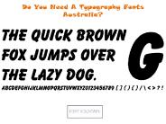
Well, when we are willing to have a unique and fresh looking font in our writing piece, it obviously arise a question that who is here to deliver us such desired fonts??? But nothing to worry, because there are many such font designing websites available today who offer all new ranges of typography fonts Australia. Going with them is the guarantee of having a never seen before typeface design for sure.
| PowerPoint PPT presentation | free to download
Primarily visual (but also auditory) forms. Moving pictures. Rather different properties ... Visual properties. Color, saturation, brightness, etc. Translucency ...
| PowerPoint PPT presentation | free to view
Look at logos on everyday household items, bus signs, cereal boxes. ... What's on the Cronkite School logo, which is right outside the entrance to this building? ...
| PowerPoint PPT presentation | free to view
The trend method of design focuses on using current design trends to create appealing products and branding. These trends change due to technology, culture, and consumer preferences, so designers need to adapt to stay relevant. In 2024, popular branding trends include sustainability, minimalism, and bold typography, as consumers increasingly value ethical choices and simplicity. To create an effective brand identity, designers should pay attention to elements like color, typography, and imagery that connect with their target audience.
| PowerPoint PPT presentation | free to download
Explore the realm of website typography in our PPT—uncover its significance, optimal techniques, and current trends for effective design. This information is written by our experts of the best web design company in Delhi –
| PowerPoint PPT presentation | free to download
Want to Know About art of Typography. So lets Know What is art of Typography and the Principles to be the Masterin art of Typography. Read Now be a master in this Art. information by Indylogix Solutions Pvt Ltd.
| PowerPoint PPT presentation | free to download
Join the Everything Begins to get updates of new original painting releases, special offers, & to be among the first to view and purchase! Or contact to eveythingbegins!
| PowerPoint PPT presentation | free to download
Typography is a powerful yet often underestimated element of web design. The right font selection can define your brand’s personality, enhance readability, and create a seamless user experience. As a creative graphic designing company, Codeblends understands the importance of typography in crafting visually appealing and functional websites. In this blog, we explore the significance of typography and how to choose the perfect fonts for your brand.
| PowerPoint PPT presentation | free to download
This is flush left; notice the ragged right edge. Flush left is the most common alignment. ... This is flush right; notice the ragged left edge. ...
| PowerPoint PPT presentation | free to download
Gothic type: modeled after German script. Goal: To replicate the look of a manuscript Bible ... Blurred the line between 'high art' and 'mass media' ...
| PowerPoint PPT presentation | free to download
Enable you to make more informed decisions regarding typeface appropriate & aesthetic ... Bauhaus & Typography. International Style Swiss Design ...
| PowerPoint PPT presentation | free to view
Graphic designers utilize images in a multitude of ways to effectively communicate messages and evoke emotions. They often employ graphic design software, such as Canva, which provides a user-friendly platform that allows both professionals and beginners to create visually appealing designs. While some may perceive graphic design as a challenging field due to its blend of creativity and technical skills, many find it rewarding and enjoyable. Additionally, graphic designers frequently edit photos to enhance their visual impact, incorporating them into various projects.
| PowerPoint PPT presentation | free to download
Use two or more fonts that are similar (same family) Creates a visual dissonance ... May involve 1 or more fonts. Requires careful planning. For example. ...
| PowerPoint PPT presentation | free to view
Modernist era: late 19th - early 20th century. Political potential of (experimental) typography ... (new-ish technology) Bold, basic colors. Typography and Print: ...
| PowerPoint PPT presentation | free to download
ne key aspect of this communication is typography, the art and technique of arranging type to make written language legible, readable, and appealing. Mastering the art of typography in consulting presentations involves selecting appropriate fonts, sizes, and styles to enhance the clarity and impact of the content being presented.
| PowerPoint PPT presentation | free to download
Choose a line from a song and recreate the line using text made ... ascender. serif. lower case. Font Categories. Serif. Sans Serif. Script. Display. Symbols ...
| PowerPoint PPT presentation | free to view
Online font sellers are all set and ready to offer the best range of interesting typography art font Australia. Their fonts, being pleasing to eyes, is considered most readable. They purportedly serve as aids to the eyes, moving us from one letter to the next in a smoother fashion. Their designer fonts prove to be quite familiar to everyone and are also easiest to read in small. They creative font styles are the best suitable styles for any logo, poster or writing pieces.
| PowerPoint PPT presentation | free to download
Typography and Color Theory Mrs. Lolkema Miss Wadycki Mrs. Verpooten What is typography? The art and technique of selecting and arranging type styles, point sizes ...
| PowerPoint PPT presentation | free to view
Typography is everywhere. When you see posters, brochures, logos, websites, or anything that has text, to a smaller or larger extent, it involves the use of typography. Graphic designers use typography to adjust the text within the design. This helps in creating content with a purpose. The planned use of typefaces allows the designers to make a design look aesthetic and pleasing. https://99effect.com
| PowerPoint PPT presentation | free to download
When creating images in Canva, aim for a resolution of at least 300 DPI (dots per inch) for high-quality prints. To achieve this, choose the right dimensions for your design, ensuring the pixel count matches the print size you want. While Canva is user-friendly and great for resizing images without losing quality, some users may prefer more advanced graphic design tools like Adobe Illustrator or Photoshop for professional features. To make your Canva designs more visually appealing, pay attention to color schemes, typography, and composition. Additionally, use high-quality images that align with your message. Overall, Canva is a good choice for creating designs, but consider your needs to determine if a more sophisticated tool is necessary.
| PowerPoint PPT presentation | free to download
... larger sizes, such as headlines, titles, and display purposes ... typefaces contain decorative ornaments, pictures, or symbols for some or all characters. ...
| PowerPoint PPT presentation | free to view
GROUPS OF TYPEFACES SHARE SIMILAR CHARACTERISTICS. TYPEFACES HAVE FAMILIES. ... the height of typography and is measured from the ascender to the descender. ...
| PowerPoint PPT presentation | free to view
Typography is a crucial part of design and communication, following basic rules for font selection, size, spacing, and alignment to make text readable and visually pleasing. It involves knowing about typefaces, fonts, and their characteristics like serif and sans-serif styles.
| PowerPoint PPT presentation | free to download
www.fontfont.com (free previews good for 72 dpi work) www.fontshop.com. www.fonts.com ... Your computer has certain fonts installed on it. ...
| PowerPoint PPT presentation | free to view
Typography is one of the most fundamental and intelligent aspects of design. So, here we are sharing 8 typography trends that you can incorporate in your next design to get the boost you were looking for.
| PowerPoint PPT presentation | free to download
Typography is an underrated yet one of the most critical features of design. Let’s learn how to improve your graphic designs with impeccable typography.
| PowerPoint PPT presentation | free to download
Material UI Typography is a comprehensive component library within the Material-UI framework, specifically tailored for managing text elements in React applications. It simplifies the styling and configuration of typography, providing predefined styles, responsive design, and customization options, ensuring consistent and aesthetically pleasing text across diverse user interfaces.
| PowerPoint PPT presentation | free to download
In the digital age, the look of your website may have a massive impact for your online visibility. One of the maximum vital factors of web layout is typography. The font you choose not only impacts readability, but also the overall user experience and brand perception.
| PowerPoint PPT presentation | free to download
Are you from a designers kingdom? Do you know that communication plays a vital role in design —it’s essential to establish a clear connection between the website and user and to help your users accomplish their goals.
| PowerPoint PPT presentation | free to download


