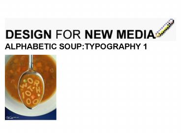
ALPHABETIC SOUP:TYPOGRAPHY 1 - PowerPoint PPT Presentation
1 / 29
Title:
ALPHABETIC SOUP:TYPOGRAPHY 1
Description:
Enable you to make more informed decisions regarding typeface appropriate & aesthetic ... Bauhaus & Typography. International Style Swiss Design ... – PowerPoint PPT presentation
Number of Views:94
Avg rating:3.0/5.0
Title: ALPHABETIC SOUP:TYPOGRAPHY 1
1
- ALPHABETIC SOUPTYPOGRAPHY 1
2
Objectives
- Enable you to identify typeface categories
- Introduce typeface terminology
- Enable you to make more informed decisions
regarding typeface appropriate aesthetic
3
Typography is to printing as dramatics and
elocution are to the spoken word. Best Book
Erik Spiekermann Stop Stealing Sheep
4
(No Transcript)
5
A
A
6
Lascaux, c.15,000BC
Papyrus of hunefer, c.1370 BC
Schoensperger, 1517
Leap Year Ball, 1888
Douce apocalypse, 1265
7
Bauhaus Typography
8
International Style Swiss Design
Hofmann, Ballet Poster, 1959
Muller Brockman, Public Awareness Posters, 1960
1953
9
1980s 90s
Neville Brody, Various Design, 1990s
Poster for "Snow White the Seven Pixels"
presentation. April Greiman, 1986
10
counter
arm
serif
bowl
ABER
apex
stem
tail
bar
counter
UPPER CASE
11
cross stroke
ascender
ear
crotch
bfpry
serif
descender
tail
stem
counter
lower case
12
Font Categories
Handgloves
- Serif
- Sans Serif
- Script
- Display
- Symbols
13
handgloves
handgloves
handgloves
handgloves
14
VARIETY
variety
UPPER CASE
Vs.
lower case
15
A
A
Vs.
Serif Sans Serif
16
A
- Short finishing strokes
- More traditional
- Easier reading
- Main body text
Serif
17
A
- Abrupt ends
- Even in thickness
- Modern
- Upward flowing
Sans Serif
18
A
A
Serif Sans Serif
19
A
A
250 pts
250 pts
Times New Roman Arial
20
Hp
Point size measured from baseline to baseline.
Axb
Cap height
X-height
baseline
21
(No Transcript)
22
reason
There should be a
for your choice of typeface
23
(No Transcript)
24
(No Transcript)
25
(No Transcript)
26
Typography as Identity
27
Typography as Emotion
28
lonely
29
Summary - think about...
- Letter shape - sans serif vs serif
- Word shape - caps vs lower
- Identity - typography gives extra meaning to
words - Suitability
- Size - relation to space
- Aesthetics aim for elegance above novelty


