
Pareto Chart PowerPoint PPT Presentations
All Time
Recommended

Where does the Check Sheet fit into the PDSA Cycle? Why use the Check Sheet. in the Classroom. Use the Check Sheet to distinguish between opinions and facts ...
| PowerPoint PPT presentation | free to view

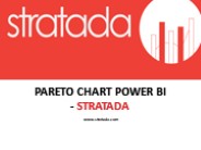
The Stratada Timeline shows dates, milestones and progress based on OnePlan data. Understanding metrics around objectives is critical to decision making. The Stratada Timeline is used to show the timing of the objectives. This report shows a high level view of metrics around resources and effort. http://stratada.com/
| PowerPoint PPT presentation | free to download

Excel Charts Basic Skills Creating Charts in Excel Creating a Run Chart Tracking Trends Creating a Column Chart Comparing Values Creating a Pie Chart Creating a ...
| PowerPoint PPT presentation | free to view

... also help you measure the impact of an improvement by comparing before and after. ... When comparing before and after, if the improvement measures are effective ...
| PowerPoint PPT presentation | free to view

Some systems classify materials into groups ... It is normal industrial practise to categorise stock items into three classifications ... Why categorise? ...
| PowerPoint PPT presentation | free to view

The misnamed Pareto principle (also ... (F. P. Brooks, The Mythical Man-Month) - 19 ... velser: - France Vacances - case 1 del 1. - 'The Mythical Man Month' ...
| PowerPoint PPT presentation | free to view

Attribute Control Charts Learning Objectives Defective vs Defect Binomial and Poisson Distribution p Chart np Chart c Chart u Chart Tests for Instability Shewhart ...
| PowerPoint PPT presentation | free to download

... symmetrical around the ... that are equally rare and use them as flags for instability. ... anything, from the science of management to the physical world ...
| PowerPoint PPT presentation | free to view

Recommended by Microsoft office team. Premium Excel Utilities.Endorsed by leading companies around the world.Create presentations from Excel. Copy at once hundreds of charts and tables in any format. A "Life saver" ... Merge, Recode, Replace, Reshape. More powerful than SPSS similar functions... Design and generate professional and interactive executive dashboards with genuine dashboard components Analyze instantateously a range of values in Pareto style. More powerful than PivotTable for one variable... The utilities have been evaluated and found compelling and useful for Microsoft Office users. http://www.excel-premiumutilities.com/
| PowerPoint PPT presentation | free to download

How are they similar to Pie Charts? Both pie charts & bar graphs can display the distribution of a categorical variable How are they different from Pie Charts?
| PowerPoint PPT presentation | free to view

7 QC Tools are simple statistical tools used for problem solving. Nilesh Arora presented basics of 7 QC Tool training and details about Pareto Diagram.
| PowerPoint PPT presentation | free to download

... Tables, the Ogive. Presentation Topics ... Ogive. Tables. 41, 24, 32, 26, 27, 27, 30, 24, 38, 21. 21, 24, 24, 26, 27, ... The Ogive (Cumulative % Polygon) ...
| PowerPoint PPT presentation | free to view

5-Displaying and tracking results ... Bar chart. Histogram. Line chart. Pie chart. Pareto diagram. Time-ordered data. Run chart ...
| PowerPoint PPT presentation | free to view

Bar Graph (order of bars determined by order of the ranking ... Ogive. Line Chart. Non-cumulative Frequency. F or % Class Midpoints. Polygon. Line Chart ...
| PowerPoint PPT presentation | free to view
Problem Solving Steps Statistical Tools Run Chart Pareto Chart Cause and Effect diagram- Fishbone Diagram Brainstorming Histograms or Stem-and-Leaf Plot Control Chart Process Capability,
| PowerPoint PPT presentation | free to download

Pareto Chart Pareto analysis is a ranked comparison of factors related to a quality problem Prioritized bar chart for determining which problem to work on first.
| PowerPoint PPT presentation | free to download

How Collabion Charts For Sharepoint Can Take You from Sharepoint Charting Nightmare To Nirvana
| PowerPoint PPT presentation | free to download

Gantt chart. Fish diagram. Job/Worksite Analysis Guide. IE 327. 5. PARETO ... GANTT CHART. Horizontal bar chart of activities. Shade in bar as completed ...
| PowerPoint PPT presentation | free to view
Tools of quality control A-Team Basic tools of quality control control chart histogram Pareto chart check sheet cause-and-effect diagram flowchart scatter diagram ...
| PowerPoint PPT presentation | free to download

Operator (Tom, Nina, Jose) Graphical tools. Bar charts. Pie charts. Pareto charts ... To develop a statistical model that can be used to predict the value of a ...
| PowerPoint PPT presentation | free to view

time management decision analysis problem solving tools problem solving conflict resolution 3-1 senior class height check sheet pareto chart histogram workload ...
| PowerPoint PPT presentation | free to view

ATI Technologies XILLEON 220 SOC for Digital Set-top Box Market ... Adelante Technologies offers complete SOC customizable platforms for DSP domains ...
| PowerPoint PPT presentation | free to download
... Check sheets Flow charts Graphs & Histograms Pareto diagram ... It is used by automotive ... They should only include the appropriate check information ...
| PowerPoint PPT presentation | free to view

ABC Software ABC Software Improvement Team: Germ n Ben tez John Boveri Siewhung Tee Akeya Vaughan Agenda Define Charter CTQ Tree Kano Gantt Chart Measure Pareto ...
| PowerPoint PPT presentation | free to view

Other Types of Graphs Pareto Chart Represents a frequency distribution for a categorical variable, frequencies are displayed by the heights of vertical bars, arranged ...
| PowerPoint PPT presentation | free to view

Qualitative data is often termed catagorical data. ... Histograms, Ogive, Pareto Diagrams, Pie Charts. Exploratory Data Analysis. Stem-and-Leaf Diagram ...
| PowerPoint PPT presentation | free to view

Conversion Time. Wait Time. Move Time. Down Time. Value-added. Total Lead Time. Start of production ... Pareto Chart of Quality Costs $400,000. 350,000. 300,000 ...
| PowerPoint PPT presentation | free to download

How to ... How to Construct a Pareto Diagram. 1. Identify the problem and ... How to Construct a Run Chart. 1. Decide on the process performance ...
| PowerPoint PPT presentation | free to view

2. Review data to determine baseline performance in the specific area identified (Run Chart/Pareto Diagram) ... targets below for each non-proficient sub group) ...
| PowerPoint PPT presentation | free to view

... from the 10 synthetic filmy and spotty was plotted on Pareto Charts which follow. ... at which all panelists would reject the glass as too spotty or filmy for use. ...
| PowerPoint PPT presentation | free to view

LC Technology Manufacturing Systems Quality Management Pareto Analysis Quality Management Pareto Analysis Quality Management Pareto Analysis Statistical ...
| PowerPoint PPT presentation | free to download

6sigma CTQ ... Break-down ... Flow Chart ...
| PowerPoint PPT presentation | free to download
... Objectives Quality and Productivity Improvement Process Quality Tools Check Sheet Run Chart Histogram of Lost Luggage Cause-and-Effect Chart for Flight ...
| PowerPoint PPT presentation | free to download

Pareto Diagram. Graphical Methods for Describing Quantitative Data. The Data ... Pareto diagram. Graphical methods for Quantitative Data. Dot plot. Stem-and ...
| PowerPoint PPT presentation | free to view

Pie Charts for $ 100 ... Pie Charts for $ 300. The tool that may be more ... The music plays for 15 seconds, while the team formulates their response. ...
| PowerPoint PPT presentation | free to view

X bar average level chart. P fraction defective. C chart - # of defects per sample ... Blue Bird examples (pg.85-103) ISO Standards. ISO 9000 and alternatives ...
| PowerPoint PPT presentation | free to download

Mark Twain. Statistical Process Control. Seven Basic Tools: Control Chart. Run Chart ... If you don't know where you are going any map will do, ...
| PowerPoint PPT presentation | free to view

Cost of Poor Quality. Voice of the customer. Customers needs ... Tools for Improving quality. XBAR and R Charts. Theoretical Control Limits for XBAR Charts ...
| PowerPoint PPT presentation | free to view

Using the 'Pareto Creator v. 2.0' Step-by-Step instructions to using the Pareto Creator to ... open the Excel file 'Pareto Creator v. 2.0 and knows some very ...
| PowerPoint PPT presentation | free to view

8-5 Control Charts for Individual Measurements The moving range (MR) is defined as the absolute difference between two successive observations: MRi = |xi - xi-1 ...
| PowerPoint PPT presentation | free to view

... tools ('macros') that facilitate the process of building chart-centric reports. ... Y_ZERO - Include/Exclude zero to calculate Y1-axis auto-scale ...
| PowerPoint PPT presentation | free to download

Bivariate/Multivariate Analysis (Data) Run Diagram (Data) Control Chart (Data) Capability Analysis (Data) Major Tools for Analysis. Plan ...
| PowerPoint PPT presentation | free to view

Describe the data using visual methods (charts, etc. ... Color ... Pie charts are useful to show the relative proportions of each category, compared to the whole ...
| PowerPoint PPT presentation | free to view

Story Boards. Control Plan/Charts. Processes and LSS. Y = f(x) ... into cup. Add. cream & sugar. Water Supply. Process. Shopping. Process. Electricity. Supply ...
| PowerPoint PPT presentation | free to view

... key culprits of the ... (Focusing on Key Culprits) Fishbone Diagram. Relations Diagram ... (look back to the Pareto Diagram to select the next 'culprit' ...
| PowerPoint PPT presentation | free to view

The molding process run chart shows that molding machine cycle time is erratic over time. ... could be attributed to machine adjustments or changes in inputs, ...
| PowerPoint PPT presentation | free to view

Weight. Height. 9. Tables. Simplify some types of analysis ... Weight. Height. 10. Bar Charts. Good for comparisons. Good for trends in small datasets ...
| PowerPoint PPT presentation | free to view

Lesson 2 - 1 Organizing Qualitative Data Objectives Organize qualitative data in tables Construct bar graphs Construct pie charts Vocabulary Frequency Distribution ...
| PowerPoint PPT presentation | free to download

Outline Quality Control Definition of Quality Commonly Used Terms TQM Seven QC tools Variance reduction Control Charts Definition of Quality Fitness for use - J.M ...
| PowerPoint PPT presentation | free to download

Masking noise: fountains, A/C, music, fans. Reducing noise: Plan ahead ... Psychometric Charts. Comfort is divided into 7 major factors ...
| PowerPoint PPT presentation | free to view
Activity 7 - 3 The Class Survey Objectives Organize data with frequency tables, dotplots, ... Typical graphs of categorical data: Pie Charts; ...
| PowerPoint PPT presentation | free to download

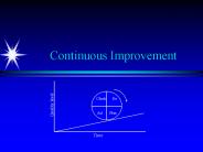
Continuous Improvement, Quality Tools and Improving Student Services. Dr. ... A trend chart shows a running tally of some measureable characteristic over time. ...
| PowerPoint PPT presentation | free to view

... NOR x F = x' 1 inverter 0 ... Minimize size Minimum cover Minimum cover that is prime Heuristics Multilevel minimization Trade performance for size Pareto ...
| PowerPoint PPT presentation | free to download

for Lean Six Sigma, SPC & Process Improvement. by Jay Arthur MMVI ... Box and Whisker Chart MMVI KnowWare International Inc. www.qimacros.com 888-468-1537 ...
| PowerPoint PPT presentation | free to download

ISM Best Practices. Aurora, CO. Dave Jackson. September 2006. Dashboards and Control Charts ... Better than rolling all data into one index ...
| PowerPoint PPT presentation | free to view