Components and Page Editor - PowerPoint PPT Presentation
1 / 16
Title:
Components and Page Editor
Description:
To add a component via Page Editor, go to the View tab and check the Designingcheckbox to enter Designing mode. Next, simply click the . Component – PowerPoint PPT presentation
Number of Views:122
Avg rating:3.0/5.0
Title: Components and Page Editor
1
Components and Page Editor
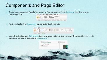
- To add a component via Page Editor, go to the
View tab and check the Designing checkbox to
enter Designing mode. - Next, simply click the Component button under the
Home tab. - You will notice that grey Add to here icons now
show up throughout the page. These are the
locations in which you are able to add various
components.
2
Components and Page Editor (continued)
- Upon clicking one of the Add to here icons, a
list of insertable components will be shown in a
pop-up window titled Select a Rendering. Pick the
desired component and click Select. - For further instructions on adding components,
search this document for the proper component and
follow the directions listed there.
NOTE In Page Editor, use Designing mode when
adding components, setting associated content,
and moving components around on a page. Use
Editing mode when editing the content of an
existing component.
3
Data-Sources gt Existing and New
- After adding a component, you are able to choose
between Select Existing Content or Create New
Content. - If Select Existing Content was chosen, select the
appropriate content in the tree and hit ok. - When choosing Create New Content, name the new
content, select a location where the content will
be saved, and then click ok.
4
Creating Data-Sources gt Branches
- To create content / data-sources from a branch
using content editor you must follow these steps.
- In this example we will be using the
InterestingInfoBranch. - In Content Editor, navigate to the appropriate
folder within site-data. - Right click on that same folder, click on Insert
and select Insert from Template.
NOTE Be sure to save your work often by clicking
the floppy disk button in the top left corner of
the page editor toolbar.
5
Creating Data-Sources gt Branches (continued)
- Click the browse tab, locate and click on the
BranchInterestingInfo template within the
Branches node, give your item a name, and click
Insert. - You will now see your new content / data-source
neatly organized within your tree. - The parent item holds your categories called
InterestingInfoCategory, and your categories hold
your - text items called InterestingInfoItems.
- You must now edit the items that were created by
clicking on the children items and changing the
data in the fields. You can also edit the name
that appears in the tree by clicking on the item
and hitting F2 on your keyboard or right clicking
the item and clicking Rename.
InterestingInfoCategory
InterestingInfoItems
NOTE See the Interesting Info slide for more
information on adding this component.
6
Creating Data-Sources gt Branches (continued)
- If a second category needs to be created, select
the parent item, right click the item, click
Insert, click InterestingInfoCategory, give the
item a name, and click ok. - Your new item will show up in the tree and you
may now add children items to it. - The process of adding children to categories is
the same as the steps above. Select a category,
right click it, click on Insert, choose
InterestingInfoItems, - give it a name, and click ok.
NOTE Be sure to change the default data. This
can be done within Content Editor or Page
Editor.
7
Feature Box gt Picture, Title, and Text
- The Feature Box is a small component that uses a
Picture, Title, and Rich Text of your choice. - After adding this component to your page click
inside the edit box so the Feature Box edit
buttons become visible. - Clicking the blue box with the checkmark brings
up a new window where you will add content within
the editable fields.
NOTE You will not see an image edit frame until
an image is added to the component. This is the
intended practice for this component
8
Feature Box gt Picture, Title, and Text
- Be sure to edit all fields appropriately.
- To change or insert a Link, click on one of the
Link buttons and follow the instructions on the
insert link slides. - Be sure to edit the Text field by clicking one of
the Text buttons above the field and entering
your text or html. - To change or insert an Image, click the browse
button and follow the instructions on the insert
image slides - After all of your content is entered hit ok.
- Save your work by clicking the floppy disk icon
in the top right corner of page editor.
9
Social Media Buttons gt Follow Us
- Once the component is added to the page you will
need to click the whitespace next to the title to
bring up the edit buttons. - Click the blue box with the checkmark to open the
content editor window. - To add or edit a link, click on the Insert
External Link above the Social Media title and
fill the URL field with your Social Media Profile
link. - You can also edit the Title of the component by
changing the text in the Title field.
NOTE If a field is left blank the button will
not appear on the page.
10
Social Sider Bar gt Twitter Feed
- Once the component is added to the page you will
need to click the whitespace to bring up the edit
buttons. - Click the blue box with the checkmark to open the
content editor window. - Fill-in all the fields in order to allow the
component to pull in the Twitter posts.
NOTE If a field is left blank the component will
not appear on the page.
11
Announcement Bar gt Title and Text
- The Announcement Bar is a component that is used
to display special announcements. It can be added
to any page type. - When you add an Announcement Bar to a page and
create new content, it will appear like this in
Editing mode. - Notice that both fields contain the message No
text in field. You can click on either field and
begin to add text directly onto the page.
NOTE When both text fields are empty, the
Announcement Bar will be invisible outside of
Page Editor. If the page is published in this
state, site visitors will not see the bar at all.
This allows you to leave it on the page for
future use, and to add or remove content as
needed.
12
Galleries gt Add Videos and Images.
- There are five gallery styles to choose from. 1
through 4 are good choices for displaying both
Images and YouTube videos, while 5 is best for
Images. - Galleries can go in the center column of a
three-column page, or the right column of a
two-column page. - To add a gallery in Page Editor, click the
Component button and choose an appropriate Add to
here icon. - In the Select a Rendering dialog, choose which
gallery style you would like to use, then click
Select.
13
Galleries (continued)
- In the Select the Associated Content window, you
can select existing gallery content or create new
gallery content. - After selecting the content for the new gallery
and clicking OK, click the Save icon in Page
Editor. - If you created new content, the gallery will now
appear on the page with a couple of sample slides
that you can edit, add to, and further customize. - If you enter Editing mode and click a blank area
on a gallery, a toolbar will appear. Clicking the
green plus sign edit button will allow you to add
more slides to the gallery.
14
Rich Text
- The Rich Text component can be placed in the
right column of a three-column layout, and allows
you to add custom content. - As you can see in the example screenshot, this
component can contain multiple lines of text and
images. Beyond that you can style and format your
text in various ways. - In addition, if you want to use custom HTML for
display on a page, this component will allow you
to do so. - Once you have added a new Rich Text component to
a page through Page Editor, you will see an empty
bordered component with text inside of it that
reads No text in field.
15
Rich Text (continued)
- To edit the content of this component, go into
Editing mode. Now you can click on the text and
immediately begin editing it. - If you would like to have more options in terms
of styling the text, adding images, or
manipulating markup, click on the far left icon
in the toolbar that appears. - You can now edit the text in this window, using
the various buttons to add features and styles to
your text. - Note that the Design tab is selected by default
when you open this window. If you select the HTML
tab, you can add markup directly to the text
area, which can then be rendered on the page
(within this component). - When you are finished, click Accept and make sure
to save the page.
16
Rich Text with Title
- The Rich Text with Title component is a
specialized, left-column version of the standard
Rich Text component. It allows you to enter a
pre-styled Title and multiple lines of text with
whatever formatting you choose. - If you have added the component to a page without
using existing content, you will be presented
with two fields that read No text in field. - Just go into Editing mode and you can immediately
enter text in each of the these areas. Just make
sure to click Save when you are finished! - This component is perfect for displaying things
like office hours or contact information.


