Boost Your Business: Enhancing Outdoor Sign Visibility - PowerPoint PPT Presentation
Title:
Boost Your Business: Enhancing Outdoor Sign Visibility
Description:
Improve the effectiveness of your business outdoor signs with strategic placement, bold fonts, and appropriate lighting. This guide offers practical tips to ensure your outdoor signs for business attract maximum attention and drive customer traffic, helping your brand stand out. Visit: – PowerPoint PPT presentation
Number of Views:0
Title: Boost Your Business: Enhancing Outdoor Sign Visibility
1
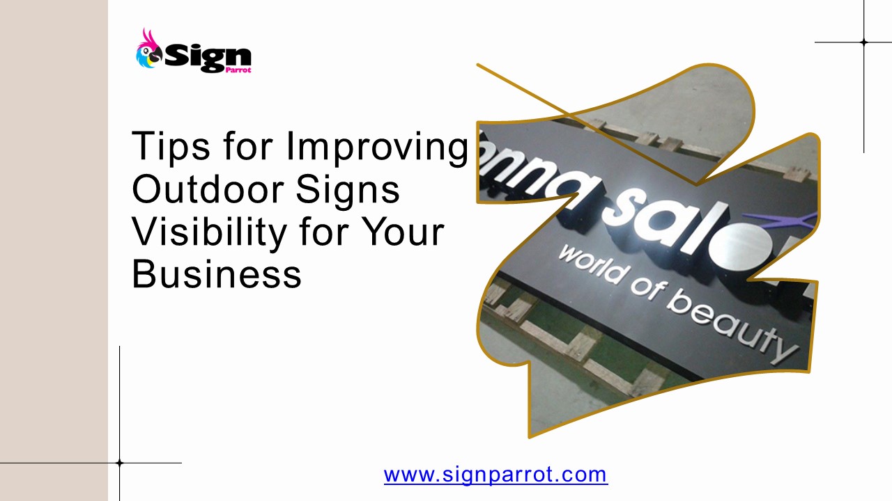
Tips for Improving Outdoor Signs Visibility for
Your Business
www.signparrot.com
2
Four Tips for Improving Outdoor Signs Visibility
for Your Business
In the fast-paced world of business, making sure
your sign stands out can be the difference
between attracting new customers and blending
into the background. A well-placed, eye-catching
sign can drive foot traffic, increase brand
recognition, and boost your bottom line. But how
do you ensure your sign is as visible and
effective as possible? Here are four actionable
tips to improve business outdoor signs
visibility and make a lasting impression on
potential customers.
3
CHOOSE THE RIGHT LOCATION
- The first step to improving business outdoor
signs visibility is selecting the optimal
location. Your sign should be placed where its
easily visible to your target audience. Consider
these factors - High Traffic Areas Place your sign in a location
with high foot or vehicle traffic to maximize
exposure. Think about the main roads, busy
intersections, or high-traffic pedestrian zones.
4
CHOOSE THE RIGHT LOCATION
- Eye Level Positioning Ensure your sign is at eye
level or slightly above. This ensures that it is
visible to drivers and pedestrians alike, making
it easier for them to read. - Avoid Obstructions Make sure your sign isnt
blocked by trees, poles, or other structures. An
unobstructed view will make your sign more
effective.
5
USE BOLD, READABLE FONTS
- The design of your sign plays a crucial role in
its visibility. To ensure that your message is
clear and legible, follow these design
principles - Choose Bold Fonts Opt for bold, sans-serif fonts
that are easy to read from a distance. Avoid
intricate or decorative fonts that may be
difficult to decipher quickly. - High Contrast Colors Use high contrast color
combinations, such as dark text on a light
background or vice versa. This contrast improves
readability and ensures that your sign stands
out. - Keep It Simple Limit the amount of text on your
sign. Focus on key information like your business
name, contact details, and a brief call to
action. A cluttered sign can be overwhelming and
hard to read.
6
INCORPORATE LIGHTING
- Lighting is essential for ensuring your business
signs remains visible during low-light conditions
or at night. Consider these lighting options - Illuminated Signs Use internally or externally
illuminated signs to make your message visible
around the clock. LED lights are energy-efficient
and offer bright, even illumination. - Spotlights Install spotlights or floodlights to
highlight your sign, especially if its placed on
a building or in a dimly lit area. - Reflective Materials Incorporate reflective
materials into your sign design. These materials
can enhance visibility during nighttime and in
low-light conditions, reflecting any available
light.
7
REGULAR MAINTENANCE
- Maintaining your sign ensures that it remains
effective over time. Regular upkeep helps to
avoid issues that can compromise visibility - Cleanliness Keep your sign clean and free from
dirt, dust, and grime. A dirty sign can be hard
to read and may give a negative impression of
your business. - Repairs Check for and promptly repair any
damage, such as faded text or broken lights. A
well-maintained sign looks professional and
reinforces your brands commitment to quality. - Update Information Ensure that your sign always
displays current information. Outdated or
incorrect details can confuse potential customers
and diminish the effectiveness of your business
signs.
8
FINAL THOUGHTS
A well-visible sign is a powerful marketing tool
that can significantly impact your businesss
success. By choosing the right location, using
bold and readable fonts, incorporating effective
lighting, and maintaining your sign regularly,
you can enhance its visibility and attract more
customers to your business. Remember, your sign
is often the first impression customers have of
your brand, so make sure its a good one! With
these tips in mind, youll be well on your way to
creating a business sign that not only stands out
but also drives your business forward.
9
Let's Work Together!!
813-939-7446 Shop_at_SignParrot.com www.signparrot.c
om 6400 E Columbus Dr, Tampa, FL 33619


