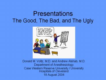
Presentations The Good, The Bad, and The Ugly - PowerPoint PPT Presentation
1 / 43
Title:
Presentations The Good, The Bad, and The Ugly
Description:
Title: Presentations The Good, The Bad, and The Ugly Author: DVOLTZX0 Last modified by: dvoltzx0 Created Date: 8/16/2004 5:45:49 PM Document presentation format – PowerPoint PPT presentation
Number of Views:399
Avg rating:3.0/5.0
Title: Presentations The Good, The Bad, and The Ugly
1
PresentationsThe Good, The Bad, and The Ugly
- Donald M. Voltz, M.D. and Andrew Alshab, M.D.
- Department of Anesthesiology
- Case Western Reserve University / University
Hospitals of Cleveland - 18 August 2004
2
(No Transcript)
3
(No Transcript)
4
(No Transcript)
5
(No Transcript)
6
(No Transcript)
7
(No Transcript)
8
(No Transcript)
9
(No Transcript)
10
(No Transcript)
11
(No Transcript)
12
The Bad
- Change of color scheme
- Gratutous clip art
- Distracting transitions
- Long sentences, lots of text on the slide
instead of bullets. Small fonts make readability
difficult in the back of the classroom. Overuse
of bold, italics, font sizes, colors.
13
The Bad cont.
- Cont. instead of just the same title
- Sound that doesnt add anything
- Too much clutter
- I particularly dislike full sentences that wrap
to the next line and could have been cut instead
of running on. - Too many bullets
- Running off the slide due to above
- Putting text below slide space
14
The Bad cont.
- Cont. instead of just the same title
- Sound that doesnt add anything
- Too much clutter
- I particularly dislike full sentences that wrap
to the next line and could have been cut instead
of running on. - Too many bullets
- Running off the slide due to above
- Putting text below slide space
15
The Bad ...
- Switching color for no reason just distracts.
Sometimes you need a paragaraph for a quote or
definition. Put it on a slide by itself instead
of crowding your slide with a number of lines.
This is hard to read.
What do you think of the color and the long
paragraph? How about the misspelling?
16
The Bad
- This is my students favorite clipart.
- Note that sound may or may not help the audience
attend to what you are saying. - Most included sounds are short but you can record
your own.
Note style change
17
The Ugly ...
- Too much of anything
- Sickening transitions
- Bad color schemes
- Distracting sounds
18
The Ugly
Too much of a good thing
- Since all three of our kids have started college,
the Bast family outflow has taken a BIG upsurge!
19
Examples of Whats Available
- Title slide
- Bullet
- Combination text and graphic
- Organization chart
- Chart (graph)
- Word Tables
20
Will Students Come If You Provide Handouts?
21
Colour - Bad
- Using a font colour that does not contrast with
the background colour is hard to read - Using colour for decoration is distracting and
annoying. - Using a different colour for each point is
unnecessary - Using a different colour for secondary points is
also unnecessary - Trying to be creative can also be bad
22
Background Bad
- Avoid backgrounds that are distracting or
difficult to read from - Always be consistent with the background that you
use
23
Graphs - Bad
24
Graphs - Bad
25
(No Transcript)
26
(No Transcript)
27
(No Transcript)
28
(No Transcript)
29
(No Transcript)
30
(No Transcript)
31
(No Transcript)
32
(No Transcript)
33
(No Transcript)
34
(No Transcript)
35
(No Transcript)
36
(No Transcript)
37
(No Transcript)
38
(No Transcript)
39
(No Transcript)
40
(No Transcript)
41
(No Transcript)
42
(No Transcript)
43
(No Transcript)


