
The Benefits of Using Area Charts for Analysis and Decision-Making
Title:
The Benefits of Using Area Charts for Analysis and Decision-Making
Description:
An area chart is a useful visual tool for showing quantitative data over time, helping to highlight trends and changes. To create an area chart in Excel, go to the "Insert" tab, select "Chart," and then choose "Area Chart." These charts are great for displaying cumulative totals and comparing different data series, as the filled areas represent data volumes clearly. After creating the chart, you can improve its appearance and clarity by adjusting colors, adding data labels, and changing axis titles. Area charts help communicate complex information in a visually appealing way, making them valuable for data analysis and decision-making. –
Number of Views:1
Date added: 20 March 2025
Slides: 3
Provided by:
visualsculptors
Category:
How To, Education & Training
Tags:
Title: The Benefits of Using Area Charts for Analysis and Decision-Making
1
Data Visualization Charts, Graphs and
Infographic designs Think Cell Common Queries
Answered
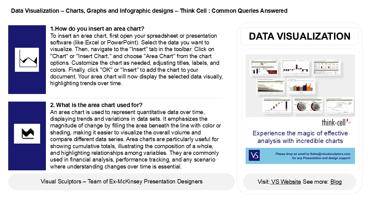
1.How do you insert an area chart? To insert
an area chart, first open your spreadsheet or
presentation software (like Excel or PowerPoint).
Select the data you want to visualize. Then,
navigate to the "Insert" tab in the toolbar.
Click on "Chart" or "Insert Chart," and choose
"Area Chart" from the chart options. Customize
the chart as needed, adjusting titles, labels,
and colors. Finally, click "OK" or "Insert" to
add the chart to your document. Your area chart
will now display the selected data visually,
highlighting trends over time.
DATA VISUALIZATION
2. What is the area chart used for? An area
chart is used to represent quantitative data over
time, displaying trends and variations in data
sets. It emphasizes the magnitude of change by
filling the area beneath the line with color or
shading, making it easier to visualize the
overall volume and compare different data series.
Area charts are particularly useful for showing
cumulative totals, illustrating the composition
of a whole, and highlighting relationships among
variables. They are commonly used in financial
analysis, performance tracking, and any scenario
where understanding changes over time is
essential.
2
Data Visualization Charts, Graphs and
Infographic designs Think Cell Common Queries
Answered
3. Where is area chart in Excel? In Excel, you
can find the area chart option by following these
steps click on the "Insert" tab in the Ribbon at
the top of the window. In the "Charts" group,
look for the "Insert Area Chart" icon. Click on
it to reveal different area chart types, such as
stacked area or 100 stacked area. Select your
preferred type, and the chart will be inserted
into your worksheet. You can then customize it as
needed.
4. How do you format an area chart? To format
an area chart, start by selecting your data range
and inserting the chart through your software's
chart options. Customize the chart by adjusting
the axis titles, labels, and gridlines for
clarity. Choose color schemes that enhance
visibility and differentiate data series. You can
add data labels for precision and a legend if
multiple series are present. Adjust the
transparency of the area fills for better
readability. Finally, ensure the chart has a
clear title and maintain a clean layout for
effective communication of the data trends.
5. Why use area chart? Area charts are useful
for visualizing quantitative data over time,
highlighting trends and changes in values. They
effectively display cumulative totals and the
relationship between multiple data series, making
it easier to compare their contributions to a
whole. By filling the area below the line, they
emphasize the volume of data, improving overall
readability. Area charts are particularly
beneficial when tracking changes in data over
intervals, as they provide a clear representation
of growth or decline, making them ideal for
presentations, reports, and data analysis in
various fields.
Recommended
CrystalGraphics Presentations


