
Simplifying Data Presentation: How to Use 100% Charts for Clear Comparisons
Title:
Simplifying Data Presentation: How to Use 100% Charts for Clear Comparisons
Description:
Creating a 100% chart in Excel is an easy way to show data as a percentage of a total, helping to visualize how parts contribute to a whole. The most common types are the 100% stacked column chart and the 100% stacked area chart. The 100% column chart uses vertical bars to represent each category, ensuring that each bar equals 100%, making it simple to compare different groups. The 100% stacked area chart shows the total amount while highlighting the size of each part across time or categories. There is also a 100% stacked chart that merges features from both types, allowing for easy comparison of percentages across multiple series without focusing on exact values. By using these charts, users can present data insights clearly and engagingly. –
Number of Views:0
Date added: 18 March 2025
Slides: 3
Provided by:
visualsculptors
Category:
How To, Education & Training
Tags:
Title: Simplifying Data Presentation: How to Use 100% Charts for Clear Comparisons
1
Data Visualization Charts, Graphs and
Infographic designs Think Cell Frequently
Asked Questions Explained
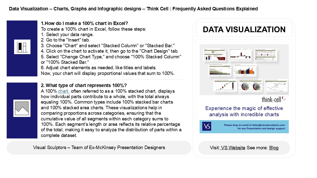
1.How do I make a 100 chart in Excel? To
create a 100 chart in Excel, follow these steps
1. Select your data range. 2. Go to the "Insert"
tab. 3. Choose "Chart" and select "Stacked
Column" or "Stacked Bar." 4. Click on the chart
to activate it, then go to the "Chart Design"
tab. 5. Select "Change Chart Type," and choose
"100 Stacked Column" or "100 Stacked Bar." 6.
Adjust chart elements as needed, like titles and
labels. Now, your chart will display
proportional values that sum to 100.
DATA VISUALIZATION
2. What type of chart represents 100? A 100
chart, often referred to as a 100 stacked chart,
displays how individual parts contribute to a
whole, with the total always equaling 100.
Common types include 100 stacked bar charts and
100 stacked area charts. These visualizations
help in comparing proportions across categories,
ensuring that the cumulative value of all
segments within each category sums to 100. Each
segment's length or area reflects its relative
percentage of the total, making it easy to
analyze the distribution of parts within a
complete dataset.
2
Data Visualization Charts, Graphs and
Infographic designs Think Cell Frequently
Asked Questions Explained
3. What is a 100 percent column chart? A 100
percent column chart is a type of bar graph that
displays data as percentages of a whole, with
each column representing a category and the total
height of each column normalized to 100. This
format allows for easy comparison of the relative
proportions of different categories within each
column, regardless of the actual values. Each
segment of the column is colored differently to
indicate specific data points, making it useful
for visualizing the composition of data across
multiple categories in a clear and
straightforward manner.
4. What is a 100 stacked area chart? A 100
stacked area chart is a data visualization tool
that displays the relative contribution of
multiple data series to a whole, with the total
always summing to 100. Each area in the chart
represents a data series, and the segments are
stacked on top of each other, showing how each
category changes over time or across categories
while maintaining a proportional relationship.
This type of chart helps in understanding the
composition and trends of data sets, allowing for
easy comparison of parts to the whole across
different time periods or categories.
5. What is a 100 stacked chart sub type? A
100 stacked chart is a data visualization type
that displays the relative contribution of
different categories to a whole, with each
category's value represented as a percentage of
the total. In this chart, segments are stacked on
top of each other, ensuring that the total for
each category sums to 100. This allows viewers
to easily compare proportions across different
groups or time periods while maintaining a focus
on the overall distribution. Its commonly used
for displaying composition changes in a dataset,
such as market share or demographic distribution
over time.
Recommended
CrystalGraphics Presentations


