
Tips for Effective Use of Clustered Column Charts in Data Presentation
Title:
Tips for Effective Use of Clustered Column Charts in Data Presentation
Description:
Clustered column charts are popular for visualizing data because they allow easy comparison of multiple categories side by side, helping to identify trends and differences. However, they can become cluttered if too many categories are included, which makes interpretation harder. Unlike simple bar charts that display one data series, clustered column charts compare multiple series within each category, offering a broader view of the data. They are best used when comparing different groups across various categories. To improve their usefulness, users can overlay a line graph on the columns, which adds insights into trends over time or highlights specific data points. –
Number of Views:0
Date added: 18 March 2025
Slides: 3
Provided by:
visualsculptors
Category:
How To, Education & Training
Tags:
Title: Tips for Effective Use of Clustered Column Charts in Data Presentation
1
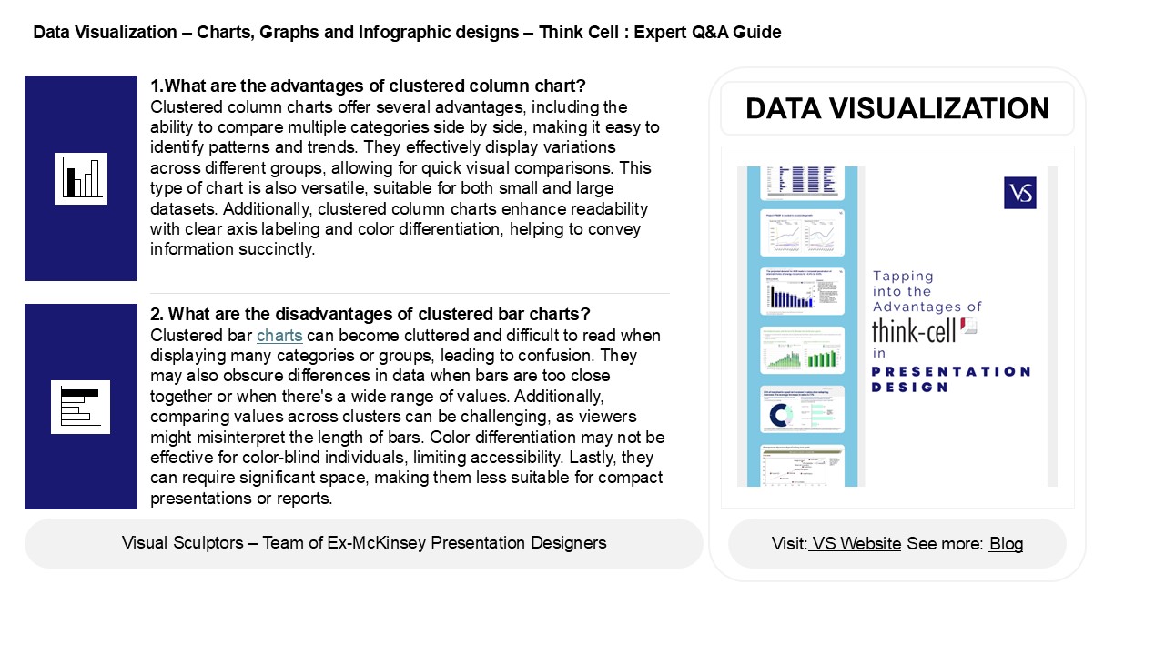
Data Visualization Charts, Graphs and
Infographic designs Think Cell Expert QA
Guide
1.What are the advantages of clustered column
chart? Clustered column charts offer several
advantages, including the ability to compare
multiple categories side by side, making it easy
to identify patterns and trends. They effectively
display variations across different groups,
allowing for quick visual comparisons. This type
of chart is also versatile, suitable for both
small and large datasets. Additionally, clustered
column charts enhance readability with clear axis
labeling and color differentiation, helping to
convey information succinctly.
DATA VISUALIZATION
2. What are the disadvantages of clustered bar
charts? Clustered bar charts can become
cluttered and difficult to read when displaying
many categories or groups, leading to confusion.
They may also obscure differences in data when
bars are too close together or when there's a
wide range of values. Additionally, comparing
values across clusters can be challenging, as
viewers might misinterpret the length of bars.
Color differentiation may not be effective for
color-blind individuals, limiting accessibility.
Lastly, they can require significant space,
making them less suitable for compact
presentations or reports.
2
Data Visualization Charts, Graphs and
Infographic designs Think Cell Expert QA
Guide
3. What is the difference between clustered bar
chart and simple bar chart? A simple bar chart
displays individual categories with bars
representing their values, making it easy to
compare single variables. In contrast, a
clustered bar chart groups multiple related
categories side-by-side, allowing for comparison
across different groups or variables within the
same category. This makes clustered bar charts
useful for visualizing the relationships between
multiple datasets, while simple bar charts are
better for highlighting standalone data points.
4. When to use a clustered column chart? Use a
clustered column chart when you want to compare
multiple categories of data across different
groups. This chart is effective for visualizing
relationships and differences in values among
discrete categories, allowing for easy comparison
within each group. It's ideal for displaying data
with two or more series, such as sales figures
across different regions or time periods.
Clustered column charts help identify trends,
patterns, and outliers, making it easier to
analyze and interpret complex datasets.
5. How do I add a line to a clustered column
chart? To add a line to a clustered column
chart, first create your clustered column chart.
Then, right-click on the chart and select "Select
Data." In the dialog, click "Add" to create a new
data series for your line. Input the data for the
line series and ensure its formatted as a line
chart. After adding the series, right-click on
it, select "Change Chart Type," and choose
"Line." Adjust the line's format and style as
desired to enhance visibility against the
columns. Finally, ensure the primary and
secondary axes are set up correctly for clarity.
Recommended
CrystalGraphics Presentations


