
The Power of Butterfly Charts: Visualizing Demographic Distributions Effectively - PowerPoint PPT Presentation
Title:
The Power of Butterfly Charts: Visualizing Demographic Distributions Effectively
Description:
A butterfly chart serves as a powerful data visualization instrument, enabling the side-by-side comparison of two distinct datasets while effectively highlighting their differences or similarities. To construct a butterfly chart in PowerPoint, one begins by arranging a bar or column chart that positions the datasets on either side of a central axis. This process entails selecting the appropriate data, inserting the chart, and tailoring its design to achieve the desired butterfly configuration. This chart format is particularly advantageous for depicting distributions, such as demographic statistics, thereby facilitating a clearer understanding of comparative data for the audience. In tabular presentations, butterfly charts significantly improve clarity and support rapid analysis, making them indispensable for a range of applications, including business presentations and academic research. – PowerPoint PPT presentation
Number of Views:2
Date added: 15 March 2025
Slides: 3
Provided by:
visualsculptors
Category:
How To, Education & Training
Tags:
Title: The Power of Butterfly Charts: Visualizing Demographic Distributions Effectively
1
Data Visualization Charts, Graphs and
Infographic designs Think Cell Q A Tutorial
1.What is a butterfly chart used for? A
butterfly chart, also known as a tornado chart,
is used to compare two related datasets
symmetrically, typically displayed as two
back-to-back bar graphs. It effectively
visualizes differences and similarities between
two groups, such as demographic data, survey
results, or financial projections. The layout
resembles butterfly wings, hence the name. This
chart is useful for highlighting contrasts in
data, making it easier to identify trends,
patterns, and disparities brieflye. It is
commonly employed in business, research, and
presentations to facilitate data analysis and
decision-making.
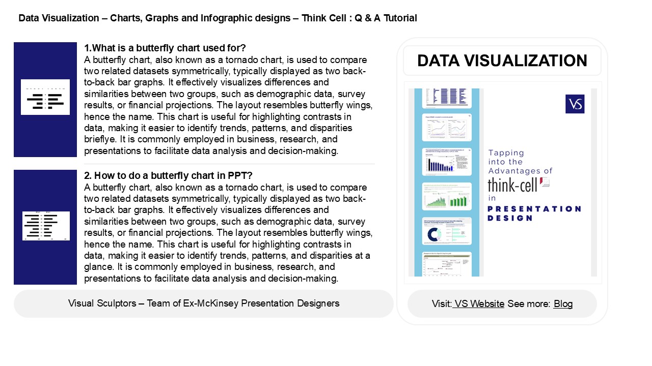
DATA VISUALIZATION
2. How to do a butterfly chart in PPT? A
butterfly chart, also known as a tornado chart,
is used to compare two related datasets
symmetrically, typically displayed as two
back-to-back bar graphs. It effectively
visualizes differences and similarities between
two groups, such as demographic data, survey
results, or financial projections. The layout
resembles butterfly wings, hence the name. This
chart is useful for highlighting contrasts in
data, making it easier to identify trends,
patterns, and disparities at a glance. It is
commonly employed in business, research, and
presentations to facilitate data analysis and
decision-making.
2
Data Visualization Charts, Graphs and
Infographic designs Think Cell Q A
Tutorial
3. How to make a butterfly chart? To create a
butterfly chart, follow these steps 1. Collect
your data, typically in two categories with a
common variable (e.g., age groups for two
different populations). 2. Organize the data into
a table with categories on the y-axis and values
on the x-axis. 3. Use a spreadsheet or charting
software (like Excel) to input the data. 4.
Create a bar chart, plotting one category on the
left (negative values) and the other on the right
(positive values). 5. Adjust the formatting for
clarity, labeling axes and adding a title. This
visualizes comparisons effectively between the
two datasets.
4. What is a butterfly chart pattern? A
butterfly chart pattern is a technical analysis
formation that resembles a butterfly's wings,
typically found in the context of trading or
investing. It consists of four price points two
peaks and two troughs, creating a symmetrical
shape. The pattern reflects a reversal in price
trends, often indicating potential buy or sell
opportunities. It is part of the broader family
of harmonic patterns and is used by traders to
identify potential price movements based on
market psychology and historical price action.
Proper analysis of this pattern can help traders
make informed decisions.
5. What is the use of butterfly chart in table?
A butterfly chart, also known as a tornado
chart, is used to compare two related sets of
data side by side, typically for visualizing
differences in categories. It features two
horizontal bars extending in opposite directions
from a central axis, allowing for easy comparison
of values. Commonly used in financial analysis,
project management, or demographic studies, it
helps identify trends, disparities, and patterns
quickly, making it useful for presentations and
decision-making. The symmetrical design enhances
readability and highlights contrasts effectively.
Recommended
CrystalGraphics Presentations


