
Best Practices for Creating Clear and Effective Waterfall Charts in Excel
Title:
Best Practices for Creating Clear and Effective Waterfall Charts in Excel
Description:
A waterfall chart serves as an effective visualization tool for illustrating the cumulative effects of sequential values, whether positive or negative. To ensure clarity in a waterfall chart, it is essential to label each bar with its corresponding value and utilize distinct colors to differentiate between increases and decreases. In Excel, you can easily create multiple waterfall charts by duplicating the initial chart and modifying the data for comparative analysis across various datasets. –
Number of Views:2
Date added: 2 March 2025
Slides: 3
Provided by:
visualsculptors
Category:
How To, Education & Training
Tags:
Title: Best Practices for Creating Clear and Effective Waterfall Charts in Excel
1
Data Visualization Charts, Graphs and
Infographic designs Think Cell Key Questions
Explained
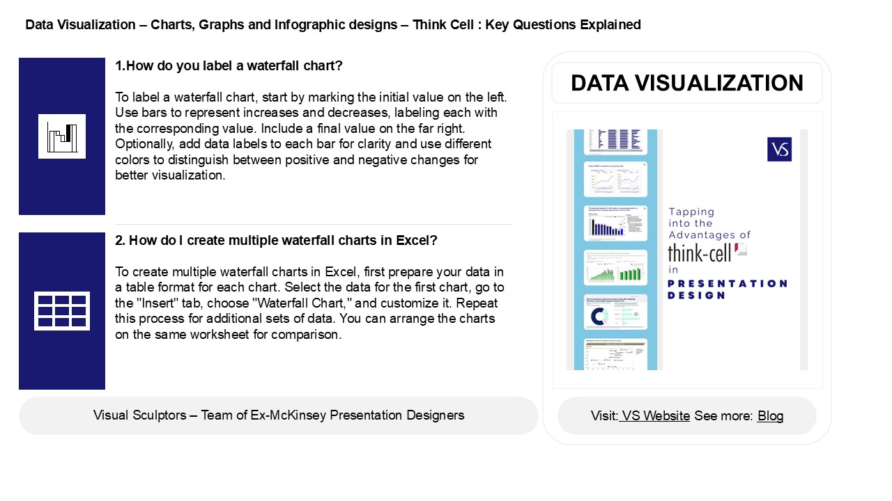
- 1.How do you label a waterfall chart?
- To label a waterfall chart, start by marking the
initial value on the left. Use bars to represent
increases and decreases, labeling each with the
corresponding value. Include a final value on the
far right. Optionally, add data labels to each
bar for clarity and use different colors to
distinguish between positive and negative changes
for better visualization.
DATA VISUALIZATION
2. How do I create multiple waterfall charts in
Excel? To create multiple waterfall charts in
Excel, first prepare your data in a table format
for each chart. Select the data for the first
chart, go to the "Insert" tab, choose "Waterfall
Chart," and customize it. Repeat this process for
additional sets of data. You can arrange the
charts on the same worksheet for comparison.
2
Data Visualization Charts, Graphs and
Infographic designs Think Cell Key Questions
Explained
3. What is the impact of a waterfall chart? A
waterfall chart visually represents the
cumulative effect of sequentially introduced
positive or negative values, helping to
illustrate how an initial value is affected by a
series of intermediate values. It effectively
highlights the contributions of various factors
to an overall change, making it easier to analyze
financial metrics, project performance, or any
data trends over time. By clearly showing
increases and decreases, waterfall charts enhance
data comprehension, support decision-making, and
facilitate communication of complex information
to stakeholders, ultimately leading to better
strategic insights and planning.
4. What are the properties of a waterfall chart?
A waterfall chart visually represents the
cumulative effect of sequentially introduced
positive or negative values. Its key properties
include 1. Sequential Bars Each bar
represents a change from the previous total,
illustrating growth or decline. 2. Starting
Point The first bar shows the initial value,
often displayed in a different color. 3. Color
Coding Positive values are typically shown in
one color (e.g., green) and negative values in
another (e.g., red). 4. Cumulative Totals
The height of each bar reflects the running
total, making trends easy to identify. 5. Clear
Visualization It effectively communicates how
individual components impact a total.
5. What is the disadvantage of waterfall chart?
The main disadvantage of a waterfall chart is
that it can become cluttered and difficult to
interpret when displaying a large number of
categories or data points. Additionally, it may
oversimplify complex data relationships, leading
to potential misinterpretations. Waterfall charts
also do not effectively show data trends over
time, as they focus primarily on cumulative
values. This limitation can hinder
decision-making when users seek a more
comprehensive understanding of underlying factors
affecting the data. Lastly, they may require more
explanation for audiences unfamiliar with the
format.
Recommended
CrystalGraphics Presentations


