
Understanding Infographics: The Power of Visual Data Presentation in PowerPoint
Title:
Understanding Infographics: The Power of Visual Data Presentation in PowerPoint
Description:
An infographic created in PowerPoint (PPT) is a visual way to present information, making complex data easy to understand and engaging for viewers. While PPT can produce infographics, it is primarily a presentation tool that can include various visuals. Infographics are different from brochures and flyers; they focus on displaying data and statistics in an attractive format, while brochures and flyers are mainly used for promotion. To effectively analyze an infographic, one should look at how clear the visuals are, check the accuracy of the data, and consider the overall message. The goal is to ensure that the infographic is not only visually appealing but also informative and relevant. –
Number of Views:5
Date added: 23 January 2025
Slides: 3
Provided by:
visualsculptors
Category:
How To, Education & Training
Tags:
Title: Understanding Infographics: The Power of Visual Data Presentation in PowerPoint
1
Data To Creative Infographic in PowerPoint
Expert QA Guide
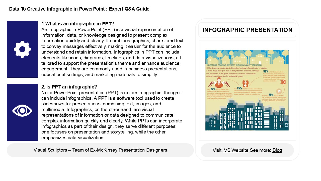
1.What is an infographic in PPT? An
infographic in PowerPoint (PPT) is a visual
representation of information, data, or knowledge
designed to present complex information quickly
and clearly. It combines graphics, charts, and
text to convey messages effectively, making it
easier for the audience to understand and retain
information. Infographics in PPT can include
elements like icons, diagrams, timelines, and
data visualizations, all tailored to support the
presentations theme and enhance audience
engagement. They are commonly used in business
presentations, educational settings, and
marketing materials to simplify.
INFOGRAPHIC PRESENTATION
2. Is PPT an infographic? No, a PowerPoint
presentation (PPT) is not an infographic, though
it can include infographics. A PPT is a software
tool used to create slideshows for presentations,
combining text, images, and multimedia.
Infographics, on the other hand, are visual
representations of information or data designed
to communicate complex information quickly and
clearly. While PPTs can incorporate infographics
as part of their design, they serve different
purposes one focuses on presentation and
storytelling, while the other emphasizes data
visualization.
2
Data To Creative Infographic in PowerPoint
Expert QA Guide
3. Is an infographic a brochure? No, an
infographic is not a brochure. An infographic is
a visual representation of information, data, or
knowledge, designed to convey complex information
quickly and clearly. It typically focuses on a
specific topic and uses graphics, charts, and
concise text. A brochure, on the other hand, is a
printed or digital promotional document that
provides detailed information about a product,
service or organization, often structured in
multiple panels. While both can be visually
appealing and informative, their purposes and
formats differ significantly.
4. Is an infographic a flyer? An infographic is
not a flyer, though they can share similarities.
An infographic is a visual representation of
information, data, or knowledge designed to
communicate complex information quickly and
clearly, often using charts, icons, and
illustrations. A flyer, on the other hand, is a
printed or digital advertisement used to promote
an event, product, or service, typically
featuring text and images. While both can
effectively convey information visually, their
purposes and designs differ significantly.
5. How to analyze infographics? To analyze
infographics, start by identifying the main
message and purpose. Examine the visual elements,
such as charts, images, and colors, to see how
they convey information. Assess the data sources
for credibility and relevance. Look for patterns,
trends, or comparisons presented in the visuals.
Consider the layout and flow to understand how
information is organized. Evaluate the clarity
and effectiveness of the text, including labels
and captions. Finally, reflect on the emotional
impact and how the design influences
interpretation. This comprehensive approach helps
in understanding the infographic's effectiveness
and accuracy.
Recommended
CrystalGraphics Presentations


