
Key Characteristics of Effective Data Visualization: Clarity, Accuracy, and More
Title:
Key Characteristics of Effective Data Visualization: Clarity, Accuracy, and More
Description:
Data can be divided into five main types: qualitative, quantitative, ordinal, nominal, and interval. These types are important for data visualization, as they help determine the best way to visually represent information. Key characteristics of effective data visualization include clarity, accuracy, efficiency, and visual appeal. To visualize categorical data, techniques like bar charts and pie charts can be used to clearly show differences between categories. Additionally, every dataset has four essential components: data values, data structure, data relationships, and data context. Understanding these elements is crucial for analyzing and interpreting data meaningfully. –
Number of Views:0
Date added: 11 November 2024
Slides: 3
Provided by:
visualsculptors
Category:
How To, Education & Training
Tags:
Title: Key Characteristics of Effective Data Visualization: Clarity, Accuracy, and More
1
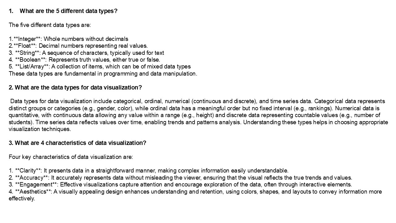
- What are the 5 different data types?
- The five different data types are
- 1.Integer Whole numbers without decimals
- 2.Float Decimal numbers representing real
values. - 3. String A sequence of characters,
typically used for text - 4. Boolean Represents truth values, either
true or false. - 5. List/Array A collection of items, which
can be of mixed data types - These data types are fundamental in programming
and data manipulation. - 2. What are the data types for data
visualization? - Data types for data visualization include
categorical, ordinal, numerical (continuous and
discrete), and time series data. Categorical data
represents distinct groups or categories (e.g.,
gender, color), while ordinal data has a
meaningful order but no fixed interval (e.g.,
rankings). Numerical data is quantitative, with
continuous data allowing any value within a range
(e.g., height) and discrete data representing
countable values (e.g., number of students). Time
series data reflects values over time, enabling
trends and patterns analysis. Understanding these
types helps in choosing appropriate visualization
techniques. - 3. What are 4 characteristics of data
visualization? - Four key characteristics of data visualization
are
2
4. How to visualize classification data? To
visualize classification data, you can use
various techniques such as scatter plots, which
display data points with different colors or
shapes representing different classes. Decision
boundary plots show how classifiers separate
classes. Confusion matrices help illustrate
classification performance, while ROC curves
depict true positive rates against false positive
rates. Pair plots can visualize relationships
between features for different classes, and bar
charts can summarize class distributions.
Additionally, tools can reduce dimensionality for
better visualization of high-dimensional data.
Choose the method that best highlights the
structure and relationships within your data. 5.
What are the 4 elements of data? The four
elements of data are 1. Type The kind of
data, such as numerical, categorical, or
textual. 2. Structure The organization of
data, which can be structured (like databases) or
unstructured (like text documents). 3.
Volume The amount of data, often measured in
bytes or records, indicating the scale of data
being managed. 4. Quality The accuracy and
reliability of the data, which affects its
usefulness for analysis and decision-making.
These elements are essential for effective data
management and analysis. Visit VS Website See
more Blog
Recommended
CrystalGraphics Presentations


