8 Effective Techniques for Data Visualization - PowerPoint PPT Presentation
Title:
8 Effective Techniques for Data Visualization
Description:
Improving data visualizations is essential for effective communication and decision-making. First, prioritize clarity by selecting appropriate chart types that accurately represent the data. Second, utilize color strategically to highlight key information and ensure accessibility. Third, simplify visual elements to avoid clutter, focusing on essential data points. Fourth, incorporate interactive features to engage users and allow deeper exploration. Fifth, maintain consistency in design elements, such as fonts and styles, to enhance professionalism. Sixth, provide context through titles, labels, and annotations. Seventh, leverage storytelling techniques to convey a compelling narrative. Finally, solicit feedback to refine your visualizations continually and better meet audience needs. – PowerPoint PPT presentation
Number of Views:0
Title: 8 Effective Techniques for Data Visualization
1
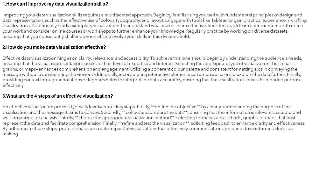
1.How can I improve my data visualization
skills? Improving your data visualization
skills requires a multifaceted approach. Begin by
familiarizing yourself with fundamental
principles of design and data representation,
such as the effective use of colour, typography,
and layout. Engage with tools like Tableau to
gain practical experience in crafting
visualizations. Additionally, study exemplary
visualizations to understand what makes them
effective. Seek feedback from peers or mentors to
refine your work and consider online courses or
workshops to further enhance your knowledge.
Regularly practice by working on diverse
datasets, ensuring that you consistently
challenge yourself and evolve your skills in this
dynamic field. 2.How do you make data
visualization effective? Effective data
visualization hinges on clarity, relevance, and
accessibility. To achieve this, one should begin
by understanding the audience's needs, ensuring
that the visual representation speaks to their
level of expertise and interest. Selecting the
appropriate type of visualizationbe it charts,
graphs, or mapsenhances comprehension and
engagement. Utilizing a coherent colour palette
and consistent formatting aids in conveying the
message without overwhelming the viewer.
Additionally, incorporating interactive elements
can empower users to explore the data further.
Finally, providing context through annotations or
legends helps to interpret the data accurately,
ensuring that the visualization serves its
intended purpose effectively. 3.What are the 4
steps of an effective visualization? An
effective visualization process typically
involves four key steps. Firstly, define the
objective by clearly understanding the purpose
of the visualization and the message it aims to
convey. Secondly, collect and prepare the
data, ensuring that the information is
relevant, accurate, and well-organized for
analysis. Thirdly, choose the appropriate
visualization method, selecting formats such as
charts, graphs, or maps that best represent the
data and facilitate comprehension. Finally,
refine and test the visualization, soliciting
feedback to enhance clarity and effectiveness. By
adhering to these steps, professionals can create
impactful visualizations that effectively
communicate insights and drive informed
decision-making.
2
4.How to design a data visualization? Designing
an effective data visualization involves several
key principles. First, clearly define the purpose
and audience to tailor the visualization
accordingly. Select the appropriate type of chart
or graph that best represents the data, ensuring
it is easily interpretable. Utilize a harmonious
colour palette to enhance readability without
overwhelming the viewer. Maintain a logical
layout, guiding the audience through the
information seamlessly. Incorporate labels,
legends, and annotations to provide context and
clarity. Lastly, iteratively test and refine the
visualization based on feedback, ensuring it
communicates the intended message and facilitates
informed decision-making. A well-designed
visualization transforms complex data into
actionable insights. 5.What are the 5 stages of
visualization? The five stages of visualization
encompass a systematic approach to transforming
abstract concepts into clear, comprehensible
representations. First, the Preparation stage
involves identifying the purpose and audience of
the visualization. Next, in the Design phase,
key elements such as colour, layout, and scale
are strategically selected to enhance clarity and
engagement. The Creation stage follows, where
the actual visualization is developed using
appropriate tools and techniques. Subsequently,
the Evaluation phase assesses the
effectiveness of the visualization in conveying
the intended message, leading to potential
revisions. Finally, the Communication stage
ensures that the visualization is effectively
disseminated, facilitating understanding and
decision-making.
3
https//visualsculptors.com/ https//visualsculp
tors.com/our-portfolio/


