
How Custom Boxes Colours and Shapes Affect User Perception ? - PowerPoint PPT Presentation
Title:
How Custom Boxes Colours and Shapes Affect User Perception ?
Description:
Are you selling a wonderful product but customers are not paying any attention to it? See How Custom Boxes Colours and Shapes Affect User Perception towards your product..info@viveprinting.co.uk Whatsapp: 07939 588196 – PowerPoint PPT presentation
Number of Views:0
Title: How Custom Boxes Colours and Shapes Affect User Perception ?
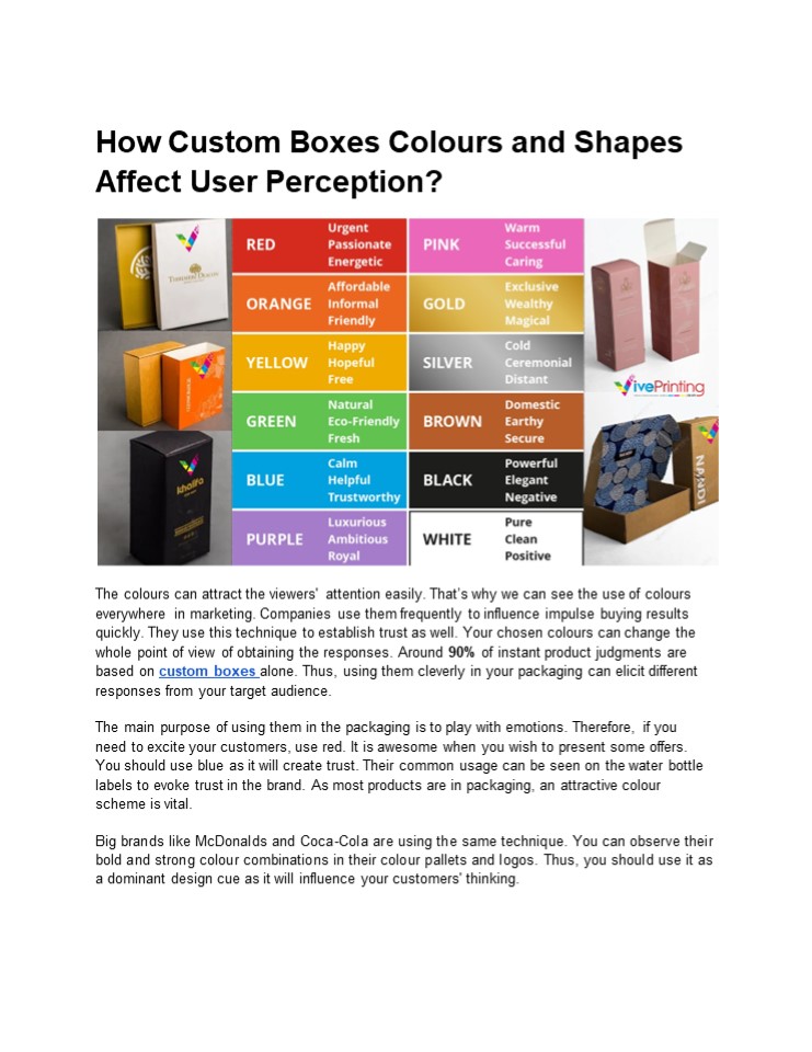
1
How Custom Boxes Colours and Shapes Affect User
Perception?
The colours can attract the viewers' attention
easily. Thats why we can see the use of colours
everywhere in marketing. Companies use them
frequently to influence impulse buying results
quickly. They use this technique to establish
trust as well. Your chosen colours can change the
whole point of view of obtaining the responses.
Around 90 of instant product judgments are
based on custom boxes alone. Thus, using them
cleverly in your packaging can elicit different
responses from your target audience. The main
purpose of using them in the packaging is to play
with emotions. Therefore, if you need to excite
your customers, use red. It is awesome when you
wish to present some offers. You should use blue
as it will create trust. Their common usage can
be seen on the water bottle labels to evoke
trust in the brand. As most products are in
packaging, an attractive colour scheme is
vital. Big brands like McDonalds and Coca-Cola
are using the same technique. You can observe
their bold and strong colour combinations in
their colour pallets and logos. Thus, you should
use it as a dominant design cue as it will
influence your customers' thinking.
2
- Using Custom Boxes Colours and Shapes to Lure
Customers - Never Ignore Their Power of Visual Appeal
- The colour and shape of packaging play a vital
role in shaping consumer opinion. Your boxes
should contain various visual elements. They must
be capable of triggering emotions. Also, ensure
that they will create an unforgettable first
sight. It is helpful for brands wanting to reach
their target market and customers. - Psychology of colours used in packaging.
- Colours carry a lot of psychological effects.
They can greatly affect consumer behaviour. For
instance, warm tones such as red and orange might
instil vigour and enthusiasm in someone. In
contrast, cool shades such as blue or green will
show peacefulness and reliability. These brands,
therefore, select colours to arouse emotions.
Also, they will build harmony between the
product and the consumer. - Packaging Shapes and Creating Brand Identity.
- The custom packaging boxes also reflect the
companys image due to their shape. It enables
items to build their uniqueness and
distinctiveness shapes. They will set them apart
on shelves. Thus, it makes it easy for users to
recognize them. Its forms may also tell what type
of personality a brand portrays. You can use it
to show your brand's classy-modern or - classic-reliable characteristics.
- Cultural Influences on Colour Perception
- Different colours may embody different ideas of
various cultures. You should use them cleverly
to see how users understand a product they buy.
For example, while Western cultures may see
white as a symbol of purity, one may relate the
same colour to mourning when coming from certain
Eastern countries. It is also vital for a brand
to an audience to avoid unintended
misunderstandings. Brands can achieve this goal
by knowing such cultural nuances. - Use of colour combinations in packaging.
- You have to think about your storage boxes for
shelves ' colour scheme a lot. It can enhance
visual attractiveness in no time. Also, it will
add meaning to your products. You can combine
complementary colours. They give rise to
conspicuity. Also, they can draw attention
instantly. You should also consider analogy as
it makes uniformness. A brand may emphasise
certain product attributes through careful
colour combinations. It should be done to direct
the customers attention.
3
- Colour-based gender navigation in packaging.
- At times, colour has connotations related to
gender stereotypes. There is no doubt that it is
a traditional idea. For instance, pink
represents femininity, and blue signifies
manliness. Yet, changing social norms are
challenging these images and colours. Brands
increasingly use colours that can reach bigger
audiences and get them away from old habits. They
are trying to change it. - Adapting Packaging Colours and Shapes to Market
Trends - The consumer tastes and the packaging designs are
continuously changing. Brands must always be
responsive to the changes within their markets.
Also, they must adjust their colour palettes and
overall box shapes. They have to do so to stay
current and remain as fresh and appealing as
possible. The flexibility of skincare packaging
makes it an attractive proposition that still
appeals to users who keep evolving with age and
time. - Effects of colour temperature in shaping
perceptions. - Warm and cool temperatures of colours elicit
certain feelings about the objects in which you
use them. Also, they are perceived by buyers.
Red and yellow are warm colours. Thus, they
usually invoke some feeling of urgency or
passion. On the other hand, blue and green are
cool colours. They suggest calmness and
dependability. Emotion-oriented consumer
experience can be enhanced by recognising how
colour temperature plays a role in packaging
alignment. You need to know how to achieve the
right feelings about the brand by using them. - Packaging Colours and Seasonal Trends
- Colours have seasons, too. An ongoing and
relevant design for your carton box for packing
would be achievable by aligning it with seasonal
colour trends. For instance, warm, earthy
colours may feel right during autumn, whereas
vibrant or pastel colours would suit well in
spring. You should align your colours according
to the festival. Thus, using Green and Red for
Christmas is helpful to make your items stand
out. - You have to adjust your box according to seasonal
trends. It guarantees that it is always visually
attractive and relates to the consumers at
different times of the year. - Wrapping up
- Creating an attractive design for your boxes is
vital. However, it is not limited to
aesthetically pleasing packaging only. You need
to use packaging psychology to influence your
target audience. It will make your customers buy
your items instantly. - This is where Viveprinting UK comes in. We are
here to take your packaging design to the next
level. Our main goal is to create the boxes that
will effectively promote your brand.
4
With our unique, attractive, and customisation
custom boxes solutions, improving your brands
packaging game will no longer be an issue. You
can rely on us to leave a lasting impression on
your target customers.
Recommended
CrystalGraphics Presentations


