Creating Braille ADA Signs: Best Practices - PowerPoint PPT Presentation
Title:
Creating Braille ADA Signs: Best Practices
Description:
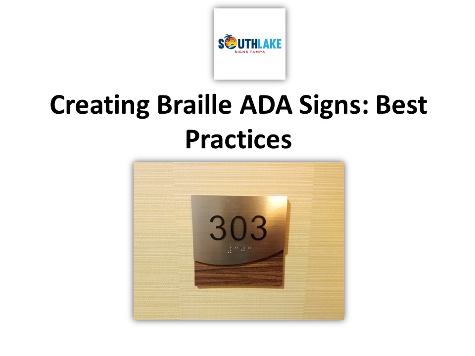
When it comes to enhancing accessibility, Braille ADA signs play a crucial role. These signs are a vital means of communication for visually impaired individuals, providing essential information and ensuring they can navigate public spaces with ease. In this comprehensive guide, we'll explore the best practices for creating Braille ADA signs, from design considerations to material selection, and the importance of compliance. Let's dive in! – PowerPoint PPT presentation
Number of Views:1
Title: Creating Braille ADA Signs: Best Practices
1
Creating Braille ADA Signs Best Practices
2
When it comes to enhancing accessibility, Braille
ADA signs play a crucial role. These signs are a
vital means of communication for visually
impaired individuals, providing essential
information and ensuring they can navigate public
spaces with ease. In this comprehensive guide,
we'll explore the best practices for creating
Braille ADA signs, from design considerations to
material selection, and the importance of
compliance. Let's dive in! What are Braille ADA
Signs? Braille ADA signs, as the name suggests,
are signs that incorporate Braille and tactile
elements to provide information to individuals
with visual impairments. These signs are a legal
requirement in many public spaces and serve to
ensure everyone has equal access to information
and directions. Design Considerations 1. Legible
Fonts and Size Choosing the right font and size
is crucial to ensure the Braille text and tactile
characters are easy to read and touch. Opt for
sans-serif fonts and consider the minimum size
required by ADA guidelines. 2. Color
Contrast Maintaining a strong contrast between
background and text colors is essential. This
enhances readability for those with low vision
and ensures compliance with ADA standards. 3.
Pictograms and Symbols Include universally
recognizable symbols to convey messages more
efficiently. For example, use a wheelchair symbol
to indicate accessibility.
3
Material Selection 1. Durable Materials Opt for
materials that can withstand various
environmental conditions, such as acrylic,
aluminum, or high-pressure laminate. These
materials are not only durable but also easily
maintainable. 2. Braille Domes Ensure that
Braille dots are rounded and of the right height
to provide a comfortable tactile experience.
Non-compliance with Braille dot specifications
can lead to discomfort for users. Compliance
with ADA Standards 1. Height and
Placement Install Braille ADA signs at a
consistent height, typically 48 inches from the
floor. This ensures that individuals can easily
locate the sign through touch. 2. Mounting
Location Place signs adjacent to the door or
entrance they identify, ensuring that they are on
the latch side and not obstructed by any
protruding objects. 3. Information Clarity The
information provided on the sign should be clear
and concise. Avoid jargon or complex language to
ensure all users can understand the
message. Conclusion Creating Braille ADA signs
involves careful consideration of design,
materials, and compliance with ADA standards.
These signs are a vital aspect of accessibility,
ensuring that visually impaired individuals can
navigate public spaces with confidence. By
following best practices, you can contribute to a
more inclusive and accessible environment for
all.
4
Visit us to know more
Website southlakesignstampa.com Email us
ron_at_southlakesignstampa.com Contact us
727-746-5899 Follow us on social
media https//www.facebook.com/southlakesignstam
pa https//www.linkedin.com/company/southlake-sign
s-tampa/


