
3 Tips to build up your website UI/User interface
Title:
3 Tips to build up your website UI/User interface
Description:
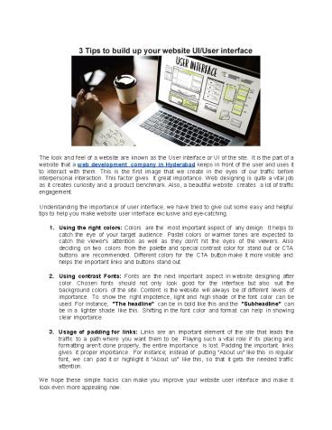
The look and feel of a website are known as the User interface or UI of the site. It is the part of a website that a web development company in Hyderabad keeps in front of the user and uses it to interact with them. This is the first image that we create in the eyes of our traffic before interpersonal interaction. This factor gives it great importance. Web designing is quite a vital job as it creates curiosity and a product benchmark. Also, a beautiful website creates a lot of traffic engagement. –
Number of Views:5
Title: 3 Tips to build up your website UI/User interface
1
- The look and feel of a website are known as the
User interface or UI of the site. It is the part
of a website that a web development company in
Hyderabad keeps in front of the user and uses it
to interact with them. This is the first
image that we create in the eyes of our
traffic before interpersonal interaction. This
factor gives it great importance. Web designing
is quite a vital job as it creates curiosity and
a product benchmark. Also, a beautiful website
creates a lot of traffic engagement. - Understanding the importance of user interface,
we have tried to give out some easy and helpful
tips to help you make website user interface
exclusive and eye-catching. - Using the right colors Colors are the most
important aspect of any design. It helps to
catch the eye of your target audience.
Pastel colors or warmer tones are expected
to catch the viewer's attention as well as
they don't hit the eyes of the viewers.
Also deciding on two colors from the palette
and special contrast color for stand out or CTA
buttons are recommended. Different colors for
the CTA button make it more visible and helps
the important links and buttons stand out. - Using contrast Fonts Fonts are the next
important aspect in website designing after
color. Chosen fonts should not only look
good for the interface but also suit
the background colors of the site. Content is
the website will always be of different levels
of importance. To show the right impotence,
light and high shade of the font color can be
used. For instance "The headline" can be in
bold like this and the "Subheadline" can be in
a lighter shade like this. Shifting in the
font color and format can help in showing
clear importance. - Usage of padding for links Links are an
important element of the site that leads
the traffic to a path where you want them to
be. Playing such a vital role if its
placing and formatting aren't done properly, the
entire importance is lost. Padding the important
links gives it proper importance. For
instance instead of putting "About us" like
this in regular font, we can pad it or
highlight it "About us" like this, so that
it gets the needed traffic attention. - We hope these simple hacks can make you
improve your website user interface and
make it look even more appealing now.
2
(No Transcript)
Recommended
CrystalGraphics Presentations


