
Responsive Web Design: Guidelines from Web Development Experts - PowerPoint PPT Presentation
Title:
Responsive Web Design: Guidelines from Web Development Experts
Description:
Are you a web designer working on responsive web design? Few advanced tips from web development specialists to build high performance site for any device. – PowerPoint PPT presentation
Number of Views:34
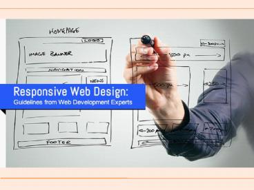
Title: Responsive Web Design: Guidelines from Web Development Experts
1
(No Transcript)
2
Although Responsive Web Design sounds simple but
it is very tricky to implement from a web
designers perspective.
But web development specialists suggest that it
is of utmost importance to get your basics right
before you endeavour to execute advanced
techniques.
The trick is to add complexity to your site layer
by layer as and when situation permits.
3
Image inclusion
Include images if they are an integral part of
the content and not for decorative purposes.
Images that are relevant to your content optimize
them before using so that they dont affect site
performance.
4
Page load time
The time your web page takes to load in your
audiences device is one of the crucial aspects
that decide your sites performance.
User experience can be improved based on their
device feature using the technique of conditional
loading i.e. holding off loading some features
until the user shows intent to use them. For
instance, you can hold off loading social media
icons until user touches them.
5
Responsive typography
A proper typography enables your readers to
easily digest your content and it is all about
making sure that your audience can experience
readability across various devices with different
screen sizes.
To ensure that you can set your HTML font size to
100 percent and also work on the REM units.
Keeping a good reading length will contribute to
the readability of your content. Moreover,
setting margins to your line height would enable
you to maintain vertical rhythm in your design.
6
Flexible layout
Layout issues can be addressed with many
different approaches web development
experts recommend using Flexbox and Grid instead
of position and floats for layouts. Use
nth-child() selector to create simple grid
layouts with minimum markup.
7
Using media queries in JS
With media queries you have been able to control
the layout across various screen resolutions and
now web development specialists have got a trick
which would enable you to tie your media queries
to JavaScript without the need to duplicate them.
You can use Breakup like predefined list of media
queries and automate the generation of font
families for getActiveMQ-watcher.
8
Progressive enhancement
Progressive enhancement is to ensure delivering
advanced features to enhance user experience. And
the beauty of this technique is that you can even
use it when a feature is not supported by any
browser but you can make sure that your audience
gets an improved experience when they start using
latest versions.
9
Finally, to get the best out of your responsive
web design ensure that the basics of your designs
are done right.
Originally Posted On- http//goo.gl/KNGHfp
10
Interested To Know More About?
Responsive Design Spezialist
Responsive Entwicklung
Responsive WebDesign Entwicklung
Recommended
CrystalGraphics Presentations


