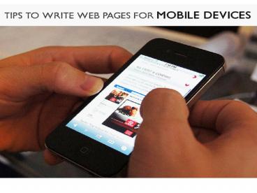
Tips to write web pages for Mobile devices - PowerPoint PPT Presentation
Title:
Tips to write web pages for Mobile devices
Description:
A perfect mobile website design is one that provides perfect resolution, easy-to-access functions/tabs and color options that do not harm the users eyesight even after reading the content of the page for a long time. – PowerPoint PPT presentation
Number of Views:30
Title: Tips to write web pages for Mobile devices
1
2
Tips to write web pages for Mobile devices
- Easy access to web pages on smartphones has
provided 24/7 information to users. However, it
is essential to know that content on the web page
should be such that it is easily accessible for
the user through his/her smartphone. Since the
display of the smartphone screen varies as per
the device, the web page design should also be
compatible with almost all types and sizes of the
device. - A perfect mobile website design is one that
provides perfect resolution, easy-to-access
functions/tabs and color options that do not harm
the users eyesight even after reading the content
of the page for a long time.
3
- Some important aspects that one needs to know
while designing a web page that is compatible
with the mobile device are mentioned below-
Analyze the page on various devices After
creating the web page it is important to test the
site on various mobile devices. Testing on actual
devices will give you a fair idea as to how
compatible the page is and what needs to change
or upgraded.
4
- Simple Layout It is important to understand
that the screen of a mobile device is tiny and
hence the content if too vast will be difficult
for the users to read without zooming it. It can
get tedious and many a times boring too. Hence, a
single column of text will be easy to read and
understand. One advantage while creating web
pages is that smartphones have inbuilt browsers
such as Safari or Chrome. Hence, the pages that
look absolutely fine on a desktop will look
perfect on the smartphone screen too. Moreover,
to avoid crowding of content the web page should
be designed in smaller chunks that are divided
into multiple pages connected to each other.
5
- Easy navigation Typing on the touch screen of
the smartphone is quite a task, and especially if
the URL of the webpage is long, then it might be
the primary reason that will shy away the users
from logging in. Hence, keep it short and simple
to spell and type. In addition, if you have
hyperlinked different words, it is essential that
the words are placed away from each other. Such
texts if adjacent, can be difficult to click.
Apart from this, the navigation tab should always
hold a position at the lower section of the page.
Scrolling up again after reading the entire page
might seem to be disinteresting for the users.
Images, if any, should be small in dimensions. In
addition, the images should be easily
downloadable. Accommodating the images and text
in sync with each other is essential. Moreover,
if the image has to lead to some more information
about the text, then the navigation should be
easy and quick. - Some more important aspects that should not be
missed are - Flash is not supported by many smartphones, hence
it should be avoided as much as possible. - Most phones do not support cookies, hence stay
away from them. - Tables or similar elements to design a webpage
should be avoided.
6
Contact Us
- Address 501-3292 Production Way, Burnaby, BC
Canada - Pin code V5A4R4
- Phone no 1-888-936-3653
- Email info_at_wittycookie.com
- Website http//www.wittycookie.com
7
(No Transcript)


