NME Magazine Powerpoint - PowerPoint PPT Presentation
Title:
NME Magazine Powerpoint
Description:
AS Media Homework – PowerPoint PPT presentation
Number of Views:82
Title: NME Magazine Powerpoint
1
NME
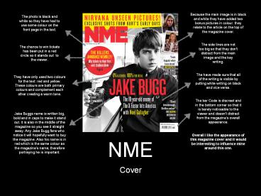
Because the main image is in black and white they
have added two bonus pictures in colour. they
relate to the article on the top of the magazine
cover.
The photo is black and white so they have had to
use some colour on the front page in the text.
The side lines are not too big so that they don't
distract from the main image and the key writing.
The chance to win tickets has been put in a red
circle so it stands out to the viewer.
The have made sure that all of the writing is
visible by putting white writing on black and
vice versa.
They have only used two colours for the text red
and yellow. These colours are both primary
colours and complement each other creating a warm
tone.
The bar Code is discreet and in the bottom corner
so that it is barely noticeable to the viewer and
doesn't distract from the magazines overall
appearance.
Jake Buggs name is written big, bold and in caps
to make it stand out. it is also in the middle of
the magazine so you see it straight away. Any
Jake Bugg fans who notice it will hopefully want
to buy the magazine. Also his name is in red
which is the same colour as the magazines name,
therefore portraying he is important.
Overall I like the appearance of this magazine
cover and it would be interesting to influence
mine around this one.
- Cover
2
NME
They have use the simple style of black writing
on white paper so that the viewer isn't
distracted from the picture straight away. This
also makes the text easy on the eyes and easy to
read.
They have used the rule of thirds when making
this contents page. the image takes up two thirds
of the page and the other third is text.
The image relates to the text below but also
contains the same colours as the rest of the
contents page the black background and red
t-shirt. This makes it look very professional.
For the title and subtitles they have done white
writing on black to add a contrast from the black
on white. It clearly shows where the different
subheading are without being distracting.
The only colour of yellow on the contents page is
in the advertisement at the bottom of the page.
It is trying to persuade you to subscribe to the
magazine. It is also against black and not white.
Therefore it stands out against the rest of the
contents page, making it unmissable to the
viewer, and therefore more people will be likely
to subscribe.
The numbers are in red so that they are easily
seen. They are the same colour red at the
magazines name so that the house style stays the
same.
Overall I like the appearance of this contents
page and it would be quite easy to model mine
from it.
- Contents
3
NME
The image is very interesting and colourful. It
catches your eye straight away and has been set
up so that it doesn't look professional. This
relates to the image that the teenaged are trying
to portray. They are sat down on what appears to
be a bed so the casualness of the set up relates
to the image as a whole.
I like how the the text varies in size. The main
article is probably size 10/12 whilst the
subtitles are a little bigger and the main title
is much bigger. Also the quote stand out from the
article because it is bigger and this is further
made by it being against a blue shape.
- Double Page Spread


