
China Website Design Company
Title:
China Website Design Company
Description:
Chinahourly.com is a web design and China marketing research company, Tailor-made solution, affordable price, search engine friendly. – PowerPoint PPT presentation
Number of Views:181
Title: China Website Design Company
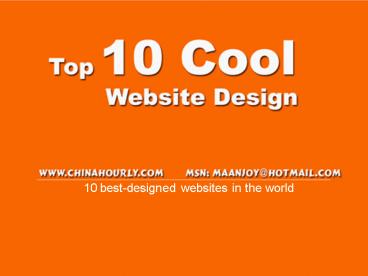
1
10 best-designed websites in the world
2
- This is our pick of 10 outstanding web
sites. It's personal preference, and you don't
have to agree, but we'll try to explain why these
designs are great.
3
1
www.apple.com
4
- Apple is the best example of striking the balance
of simplicity (white space, strong type) with
rich imagery sensitively-applied. - It's also a big, varied, constantly-new site with
loads of content, which always feels easy
enjoyable to navigate. - For solving the numerous demands on the UI so
elegantly, this is, in my opinion, the
best-designed web site in the world today.
5
2
www.mozilla.com
6
- Clear, open, fresh, simple. When you arrive at
this site, you're under no doubt what the site
does, or where to start looking for what you
want. The design is positive and happy. A winner.
7
3
www. iconbuffet.com
8
- The site sells icons, so it lets the icons rule,
showing its wares from the first page. - The colours and typography are solid strong,
projecting a trustworthy brand while not getting
in the way of the proposition.
9
4
www. whywewhisper.com
10
- Why We Whisper - restoring our right to say it's
wrong is a book about freedom of speech in the
USA, written by Senator Jim DeMint and J. David
Woodward. - The page design is a great example of
pixel-saving in action, with very little
complexity going into the page background
(chrome), leaving room for large, clear type. I
love the flourished rules between the quotes. - If I have one criticism, the pgae doesn't tell
you up-front what it's about.. relying on prior
knowledge or even reading, which may be a lot to
ask. - Another very worthy simple impacting book site
is Gangs of America.com, book by Ted Nace.
11
5
www. circografico.com.ar
12
- The guy's an illustrator, so his site has to
- Show his work
- Be interesting and characterful
- It does both these things really well!
- The graphic design is designed around Alex's
work, with intelligent typography and just enough
pixels used to give the site background its
tattered, rich vibe. - I love the way his portfolio page uses gradients
to suggest the work in a print context.
13
6
www. enhancedlabs.com
14
- Another icon maker, doing bigger, richer icons,
so the the site showcases them bigger richer. - Bold, flattish colour creates a strong first
impression and still lets the product stand out.
15
7
www. protolize.org/index.php
16
- Tony Yoo's collection of recommended web
resources is a great example of strong graphic
elements balancing to make a site that's bold and
easy to use. - Big text, simple nav, high usability, all wrapped
in strong colour and finished off with nice
graphical touches.
17
8
www. bearskinrug.co.uk
18
- Another illustrator's site (Kevin Cornell). What
can I say about this that I didn't say about Alex
Dukal's site? - It embodies the essence of Kevin's style, and -
if you look - does an excellent job of filling
the space with content, needing almost no page
furniture at all. - Count how many things on the page are both
navigation and content. Everything has had the
touch of the illustrator's brush, so the site is
just saturated with his talent.
19
9
www. corkd.com
20
- Dan Cederholm's personal wine review project
provides a neat, cleanly-designed interface,
featuring an intelligent colour scheme and
fantastic simple logo. - Easy to use and fun to browse. This site strikes
the balance just right.
21
10
www. sumagency.com
22
- Oh so 2.0, but I just love it. You know what gets
me every time? Acres of balanced white space,
easy-read text and cute content graphics
combining to tell a simple story. First-rate.
23
Designed ByDennyEmail (MSN)
maanjoy_at_hotmail.com Site http//Chinahourly.com
- Chinahourly Website Design
- Thank You!
Recommended
CrystalGraphics Presentations


