Welcome to Powerpoint - PowerPoint PPT Presentation
1 / 12
Title:
Welcome to Powerpoint
Description:
is patriotic. blah de blah. please don't read aloud every single word ... olds and 16 year olds will think it's cool. Audio 'clip art' can be useful. Maybe. ... – PowerPoint PPT presentation
Number of Views:86
Avg rating:3.0/5.0
Title: Welcome to Powerpoint
1
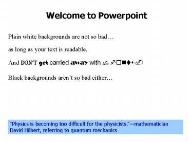
Welcome to Powerpoint
Plain white backgrounds are not so bad
as long as your text is readable.
as long as your text is readable.
And dont get carried away with the fonts.
Black backgrounds arent so bad either
Physics is becoming too difficult for the
physicists.mathematician David Hilbert,
referring to quantum mechanics
2
Dark blue text on black is not such a good idea.
Dark blue text on black is not such a good idea.
Better yet, use a bold, sans serif font on dark
backgrounds.
I personally like gradient fills for backgrounds
3
(No Transcript)
4
As long as they are reasonably subtle.
Powerpoint
offers many
animation effects
but dont
make me
feel like
I am standing
in the middle of
a war zone.
5
Organizing Your Presentation
Using the same background for all your slides
? makes you look organized
? helps you get organized
? impresses your audience
? is patriotic
? blah de blah
? please dont read aloud every single word
6
Go to http//www.umr.edu/webdivas and click on
templates and tutorials for some samples.
Click on design then color schemes and make
sure your hyperlinks are in an appropriate color
(not yellow on a white background).
7
Please, only one background per presentation.
Simply formatting your text box can add
appropriate emphasis.
But dont get carried away with too many effects,
like I am intentionally doing here
and sometimes cant help doing in my lectures
for other classes.
A mathematician may say anything he pleases, but
a physicist must be at least partially sane.J.
Willard Gibbs, mathematician, physicist
8
Dont cram too much information on one slide.
Dont cram too much information on one slide.
Blah blah blah.
Dont cram too much information on one slide.
Blah blah blah.
Dont cram too much information on one slide.
Blah blah blah.
Dont cram too much information on one slide.
Blah blah blah.
Dont cram too much information on one slide.
Blah blah blah.
Dont cram too much information on one slide.
Blah blah blah.
Dont cram too much information on one slide.
Blah blah blah.
Dont cram too much information on one slide.
Blah blah blah.
Dont cram too much information on one slide.
Blah blah blah.
Dont cram too much information on one slide.
Blah blah blah.
Dont cram too much information on one slide.
Blah blah blah.
Dont cram too much information on one slide.
Blah blah blah.
Dont cram too much information on one slide.
Blah blah blah.
Dont cram too much information on one slide.
Blah blah blah.
Dont cram too much information on one slide.
Blah blah blah.
After all, you arent paying 1.00 per
transparency sheet---------
Dont cram too much information on one slide.
Blah blah blah.
Dont cram too much information on one slide.
Blah blah blah.
Dont cram too much information on one slide.
Blah blah blah.
Or sacrificing trees by wasting paperelectrons
are recyclable.
9
You can do a lot with Powerpoints drawing tools.
All created with rectangle tool (many more
variations possible!
Handy hints select object, hold down control
key, and use arrows for precise positioning.
Disable grid for precise positioning.
10
Plan on 1 2 minutes per slide. If you go
much faster, you lose your audience.
Unless you are presenting a series of extremely
brief ideas, like I am doing here.
Clip art can be very useful.
Learn how to make transparent gifs.
Animations are fun, but your audience will pay
more attention to them than to you.
11
This is a graphical medium. Dont forget the
graphics.
Or links to the web.
12
Audio clip art can be useful.
Audio clip art can be useful. Maybe.
But I dont want to hear a lot of machine gun
clips.
Only 12 year olds and 16 year olds will think
its cool.
You will never have enough time to finish your
presentation.
You will never have enough time to finish your
presentation.
You will


