summary thumbnails readable overviews for small screen webbrowsers - PowerPoint PPT Presentation
Title:
summary thumbnails readable overviews for small screen webbrowsers
Description:
process html to render text readable (and reduce text to fit) export the new html to client ... readable text reduces the need to zoom. effects of text ... – PowerPoint PPT presentation
Number of Views:50
Avg rating:3.0/5.0
Title: summary thumbnails readable overviews for small screen webbrowsers
1
summary thumbnails readable overviews for small
screen web browsers
- heidi lam
- university ofbritish columbia
- patrick baudisch
- microsoft research
- CHI 2005
2
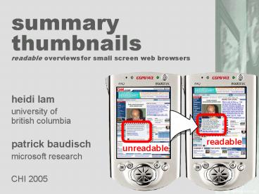
readable
unreadable
3
- any screen size
- any font size
4
(No Transcript)
5
(No Transcript)
6
(No Transcript)
7
demo
8
(No Transcript)
9
(No Transcript)
10
- related work
11
related work zooming
- Xie etc. al, www04tap to zoom into a tile
12
related work overviewdetail
- OHara et. at CHI 99 readable text on hover
13
related work multiple foci
- Wobbrocket. al UIST02 Web thumb
14
related work popouts
- popout prism suh, et al., chi02
- enhanced thumbnails
15
related work fisheyes
- document lens robertson, uist93
- unifying presentation space carpendale, uist01
- focuscontext sketching on a Pocket PC lank,
chi04
16
related work fisheyes
- works well to reduce page length
- applying it to page width works not so well
- forces users to scroll for each line
fishnet Baudisch, AVI 2004
17
related workcollapse-to-zoom UIST 2004
18
- implementation
19
implementation
- load html in web browser control
- process html to render text readable (and reduce
text to fit) - export the new html to client
- client does scaling
20
processing html
original page
- for each object on the web page
- count of lines
- increase font size
- reduce text to preserve of lines
- remove words from the end
- or, remove the most commonly occurring word based
on a frequency dictionary
scale font up
reduce text to fit
21
(No Transcript)
22
(No Transcript)
23
benefits?
- no horizontal scrolling
- preservation of original page layout
- readable text
- but waitso much missing text!
24
- user study
25
user study hypotheses
- preserving original web page layout is important
to locate information - readable text reduces the need to zoom
- effects of text reduction are acceptable
26
user study design I
- task generic target search ?the experience of
browsing pages designed for the desktop - page gathering
- interviewed 12 desktop users
- picked 3-5 pages from browser history ? 45 page
overall - gathered URLs, tasks and expected targets
- task creation
- summarized task description for each page and
target - study set generation
- removed 1 outlier page ? 44 pages
- separated into 4 sets of 11 pages per set
27
user study design II
- design within subject
- participants 11 externally recruited
- interfaces
- thumbnail
- summary thumbnail
- single-column
- desktop
- dependent variables
- task time and accuracy
- amount of zooming
- amount of scrolling
order of interface presentation
counterbalancedorder of page presentation
randomized
28
text we got during page gathering
short summarywe added
29
thumbnail interface
30
summary thumbnail interface
31
single column interface
32
desktop interface
33
results
task time
34
results
task time ANOVA (p .04)
35
results
error
preference
36
- current/future work
37
add navigation conceptmaybe add fishnet
38
how to do itconversionservice
- using proxy server
- so how fast are you? 6 sec/page ?
- first need faster shallow parser
- (but can convert 22,000 legacy pages)
39
how to do iton device
- might work better
- DOM there anyway
- need full text anyway
40
other app scenarios
- TV-based browsers same problem in bigger
- Browse through Word document
- On desktop present search results
41
read more try out
patrickbaudisch.com/projects
- thanks to VIBE
42
- END
43
The other users
- 300-500 million PCs vs. 1.5 billion cell phones
- phone only access to the digital world
- ? Not just information workers
- how much of the digitalworld can you really
seethrough our currentuser interfaces?
44
(No Transcript)
45
text reduction
- current
- cut off at the end of paragraph
- OR remove common words
- future
- use something smarter(but what we have works
surprisingly well) - however
- goal is to show users where to zoom in
- may not be a summarizer
46
related workmulti blending CHI 2004
problem with traditional alpha blending is
thisbush in palette or background?
47
related work peep hole
- Ka-Ping Yee CHI03
48
thunderhawk
summary thumb
49
other document viewers
- Word on Smartphone has same problem
- use summary thumbnails to find the page you care
about (easy recognize layout words) - then zoom in


