
Scatter PowerPoint PPT Presentations
All Time
Recommended

Scatter Plots Standards: SDP 1.0 and 1.2 Objective: Determine the correlation of a scatter plot Scatter Plot A scatter plot is a graph of a collection of ordered ...
| free to view
Scatter Diagrams Part One: Drawing Them Lesson Objective To be able to draw a Scatter Diagram Scatter Diagrams A Scatter Diagram is a graph of unconnected points When ...
| free to download
Scatter-graphs How to produce, describe and interpret a scatter-graph - Correlation - Line of Best Fit Positive correlation As one goes up... The other goes up ...
| free to download

Scatter Plots Scatter plots A graph that relates data from two different sets. To make a scatter plot, the two sets of data are plotted as ordered pairs Positive ...
| free to view

Scatter Instruments Introduction
| free to download

This presentation educates you about Tableau - Scatter Plot and its types of charts are Simple Scatter Plot, Scatter Plot - Color Encoded and Drill-Down Scatter Plot with example. For more topics stay tuned with Learnbay.
| free to download

Identify factors that affect the amount of scatter radiation produced ... Light & mirror to show area of beam and collimation. Scatter Radiation ...
| free to view

How do I create one with a graphing calculator? Coordinate Planes explored ... Sales scatter plot on page 162 with graphing calculator. Show me your graph ...
| free to view

Schulich School of Medicine & Dentistry The University of Western Ontario. 75 cm. 85 cm ... Scatter ( CT artifacts; cupping and streaking) ...
| free to view

Studying Scatter Plots Writing Equations to Represent Data When lines have positive or negative correlation you can write equations to represent the data.
| free to view

To make a scatter plot, the two sets of data are plotted as ... Juan uses the car odometer and. his watch to keep track of the. distance. Make a scatter plot ...
| free to view

Reflection Based Scatter A scattering method that combines Roughness and Diffraction effects Claus Lynge Christensen ODEON A/S Reflection Based Scatter
| free to download

Creating a scatter bubble chart in PowerPoint is easy and improves data presentation. Start by gathering your data with two variables for the X and Y axes. A scatter chart visually shows the relationship between these variables, helping to identify trends and correlations. To insert a bubble chart in PowerPoint, go to the Insert tab, select Chart, and choose the "Bubble" option. Remember, a scatter diagram is a type of graph that displays data points based on their values, making it useful for data analysis and visualization.
| free to download

Welcome To Scattered Seed Ministries . Living the Biblical Faith of Yeshua IF Power Point, Slides advance on time: Or, click mouse or Page UP-Down Keys
| free to download

Creating a scatter chart in PowerPoint is easy and helps visualize data. Start by opening PowerPoint and going to the where you want the chart. Click on the "Insert" tab, select "Chart," and choose "Scatter." After adding the chart, use the "Shapes" tool to draw the X and Y axes, making sure they intersect clearly. To add words to your chart, use text boxes and place them where needed. It’s important to label your scatter plot for better understanding; right-click on the data points and choose "Add Data Labels" to provide context for each point. By following these simple steps, you can create a clear and informative scatter graph that enhances your PowerPoint presentation.
| free to download

Lesson 11.4: Scatter Plots Standards: SDP 1.0 and 1.2 Objective: Determine the correlation of a scatter plot Scatter Plot A scatter plot is a graph of a collection of ...
| free to download

Lesson 11.4: Scatter Plots Standards: M7D1f & M7A3a & c Objective: To construct a scatter plot and determine the relationship between two variables.
| free to download

Lesson 11.4: Scatter Plots Standards: SDP 1.0 and 1.2 Objective: Determine the correlation of a scatter plot
| free to download

16 minutes ago - COPY LINK TO DOWNLOAD = pasirbintang3.blogspot.com/?klik=B099X9LC8Z | PDF/READ Smart but Scattered Teens: The 'Executive Skills' Program for Helping Teens Reach Their Potential | "I told you, I'll do it later.""I forgot to turn in the stupid application.""Could you drive me to school? I missed the bus again.""I can't walk the dog - I have too much homework!"If you're the parent of a "smart but scattered" teen, trying to help him or her grow into a self-sufficient, responsible adult may feel like a never-ending battle. Now you have an alternative to micromanaging, cajoling, or ineffective punishments. This positive guide provides a science-based program for promoting teens' independence by building their executive skills - the fundamental brain-based abilities needed to get organiz
| free to download

Lesson 11.4: Scatter Plots Objective: Determine the correlation of a scatter plot Warm Up What is the slope of a line that passes through points with coordinates (-2 ...
| free to download

Plot the following points and then join them in order to determine the shape the points make: ... between x and y, if any, suggested by each of these scatter ...
| free to view

PROPOSED DATA PRETEST Scatter plot (Observation) PROPOSED DATA POSTTEST Scatter plot ... Proposed Teacher Interaction Selection Post Intervention. x data. y data.
| free to download
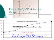
From Scatter Plot to Line Graph Guidelines to Organizing Your Plot PRESENTATION BY: Anastasia Marie, using Michael Hauge s Six Stage Plot Structure
| free to download

1. Scatter Plots. on the. Graphing Calculator. 10/23/09. 2. 1. ... Choose the type of graph (the first choice is a scatter plot). Choose the Xlist and Ylist. ...
| free to download

Scatter Plots and Trend Lines MCC8.F.4 and 5 scatter plot correlation positive correlation negative correlation no correlation trend line Vocabulary In this chapter ...
| free to view

Scatter Graphs Scatter graphs are used to show whether there is a relationship between two sets of data. The relationship between the data can be described as either:
| free to view

Scatter Plots Bivariate Data: The values of two different variables that are obtained from the same population element. While the variables may be either categorical ...
| free to view

Copy URL : gooread.fileunlimited.club/pwaug/B0BQYV7391 | Scattered Minds: The Origins and Healing of Attention Deficit Disorder Kindle Edition
| free to download

Kris De Volder, Ryan Wannop. Software Practices Lab. -- The University of British Columbia ... Typical ways to explore scattered concerns: Browse structural views ...
| free to download

Lesson 5-7 Statistics: Scatter Plots and Lines of Fit Transparency 7 Click the mouse button or press the Space Bar to display the answers. Transparency 7a Objectives ...
| free to download

Title: Ionospheric climatology and model from long-term databases of worldwide incoherent scatter radars Author: Shunrong Zhang Last modified by
| free to download

Compton interaction increases with increasing kVp. Scatter ... Does not relieve of technologist of having to collimate to anatomy. Collimator Filtration ...
| free to view

Scatter-plot, Best-Fit Line, and Correlation Coefficient The Correlation Coefficient: If r is close to zero, there is little or no evidence of a relationship.
| free to download

Incoherent Scatter: Theory and Measurable Parameters
| free to view

We plough the fields, and scatter. The good seed on the land, But ... He sends the snow in winter, The warmth to swell the grain, The breezes and the sunshine, ...
| free to view

Using a DPS as a Coherent Scatter HF Radar Lindsay Magnus Lee-Anne McKinnell Hermanus Magnetic Observatory Hermanus, South Africa
| free to download

Incoherent Scatter Radars Current Status and Future Plans
| free to view

Dynamics of Slow-Moving Lands from Permanent Scatterer Analysis ... http://edc.usgs.gov/Tectonic/InSAR.gif. Look Direction. Network of Permanent Scatterers ...
| free to view

Broadcast and scatter algorithms on mesh-based topologies. Lecture outline ... Directedness of channels (simplex, half-duplex, full-duplex) ...
| free to download

MILAN. OCTOBER 24th, 2003. Urban sprawl. the evaluation framework. SCATTER WORKSHOP 24.10.2003 ... Milan. Stuttgart. Brussels. Brussels. Brussels. Brussels ...
| free to download

Translucent materials scatter light as it passes through. ... Red Orange Yellow Green Blue Indigo Violet. White light has all of these colors. ...
| free to view

Imaging Crustal and Mantle Geology With Scattered Waves
| free to view

Kangerlussuaq ISR Research Facility Incoherent Scatter Radar Station operated by SRI and DMI Upper Atmospheric Research Facility in Kangerlussuaq
| free to download

uses 630 nm red or 590 nm amber LEDs in a diffuse light box/panel ... acquired with 1024x768 pixel 10-bit monochrome camera (410 projections over 360o) ...
| free to view

The Origin of intrinsic scatter in MBH-Mbulge relation. Minjin Kim (Carnegie, SNU), Luis C. Ho (Carnegie), Chien Y. Peng (NRC-HIA) ...
| free to view

Scattered Blast of Thoughts on Designing with Information. Peter Merholz. Work: Epinions.com ... .com/LIS/InfoDesignF96/Kelvin/Napoleon/map.html. Four Methods ...
| free to view

Underwater Optical Imaging: Systems and Insights Related to Volume Scatter in the Ocean
| free to view

Correction for Scatter and Cross-talk Contaminations in Dual Radionuclide 99mTc/123I Imaging Using Artificial Neural Network Xiaoming Zheng, PhD.
| free to download

Calibration of COSMIC Ionospheric Occultation Profiles Using the Arecibo Incoherent Scatter Radar
| free to view

Institute of Geology and Geophysics. Chinese Academy of Sciences. Beijing, CHINA ... based on the Arecibo incoherent scatter radar measurements, J. Geophys. ...
| free to view

CEDAR Frontiers : An Incoherent Scatter Radar for Space Weather Monitoring. High Quality Measurements as Input to Space Weather Models ...
| free to view

Rolling the Dice: Navigation in Scatter Plot Matrices for Visual ... Scratching 'Scratch' (like a DJ) between the current plot and an adjacent to see ...
| free to view

Intensity/Background Scatter for Negative Spots 55 Wash vs. RT Wash Ch2 (red) ... Intensity/Background Scatter for Negative Spots 55 Wash vs. RT Wash Ch1 (green) ...
| free to view

To distinguish scatter from point sources and glow/speckle using photography ... Continued work on point vs glow/speckle accounting. Logbook and other info: ...
| free to view

An Observational Study of the Development of Diabetic Macular Edema Following Panretinal (Scatter) Photocoagulation (PRP) Given in 1 or 4 Sittings
| free to download

Efficient Fitting and Rendering of Large Scattered Data Sets ... Least Squares fit Bivariate Polynomial. Presentation Overview. Introduction. Fitting method ...
| free to view