
Organization Charts - Search Results
All Time
Recommended

Create organization chart and set-up your organization charts quickly by using the practical skills.
| free to download

Ribbon charts and stacked area charts differ in how they represent data visually. Ribbon charts show the ranking of categories over time, connecting points with ribbons to highlight changes in rank. In contrast, stacked area charts focus on the cumulative values of different categories, illustrating their contributions to a total over time. To create a proportional area chart in Excel, select your data, choose the "Area" chart option, and customize it for proportional sizes. You can smooth the area graph's appearance using the "Format Data Series" option. Area charts are useful for visualizing trends and comparing the relative proportions of categories, making them effective for data analysis and presentation. They help viewers quickly understand changes and comparisons, simplifying complex data for better comprehension.
| free to download
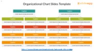
Optimize your organization's structure with SlideEgg's Organizational Chart PowerPoint Templates and Google Slides. These templates offer intuitive and visually appealing designs to represent your organization's hierarchy, departments, and roles effectively. Ideal for HR presentations, business proposals, or academic projects, they simplify complex structures and enhance clarity. Customize them effortlessly to fit your organization's needs and elevate your presentations. Explore SlideEgg's Organizational Chart Templates for a polished and professional representation of your organization's structure.
| free to download

The first chart, labeled 'Organization Next Steps' is the organization as it has ... Jewish. Islam. Hindu. Buddhist. Sikh. Bahai. Unitarian Universalist ...
| free to view

FOR MORE CLASSES VISIT www.tutorialoutlet.com See the organization chart Bertas_and_HiFives_organization_charts Add content to the WBS created in Week 4. Use Microsoft Project to add dependencies, between tasks to the WBS for the BMOS project. The following video might be helpful for adding dependencies Add durations to each task. The entire project should span six months. Make sure that in the Task Mode column, the mode for each task is “Auto Scheduled.” All dates should automatically populate according to the project start date and task dependencies. Verify that durations make sense. Task durations may be changed by adding or removing days in the “Duration” column.
| free to download

World Health Organization International Growth Standards/Growth Charts Seven Minute Overview World Health Organization Growth Standards/ Growth Charts For this ...
| free to view

"Copy Link : gooread.fileunlimited.club/pwjul24/B0861JCMPY ICD-10-CM Documentation 2021: Essential Charting Guidance to Support Medical Necessity (Essential Chartin Guidance to Support Medical Necessity) 1st Edition, Kindle Edition ICD-10-CM requires very specific documentation to correctly choose diagnostic codes, a skill that both coders and physicians must master to code successfully. Moving beyond the transition to ICD-10, the new edition focuses on the key role proper documentation plays in supporting medical necessity. Â ICD-10-CM Documentation 2021 brings coders and physicians together to ensure documentation success, identifying all ICD-10-CM documentation requirements using detailed checklists. Â Designed for use alongside an ICD-10-CM codebook, this comprehensive training guide provides all the tools necessary to conduct an effective documentation analysis and to create a corrective action plan, making it ideal for bo"
| free to download

To keep you up to date on what employees are doing, you need a reliable web-based tool for building interactive organization charts software that conveniently converts data into charts. With Talygen, you can build your business charts in minutes.
| free to download

To create an XY scatter chart in Excel, start by selecting your two numerical data sets and go to the "Insert" tab to choose the scatter chart option. You can enhance the chart by changing the bubble sizes in the scatter plot by selecting the data series and adjusting the size properties. Remember, scatter charts show the relationship between two variables, while line charts display trends over time. If you're using a bubble chart, you can add labels through the "Data Labels" feature in the chart tools. The main difference between bubble charts and scatter plots is that bubble charts also represent a third variable through the size of the bubbles, whereas scatter plots focus only on the correlation between the two main variables shown on the axes.
| free to download

Organization Chart D:\data_d\Teaching Plan\lessonplan_website\MS_Powerpoint ...
| free to download

Pedigree Charts The family tree of genetics 4. Transgenic Organism: trans = across genic = race Contains genes from another organism Bacteria Virus Human 5.
| free to view
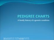
A family history of a genetic condition Pages 1-3 & 6-9 taken from Paul Billiet at the following website: saburchill.com/IBbiology/.../images/05PEDIGREE CHARTS.ppt
| free to download
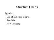
Structure Charts Agenda: Use of Structure Charts Symbols How to create Structure Chart Use Describe functions and sub-functions of each part of system (in more detail ...
| free to download

ORGANIZATION CHART Organization is structed based upon eropean system ---french system. In this system, the Maitre d hotel is in charge of the dining rooms ...
| free to download

A stock chart in PowerPoint effectively illustrates a stock's historical performance, capturing key price points such as opening, closing, high, and low values over time. To construct a radar chart, begin by organizing your data into a table, enabling a comparative analysis across various categories. Known as spider or web charts, radar charts are designed to represent multiple variables and their interrelations. To customize the appearance of a radar chart, select the chart, navigate to the Chart Tools, and modify the fill settings as desired. For visualizing hierarchical data and relationships, a tree map is an ideal choice; simply select your data, access the Insert tab, and opt for Tree Map under the hierarchy chart options. Each of these chart types enhances the clarity and engagement of presentations by visually conveying intricate data, thereby facilitating a better understanding for the audience.
| free to download

ORGANIZATION MANAGEMENT Organizational Design McKinsey 7-S Model Strategy Structure Systems Style Staff Skills Superordinate goals McKinsey 7-S Model Strategy ...
| free to view

A business report is a structured document used to provide information and analysis for decision-making within an organization. It typically includes a title page, table of contents, executive summary, introduction, body, conclusion, and recommendations. To create a report, start by defining its purpose and audience, then gather and organize relevant data. When using Word to design the report, take advantage of built-in templates for a consistent and professional look, ensuring clarity with headings, subheadings, and bullet points. Choose appropriate fonts, colors, and layouts to enhance readability while maintaining a formal tone. Overall, a business report effectively presents facts, analyses, and recommendations to aid informed business decisions.
| free to download

Pedigree Charts The family tree of genetics 4. Transgenic Organism: trans = across genic = race Contains genes from another organism Bacteria Virus Human 5.
| free to view

A butterfly chart serves as a powerful data visualization instrument, enabling the side-by-side comparison of two distinct datasets while effectively highlighting their differences or similarities. To construct a butterfly chart in PowerPoint, one begins by arranging a bar or column chart that positions the datasets on either side of a central axis. This process entails selecting the appropriate data, inserting the chart, and tailoring its design to achieve the desired butterfly configuration. This chart format is particularly advantageous for depicting distributions, such as demographic statistics, thereby facilitating a clearer understanding of comparative data for the audience. In tabular presentations, butterfly charts significantly improve clarity and support rapid analysis, making them indispensable for a range of applications, including business presentations and academic research.
| free to download

Pedigree Charts The family tree of genetics 4. Transgenic Organism: trans = across genic = race Contains genes from another organism Bacteria Virus Human 5.
| free to view

Organizing graphs in PowerPoint improves your presentation's clarity and effectiveness. Use a grid layout to align graphs with your content flow, ensuring they relate logically to your text. To create a map chart, utilize PowerPoint's built-in Map Chart feature to visualize geographical data. You can insert a world map by going to the "Insert" tab, selecting "Maps," and choosing a template. For specific maps, like building layouts, use the "Shapes" tool to draw and label areas. Additionally, consider drafting your layout in Word first, as it allows for better structure and easier adjustments before transferring to PowerPoint. By following these steps, you can create engaging and informative maps and graphs that enhance your presentations.
| free to download

A Mekko chart, or Marimekko chart, is a visual tool for displaying categorical data in two dimensions, useful for analyzing market share, revenue distribution, and other comparisons. To create a Mekko chart, you first need to organize your data into categories and dimensions, then use software like Excel or specialized charting programs to visualize it. Editing the chart is easy; you can adjust data series, change colors, or resize segments for better clarity. Adding a title is straightforward—just click the title area and type your text. Unlike standard bar charts, which have uniform bar widths, Mekko charts use variable widths to represent the size of each category, providing a more detailed view of the data. This makes Mekko charts a powerful option for visualizing complex data relationships.
| free to download

Hard Tissue Charting Dental Hygiene Theory Instructor: Nickee dela Cruz R.R.D.H.
| free to view

To create a clustered chart, like a clustered bar or column chart, start by organizing your data for easy comparison across categories. These charts are helpful for showing multiple series side by side, allowing you to easily see differences and trends. Clustered charts are widely used in business and research to illustrate relationships between multiple datasets. They are also known as grouped bar charts, highlighting their function of grouping related data for more effective analysis.
| free to download

Elevate your PowerPoint presentations by incorporating visual aids such as tree charts, decision trees, and sunburst charts. To create a tree chart, navigate to the "Insert" tab, select "SmartArt," and opt for a hierarchical layout. For a decision tree, follow a similar approach but choose a design that illustrates branching options. Utilize the "Shapes" tool to draw connecting lines between the various elements to clarify relationships. When designing a sunburst chart, choose the "Hierarchy" option in SmartArt to represent data in concentric circles effectively. To produce a starburst effect, combine various shapes and text boxes, arranging them to form a star-like structure that clearly communicates your message. These visual tools are instrumental in distilling complex information and enhancing comprehension for your audience.
| free to download

Excel Charts Basic Skills Creating Charts in Excel Creating a Run Chart Tracking Trends Creating a Column Chart Comparing Values Creating a Pie Chart Creating a ...
| free to view

Pedigree Charts The family tree of genetics Patterns of Inheritance When analyzing pedigrees, biologists find certain phenotypes are repeated in predictable patterns ...
| free to view

Gantt charts are essential tools for managing projects, and think-cell makes it easy to create and adjust them. To start, you can insert a Gantt chart directly from the think-cell toolbar, which helps visualize your project's timeline. Modifying the chart is simple; you can change task start and end dates by dragging the bar edges or entering new dates in the data sheet. Gantt charts are commonly used for software development projects, illustrating phases like planning, design, development, and testing. They can serve various purposes, such as scheduling tasks, tracking project progress, and improving team communication. By using think-cell's user-friendly features, you can improve your project management approach and ensure your timelines are clear and actionable.
| free to download

Would you like to create an organization chart but Don't Know how? Don't worry this file will help you with simple and easy steps. You can easily create an organizational chart by following this steps.
| free to download

Unlike Functional Manager, PM is More ... 2_Blends MS Organization Chart 2.0 Project ... Styles that Work Organizational Problems Organizational Approaches ...
| free to download

A bar chart is a key tool for visualizing categorical data using bars of varying lengths to represent different values. Subdivided bar graphs break each bar into segments for comparison of subcategories within a category. Distribution bar charts show how values are spread across categories, illustrating frequency distribution. Deviation bar diagrams highlight the differences between actual and expected values, making it easy to see discrepancies. Grouped bar charts arrange bars in clusters for side-by-side comparisons across multiple categories, aiding in the analysis of relationships within the data. Each type of bar chart serves a unique purpose, making them versatile tools for data analysis and presentation.
| free to download

Steering Committee Sponsor Senior Mgmt Program Manager Project Manager Business Team Other Other Other Other Click on a box to modify Project Organization Chart *
| free to download

CrystalGraphics now offers a package of 89 beautifully designed charts and diagrams. For more info visit: http://www.crystalgraphics.com/presentations/diagrams.main.asp
| free to view

Creating a 100% stacked bar chart in Excel is a straightforward process that effectively visualizes proportional data. Begin by organizing your data in a clear format, with categories in rows and series in columns. Highlight the data range, then navigate to the "Insert" tab on the ribbon. Select "Bar Chart," choosing the 100% Stacked Bar option from the dropdown menu. Once the chart appears, customize it by adding chart titles, data labels, and adjusting colors for clarity. Finally, review the formatting to ensure readability and professionalism, allowing stakeholders to easily interpret the proportional contributions of each category within the total.
| free to download

B. Only 'local' church has organization. revealed, Philippians 1:1 ... 1 Timothy 3:1-13; Titus 1:5-9 (Rest of the chart blocked whs) Rev. 091808. Farish's Charts ...
| free to view

Organization of the AFJROTC
| free to view

Helical IT Solutions, a pioneer in open-source Business Intelligence technologies, has announced the release of Helical Insight version 5.2.3, the latest and most feature-rich update to their flagship open-source BI platform. This release introduces a range of advanced statistical and scientific charts, enriched customization options, improved drill-through capabilities, and upgraded SSO and embedding features—solidifying Helical Insight’s position as a powerful, flexible, and cost-effective BI alternative.
| free to download

Learn how clear and concise medical charts can enhance optometry billing processes, ensuring accurate reimbursements and improved revenue cycles.
| free to download

Do you want to create a beautiful and awesome your company organization chart on your WordPress website? We will help you create an organization chart in WordPress and tell you a few easy ways. Org charts are very useful in displaying company hierarchy and present users to the running the business. Please visit the following link to know the complete information: - https://www.wpglobalsupport.com/create-company-organization-chart-in-wordpress/
| free to download

For more course tutorials visit www.tutorialrank.com Reference Chart Instructions: Create a chart detailing the three different forms of business organizations (proprietorships, partnerships, and corporations). Also
| free to download

Charts and Graphs Chapter 2 MSIS 111 Prof. Nick Dedeke Objectives Understanding data presentation Discrete versus continuous data Differentiate between grouped and ...
| free to view

Cementing Habits And Routines Together CHARTing the Course Hardwiring Excellence * * * * * * * * * * Communication Fundamentals A I D E T Acknowledge Introduce ...
| free to view

... National Defense Act passed 1964: ... Introduction to Air Force Junior ROTC Lesson 1, Chapter 1, Organization of the AFJROTC * How is the cadet corps organized?
| free to view
In this video you can easily learn the Step-by-step tutorial on "How To Create An Organizational Chart In PowerPoint". Check out the following link to find the best "Tips & Tricks" in format. Visit Here: https://www.egg.com/how-to-create-an-organizational-chart
| free to download

For more course tutorials visit www.tutorialrank.com Reference Chart Instructions: Create a chart detailing the three different forms of business
| free to download

... pulse rate of a person is shown to change over time. As time continues, the pulse rate ... Circle or Pie Chart. A circle graph is used to show how a part of ...
| free to view
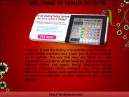
Replace worthless chore charts, with DoDots family system. DoDots will help you to organize your family, manage household tasks and increases bonding between members.
| free to download

When drafting a report, it is crucial to select a title that succinctly encapsulates the essence and intent of the document to effectively engage potential readers. The main body of the report should be meticulously organized, with findings, analyses, and conclusions presented in clearly defined sections to facilitate easy navigation. Crafting an effective report involves strategic planning, thorough research, and a coherent structure, emphasizing the logical flow of information. Incorporating visual elements such as charts and graphs can significantly enhance comprehension and maintain reader interest. Furthermore, proposal writing typically falls into four primary categories: formal proposals, informal proposals, grant proposals, and research proposals, each tailored to serve distinct purposes and target audiences. Ultimately, a well-executed report conveys its message with clarity and engages the reader through purposeful design and effective presentation.
| free to download

Hidden Faultlines In Your Organization Find them FAST FIX them Forever Dr. Ted Spickler Quality and Business Services 412-777-2054 ted.spickler.b@bayer.com
| free to download

ENG 380 Education Organization / snaptutorial.com
| free to download

For more classes visit www.snaptutorial.com HTT 250 Week 1 Assignment Organization Chart Hotel Front Office HTT 250 Week 1 CheckPoint Total Quality Management
| free to download

FOR MORE CLASSES VISIT www.hcs380rank.com Reference Chart Instructions: Create a chart detailing the three different forms of business organizations (proprietorships, partnerships, and corporations). Also
| free to download

For more classes visit www.snaptutorial.com PM 582 Week 1 Leadership Styles & Diverse Teams (1150 Words) PM 582 Week 2 Team Assignment Work Breakdown Structure Sales Increase and Hiring Initiative (1400 Words) PM 582 Week 3 Team Project Organizational Chart Paper (2000 words) PM 582 Week 4 Communications Plan Matrix (2000 words)
| free to download

For more classes visit www.snaptutorial.com Reference Chart Instructions: Create a chart detailing the three different forms of business organizations (proprietorships, partnerships, and corporations). Also include key users of financial information and briefly explain their roles. Cite 3 peer-reviewed, scholarly, or similar references to support your paper. Click on the Assignment Files tab to submit your assignment.
| free to download

Kalyan Satta Matka Result: A Guide for Charts and Records Introduction to Kalyan Satta Matka Kalyan Satta Matka Results is one of the most prominent and enduring forms of Matka gambling, a popular betting game in India. Originating in the 1960s, Satta Matka has evolved from a straightforward lottery to a highly organized and structured gambling system. Among various forms of Matka, Kalyan Matka holds a special place due to its history, the reliability of its results, and its widespread participation.
| free to download

Spider Charts: A Training Course * It is usually most helpful to start with the first criterion, looking at the differences in the alternatives values, then move ...
| free to view